- 项目名称:Brainium Studios 办公室设计
- 客户:Brainium Studios
- 面积:23,000 sqft
- 年份:2022
客户:Brainium Studios,
面积:23,000 sqft
年份:2022
坐落:Portland, Oregon, United States,
行业: Gaming,
designed the
offices with a modern and welcoming design for their space in Portland, Oregon.
Brainium asked Hacker to design a modestly branded workplace that created a welcoming and visually pleasing experience while leaving room for the unexpected. The desired qualities were not entirely different from the studio’s own work: their game apps are unique, intuitive, and engaging, with incredible attention to detail, all for the goal of an amazing experience for the player.
Before beginning the 23,000-square-foot tenant improvement, the design team started with an inquiry to the Brainium team to better understand their specific objectives for the growing company. A space that supports the health and well-being of staff with an intuitive, rational flow, simple material palette, and superb acoustics and lighting were some of the primary directives.
Certain elements were evident from start: the need for a generous reception lounge, defined by built-in seating that lines the perimeter, greets visitors and staff; and seating that connects to a desk, both clad in whitewashed tambour panel, creating a visual language that’s seen throughout.
The palette is minimal. White and shades of blue painted walls, white-washed tambour panel, blue upholstery and concrete flooring provide a canvas for Brainium to develop truly special moments in the space with colorful, interactive digital art, while also relating to the urban views. Matte black lighting and plumbing fixtures are used modestly and provide graphic accents.
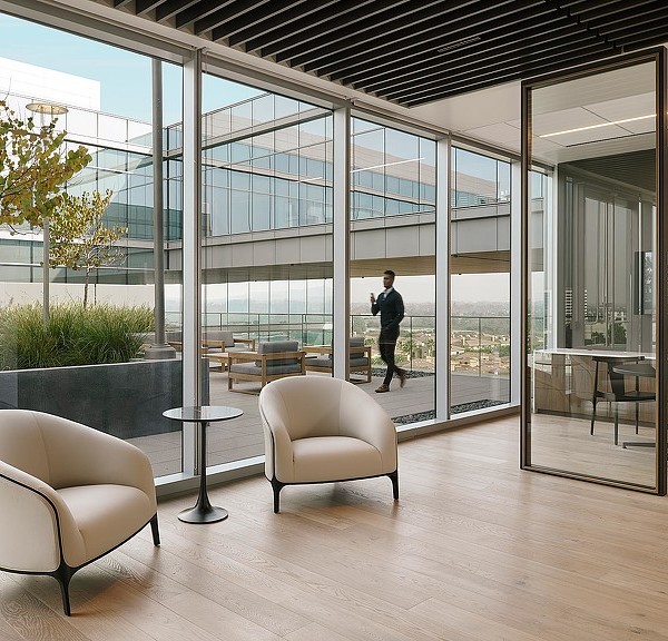
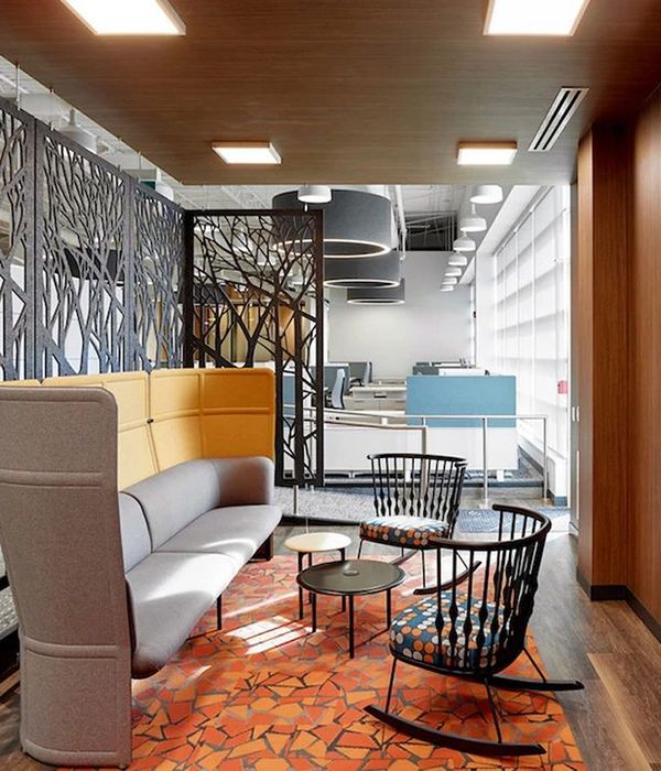
Daylight and views were paramount so vertical expressions to break down the scale of the space needed to be translucent. A screen intended to support vines and plants captures the workstation pods, creating a buffer between the desks and the primary circulation path, ensuring a visitor can see out to the Willamette River upon entering from the elevator. Access to natural light and plants throughout the space help to create a biophilic environment that contributes to the wellbeing of staff.
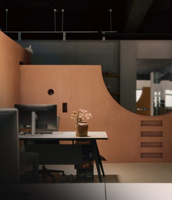
Conference rooms and enclosed offices are placed at the core, preserving the penetration of daylight deep into the space. Tambour panel clad the conference rooms and built-ins which allows for graceful, radiused corners. The same radiused expression rotates axes and becomes a glass filled “cut-out” at the enclosed offices, allowing one to see through the offices, each having been painted a different shade of blue, creating a gradient effect when seen together.
Acoustic panels are installed at the ceiling in the open office areas, helping to mitigate the large amounts of glass and other hard surfaces, and lighting types were thoughtfully layered to provide sufficient task lighting at workstations, as well as dimmable ambient light in lounge areas.
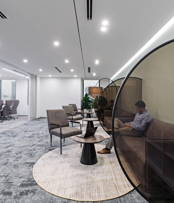
Phone booths are centrally located, entirely lined with absorptive fabric panels, creating private, acoustically separated spaces for both sensitive work calls as well as respite from the higher energy workspaces near the perimeter glazing. A mother’s room doubles as an additional room for respite.
The primary kitchen is centrally located with two smaller ones on each end of the floor plan to support staff no matter where their desk lands. The larger room can accommodate the entire staff for all-hands meetings, as well as socializing and games. A ping-pong table and special booth for video games are part of the modern amenities, as is a fully furnished deck, which is large enough for meetings and parties.
设计师:
团队:Jennie Fowler, Jen Dzienis, Keri Woltz, John Dalit, Katherine Park
:
摄影:
17 Images | expand for additional detail
{{item.text_origin}}


