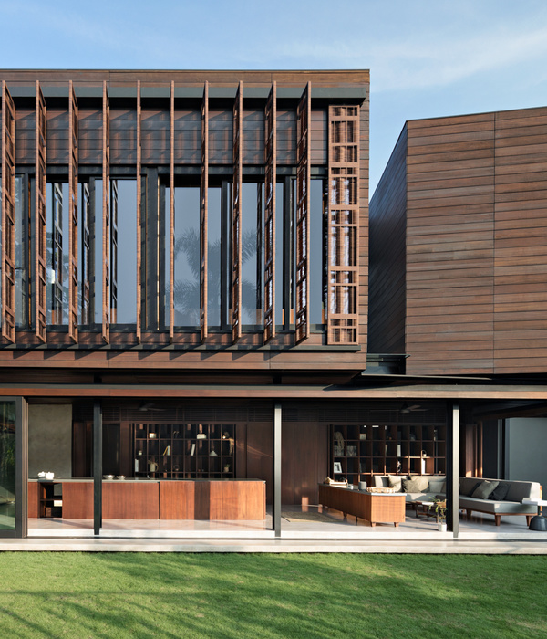
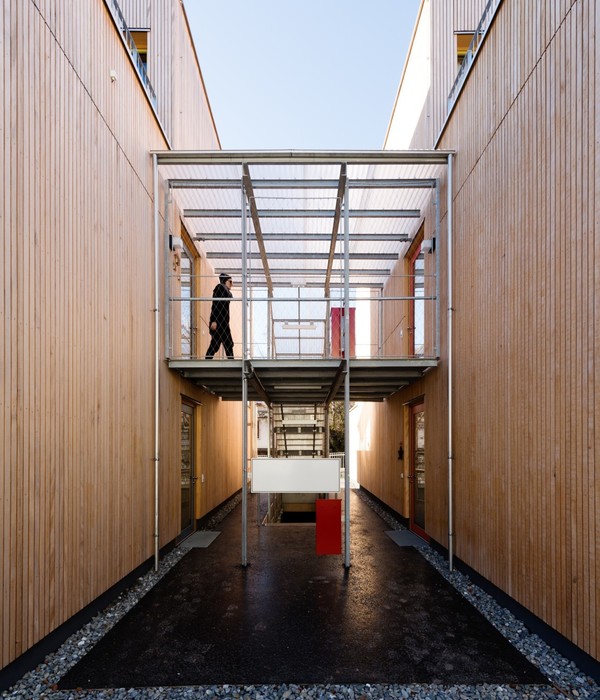
Trusting in our studio, Salva and Pablo commissioned us with the project for the relocation of their restaurant. For this purpose, an old corner house with no architectural value is chosen, located in a low-rise building area. This new location makes it possible to house the new restaurant in its own building, which allows all the advantages that its old premises did not have. The project covers the demolition of the old building and the construction of a new one. Whenever there is a change of business, there is a need to improve the existing, so the main starting point of the project was to solve all the problems that the old location had without affecting the main features of the restaurant. For this we thought, given that this new location had space, to change the concept of entry to the restaurant by having a patio and, at the same time, a secondary entrance to solve the public-private communication problems that many restaurants have.
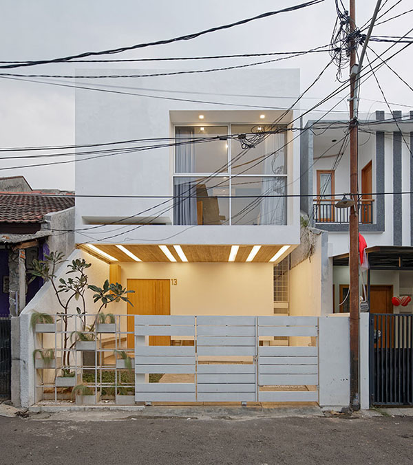
The entrance patio becomes one of the axes of the project. On the one hand, it acts as a filter between the restaurant and the street, so it allows us to open large cavities that facilitate natural lighting and spaciousness. On the other, it generates a very pleasant previous outside space thanks to its size and configuration. The façade is mainly made with three materials: black viroc panels simulating concrete body that houses the kitchen and bathrooms, a micro-cement line that joins the entire façade and a perforated latticework that creates an interior-exterior filter in the patio. The plane of viroc becomes glass in the main hall. On the inside, different spaces are created with different configurations. On the one hand, the main hall maintains the sober and elegant aesthetics of the facade, defining the personality of the restaurant. On the other hand, two private rooms are located; one close to the main hall, and another with the possibility of opening to it by means of a wooden sliding partition.
Acoustics becomes one of the important points to be solved, so false ceilings with open joints are set out which allow the installation of acoustic absorbent material on them. As a differentiated space we can find the winery, visually communicated with the small private room through a large glass and with an access from its outside area. The idea is based on having each customer accessing it to choose the wine they want to have. The storage of bottles is conceived as a wink to the construction trade, tailored as a rebar of reinforced concrete beams, housing in its interior as many bottles as possible by modulating the mesh. All the materials arranged in the project pursue the initial idea of sobriety and elegance, hence with different choices of them a set is created that evokes unity, creating a cosy space where the atmosphere generated within the restaurant is relaxed, comfortable and nice.
Architects:
VIMARVI
Architects in Charge: Jorge Martinez Villar + Jaime Martinez Villar
Photographs:
German Cabo
{{item.text_origin}}

