在阿姆斯特丹的De Pijp街区,传奇酒水品牌Goudvisch的新店Arie现已开张。一如既往,Studio Modijefsky不仅为客户设计了新的环境,还塑造了品牌形象,赋予店铺新的生命。Arie所在的大楼可追溯至1876年,因位于Ferdinand Bolstraat和Quillijnstraat街的交汇处,故得名‘op de hoek’,即荷兰语中“在转角”的意思。 第二次世界大战后,著名的“Gezellige俱乐部”便在这个繁华的街角开张营业,直至现在,这里一直经营着阿姆斯特丹受欢迎的咖啡厅或酒吧。
Arie is the latest addition to the Goudvisch family. The imaginary family of bar owners that was born with Bonnie welcomes a new cousin, Arie, in Amsterdam’s ‘De Pijp’ neighbourhood. Once again Modijefsky has created a name, character and interior that all blend seamlessly into each other. The building in which Arie is housed dates back to 1876. Its location on the intersection of the Ferdinand Bolstraat and Quillijnstraat gives Arie its second name ‘op de hoek’, meaning ‘on the corner’. After the Second World War “The Gezellige Club” opened on this bustling spot, and ever since there has been a bar or café here to welcome generations of Amsterdammers.
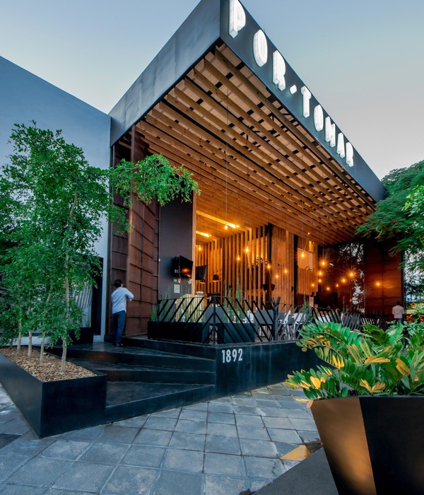
▼店铺外观 exterior view © Maarten Willemstein
本案中,Studio Modijefsky为Arie打造的新形象是一间“棕色咖啡厅”。阿姆斯特丹的酒吧文化富有传奇色彩,这些店铺由大楼底层的私人商铺发展而来,当时,居民敞开自家大门售卖食物和饮品以赚取生活费用。时光流转,积年累月的雪茄烟雾将墙壁染成了深色。Arie的新设计便致敬了这段历史,通过染色的木制镶板还原了当时氛围。
For its latest incarnation as Arie, Studio Modijefsky was asked to design a modern ‘brown cafe’. These legendary Amsterdam bars were originally created by people living on the ground floor of buildings who opened up their homes to serve food and drinks in order to supplement their low incomes. They got their name from the incessant cigar and cigarette smoke that discoloured the walls, a status to which Arie pays tribute with stained wooden panelling.
▼室外用餐区 the outdoor dining area © Maarten Willemstein
Studio Modijefsky还采用了当时流行的铜、水磨石、瓷砖、织物和木材等材料,旨在重现那段旧日时光。深色山毛榉木作为主要材料,和老化铜与红色大理石制成的复古吧台形成了鲜明对比,不同色调的蓝色瓷砖更凸显了对比的效果。吧台的后墙一直延伸至红黄相间的天花板,定制的酒水柜让人联想起二十世纪初期制造的冰箱,富有浓郁的年代气息。
To recreate the atmosphere of these days Studio Modijefsky concentrated on the popular materials of the time: copper, terrazzo, tiles, fabrics, and wood. Darkened beech is used throughout, creating a strong contrast with the aged copper and red marbles of the front bar. Blue tiles in a variety of shades accentuate these contrasts and connect the yellow and red ceiling with the back of the bar, where a custom-made cooling cabinet recalls the kind of crafted fridges you might have found in this building at the start of the 20th century.
▼室内概览 overview © Maarten Willemstein
▼吧台区 the bar © Maarten Willemstein
作为室内核心区域,从两个入口都可以直接看到吧台。吧台下方铺设着传统的荷兰水磨石,黄铜踏板更为这里蒙上一层复古气息。大理石台面十分光滑,倒映出霓虹灯与深蓝瓷砖铺就的天花板。条形吧台还扮演了划分空间的角色,为前部的高脚桌用餐区和后部的舒适卡座区提供了过渡。
As the bar is visible from both entrances, it serves as Arie’s centrepiece. The floor on which it stands is a traditional Dutch terrazzo on which a brass footrail adds another classic touch, while the marble counter reflects the neon light crossing the glossy dark blue tiled ceiling. On a functional level the bar marks the transition between two areas: at the front there is a high seating area; at the back, a more comfortable low seating space.
▼蓝色瓷砖铺就的天花板与霓虹灯 the neon light crossing the glossy dark blue tiled ceiling © Maarten Willemstein
室内的每个区域都笼罩在独特的氛围中,前部视觉效果丰富,后部用餐区则相对狭窄,采用了更加舒适淡雅的色调。改造中保留下来的窗户在室内投射下光影效果,墙上镜面拓展了空间的深度。此外,壁灯上的木质底座等独特的定制元素体现着回收与再利用的策略。
Each area has a distinct mood and atmosphere. The rich visual landscape at the front shifts into a more relaxed monotone setting in the narrow part at the back. Here the existing openings have been projected on the blind wall and used as a blueprint for mirrors to create virtual space and openness. More elements from the original building have been translated into custom fixtures, such as the wooden elements of the wall lights.
▼吧台作为空间的过渡 the bar marking the transition between two areas © Maarten Willemstein
▼高脚桌用餐区 the high table dining area © Maarten Willemstein
▼每个区域都具有独特氛围 each area has a distinct mood and atmosphere © Maarten Willemstein
▼舒适卡座区 the dining area © Maarten Willemstein
▼窗边座位 seating area by the window © Maarten Willemstein
▼墙上镜面 mirror on the wall © Maarten Willemstein
▼回收利用的壁灯 elements from the original building © Maarten Willemstein
从木质镶板到细节处的丰富材质与吧台后的传统冷柜,Arie街角酒吧将不同的元素完美融合,荷兰酒吧中传统好客的氛围通过设计而复兴。这里既是小酌一杯的好去处,也吸引着人们在深夜时分长久驻留,感受家一般的温馨与舒适。
Everything in Arie Op de Hoek – from the panelling to the materials and the traditional wooden cooling cabinet at the back of the bar – combines to create an authentic atmosphere that is disappearing from the Dutch hospitality scene. A place you go for a quick beer, but leave long after your bedtime. A place that will quickly become your second home.
▼细部 details © Studio Modijefsky
▼平面图 plan © Studio Modijefsky
Project: Arie op de hoek Location: Amsterdam, The Netherlands Program: Cafe, bar Assignment: Interior design & Identity design & Branding Status: Realised April 2021 Size: 143m2 interior / 50m2 terrace Client: 3WO, Dennis Kaandorp Design: Studio Modijefsky; Esther Stam, Moene van Werven, Agnese Pellino, Christel Willers Photography: Maarten Willemstein
{{item.text_origin}}

