Studio Bua overhauls tired 1920s semi to create a light & colour filled family home
Located on a quiet suburban street, this 1920s, 4 bedroom house had not been altered since the 60s and was in need of a major update. Bua’s design transformed the existing property, removing piecemeal and poorly constructed additions, retaining as much of the fabric as feasible and consolidating the volume with a two-storey brick extension.
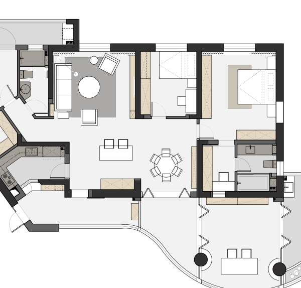
The brief was to add a generous master suite, larger family bathroom and to rethink and enlarge the ground floor living space to accommodate a study, playroom and separate utility room. The client loves to entertain and has a young family, so the new living spaces have been designed as a series of interconnected rooms, giving greater flexibility and character than the ubiquitous open plan extension. The house benefits from a large plot with established trees on the boundary, however the existing house was orientated to the street, with only small openings to the rear. Bua’s addition flips this focus towards the rear garden, with a series of glazed doors and a new terrace, level with the internal floor.
Care has been taken to respond to the scale of the existing rooms – a key requirement of the client’s brief was that the spaces be impressive without feeling oversized or lonely and that there is a clear definition and character to each space; “...we would like each area to feel like its own area so when there’s just the four of us it doesn’t feel like too big a space, but if we have a big party it would feel right too”. At the center of the reconfigured plan is the lounge, which has been stepped down to give extra height and grandeur. Externally the hard landscaping follows the split-level concept, with a sunken terrace extending the lounge into the garden. The lounge is separated from the open kitchen and dining space by a screen wall featuring a three-sided fireplace, a homework area and media unit.
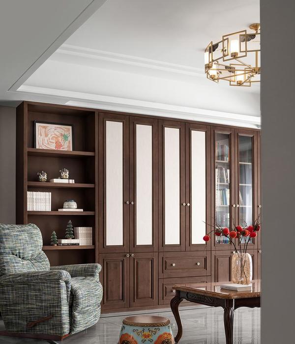
The client loves colour, and Bua were inspired by lithograph poster’s at the Ocean Liners: Speed and Style exhibition at the V&A, which are contemporary to the period of the house. Bright pinks and greens have been paired with dark stained timber, marble and brass. The extension has been designed to be ‘period appropriate’ complimenting the existing 1920’s red brick & stucco house. Although modern in form, the brickwork detailing and creasing tile sills refer back to the existing house. There is a horizontal emphasis to the rear extension, reinforced with a triple stacked soldier course architrave, inspired by the stacked card of an early physical model.
Lisa & Toby , Project completed 2020
Architecture & Interior Design: Studio Bua
Structural engineer: Axiom Structures
Photographer: Andy Matthews
Sliding Doors: Maxlight
Fireplace: DRU Fire
Tiling: Claybrook, Mandarin Stone, Saloni
Paintwork: Dulux Trade
Sanitaryware: Lusso Stone, Duravit, Living House
{{item.text_origin}}

