Architect:Osamu Morishita Architect & Associates
Location:Naniwa-suji, Japan; | ;
Project Year:2011
Category:Showrooms;Factories
Digital epoch. These words give the impression that already anachronistic. The internet era. This description is also obsolete. Time is flowing quickly. Cloud computing world. It is now. When wandering about in the information like clouds, it is not recognized as each information not being clear in the characteristic and an identity. In the cloud computing world, we can know it without touching the real. If we type a keyword on the search engines, we get the information we want quickly. Sports cars, British car, SUV, Jaguar, Land Rover, Aston Martin, James Bond, 007,,,,,,, We have already estimated favorite goods in the clouds. So we need the specific place where we can touch them directly like these showrooms. This is a showroom of 60 m length facing the broad street, Naniwa-suji.(Osaka).
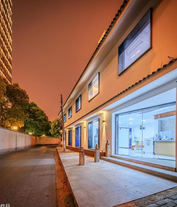
The concept of translucent/transparency, while the perspective is explained by building spaces and building components. The 60m length exterior façade with transparency glass panels created the supportive relationship between inside and outside building. In fact, it will be a strong barrier and precisely. Even the strong barrier could not be able to feel in touch directly with the internal space, but people can feel there are specialized by cars. The display window will attract people. Transparency elements made up the difference between inside and outside. Although the connection between the semi-transparent screen and space that people cannot see it at all, but can feel the movement. It is perceived through movement, through space and time that make people imagine about what is behind the screen. The semi-transparent screen makes people feel the connection of both sides with imaginations. From the viewpoint on the street, the opening void of the building demonstrated the access of this project. It is a kind of gimmick that invited people to get inside the building. This void cut off the volume of the showroom. Layers of glass are according to the parking space that related to emphasizing the depth.
The Maintenance area on the third floor is the one of main programming of this building. Especially, in the area of technical maintenance that we intend to present the technical maintenance processes to visitors (customer). These areas are visible from the road. Some parts of façade are opening gaps between aluminum windows which are arranged on the façade. When people look up to the third floor, they can see vehicle maintenance space.
People used a car as their main mode of transport and driving pass the site with high speed. In that time, that kind of people behavior will create a connection between them and the dynamic movement of the façade. On the 60 m length of façade, the human visual system can rapidly recognize objects despite transformations. Random pattern of aluminum windows on the facade appeared on perception when they are driving through the building as the dynamic's motion. Set some direction axis to the architecture was thought to design with context. By limiting the small operation, each operation is organized, and showing the rhythm.
▼项目更多图片
{{item.text_origin}}

