和谐的韵律
SNS Neurology Clinic
| SNS Neurology Clinic
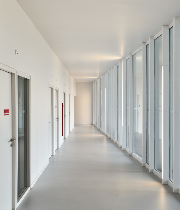
私人诊所,面积不大,用一个暖色调贯穿整个设计,完全感受不到医院的那种冰冷感;大量的使用了弧形,不但使空间显得更加柔和,也呼应了诊所的公司文化。
Private clinic, a small area, with a warm color throughout the entire design, completely unable to feel the cold feeling of the hospital; a lot of the use of curved, not only to make the space appear softer, but also echoed the clinics company culture.
配合柔和的灯光,感觉设计师不是单纯的做一个空间设计那么简单,而是用空间的语言来画画。
With the soft lighting, it feels that the designer is not simply doing a space design so simple, but painting with the language of space.
Sappun旗舰店
| Sappun
Sappun 新建筑的外部从入口立面开始将具有曲线。入口右侧的曲面将延续至柜台背面的储藏室,空间看起来更深且可以扩展。
The exterior of the new Sappun building will be curved from the entrance façade. The curved surface to the right of the entrance will continue into the storage room behind the counter, where the space appears deeper and expandable.
从入口开始,以中心为中心,重心向右偏移,入口通向内部的通道大开。这样的设计是为了让入口的左侧变得更轻盈,从而将进入的顾客的人流轻松自然地引入空间,让空间看起来更有深度。
Starting from the entrance, the center of gravity is shifted to the right with the entrance leading to the interior wide open. This is designed to make the left side of the entrance lighter, thus bringing the flow of incoming customers into the space easily and naturally, giving the space the appearance of depth.
我们设计多维性是为了让空间有两个视角。它们是由地板、墙壁和天花板形成的大空间视角,以及由家具和固定装置的个性形成的小空间视角。
We designed Multidimensionality to give two perspectives on space. They are the perspective of the larger space, formed by the floor, walls and ceiling, and the perspective of the smaller space, formed by the personality of the furniture and fixtures.
{{item.text_origin}}


