Beatrixlaan lightrailstation, The Hague | ZJA I Architects & Engineers
Firm: ZJA I Architects & Engineers
Type: Transport + Infrastructure › Train/Subway
STATUS: Built
YEAR: 2006
A narrow fit
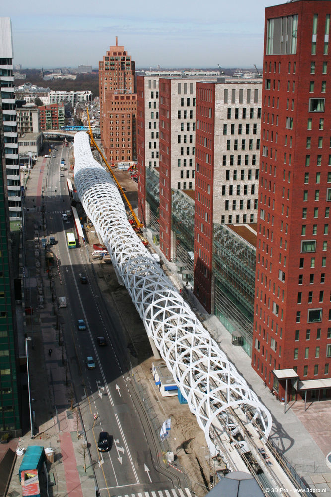
To improve accessibility by public transport to the Beatrixkwartier in The Hague, connectivity with the RandstadRail network was needed. In this dense urban area a new and elevated station had to be developed along the Beatrixlaan. Space was scarce, as a two-way road and a bicycle path follow the same route. To obtain an asymmetrical layout these two had to be re-routed.
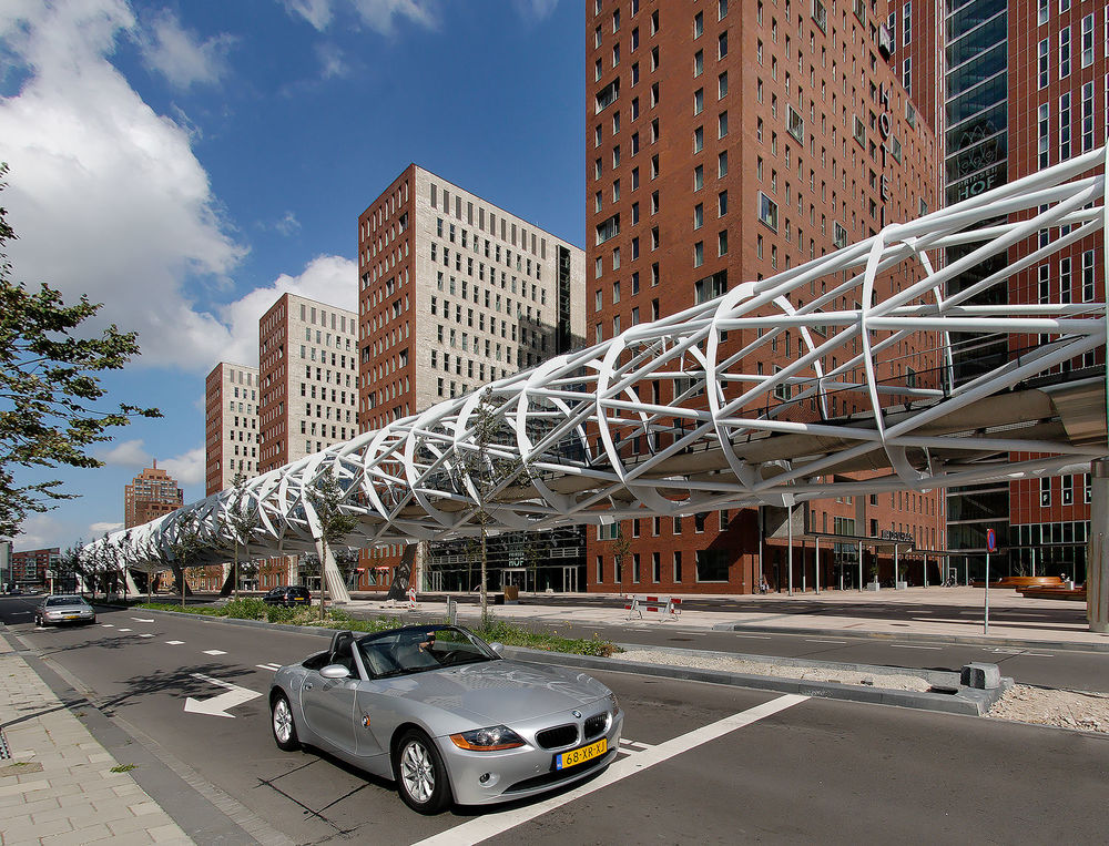
ZJA’s design for an elevated lightrail viaduct over 400 meters and the station is based on two principles. First, the entire construction was not to appear as a spatial and visual obtrusion, as a heavy obstacle, but rather as a light and open construction that emanates movement, connectivity and energy. Secondly, the construction of the elevated lightrail and the station should be used as an opportunity to create a new and attractive identity for the public space in the neighbourhood.
The construction and the appearance
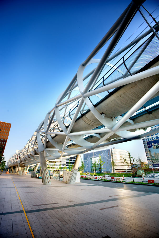
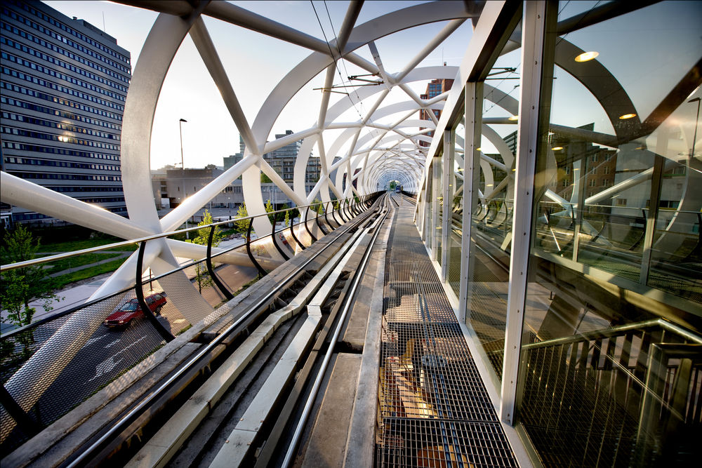
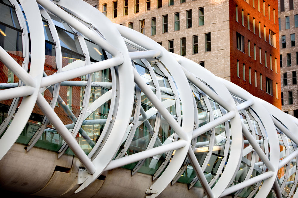
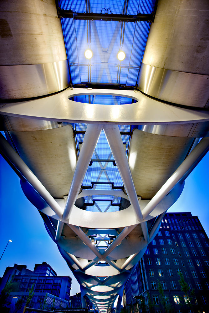
The elevation was designed to make sure pedestrians, cyclists and motorists alike maintained an unobstructed view. The fewer columns necessary to support the enormous construction, the better. That meant the tube through which the train moves had to be high, strong and stiff to allow for a large span. ZJA designed a construction consisting of huge steel rings with a diameter of ten meters, set apart forty to fifty meters and supported by V-shaped columns. The vertical rings are connected by diagonally placed tubes. This creates a strong but open network of tubes that widens at the section where the station is, like a boa constrictor after having swallowed a piglet. This design is the result of a quest for an efficient and functional construction but offering an aesthetic, even joyful, sexy image all at the same time. It did not take long for the elevated light rail to acquire a nickname: The Fishnet Stocking.
The future of our cities lies in keeping their increasingly dense structure accessible and pleasurable to live in. Pedestrian zones, bicycle paths, parks and public transport are necessary to achieve that. The elevated light rail along the Beatrixlaan shows that such necessary and efficient infrastructure can be an attractive and aesthetically pleasing addition to the city. That kind of infrastructure can then also afford to be conspicuous and painted white.
New spaces
Building a new station of the Randstadrail in a neighbourhood offers the opportunity to improve and vitalize public spaces. This is an additional feature of ZJA’s design. First of all, the tube construction containing the train is not located in between the cars, but hovers above the sidewalk. The characteristically shaped tube is positioned close to the buildings. Public transport should belong to the users, the pedestrians, who are also the visitors of the buildings.
The height of the elevated light rail creates square-like public spaces in the vicinity of the station, with enough room for green patches with trees and shrubbery. The station has an asymmetrical lay out, placing the platforms diagonally opposite to each other, all intended to provide more sightlines and an open architecture. The rails inside the tube rest on a separate concrete foundation, absorbing most of the sound and shock waves.
With this striking design, inspired by Buckminster Fuller’s Bucky Tube and the L-train in downtown Chicago, the Beatrixkwartier has gained an iconic landmark. For residents and visitors of The Hague it is a recognizable and attractive structure, open to all.
Awards
Winner: Routepluim 2008
Nomination: WAN Urban Design Award 2009, Best Building of the year 2007, Dutch Concrete Award 2007, Neprom-award 2007.
Architect: ZJA
Client: Gemeente Den Haag
Contractor: Ballast Nedam
Year: 2006
