Architects:Alexey Rozenberg
Area :115 m²
Year :2017
Photographs :Victor Chernishev
Architects : Alexey Rozenberg
City : Moscow
Country : Russia
The apartment is in a high-rise building with a flat façade. The apartment’s space is stretched along the front of the windows and is cut by transverse load-bearing concrete walls into small cells. The transverse walls were set with an indifferent, slightly beaten pace, which created a harsh character for the interior. The architect fought with their dictate by highlighting the mechanical division into sections, revealing two concrete pylons, turning them into art objects and finding for each their own game and solution.
Concrete pylons have become the basis for concave-convex, and sometimes anti-canonical, structures with the use of glass and wood. These structures interconnect rooms and levels, and as such break the given sectional character. For example, the bedroom, raised on the podium, is connected to the living room through a three-dimensional glass bay-window. Because of that the public zone of the apartment turns into a kind of courtyard, which the private room overlooks from above. The massiveness of the pylon, which separates the cabinet from the hall, is underlined by a glass frame. That frame at the same time allows the owner of the office to keep the entrance zone of the apartment under the direct visual control.
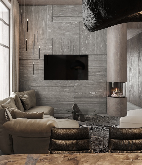
The author has preserved the genuine building concrete in the surface finishing, which continues the theme of the harsh nature of the whole space. This impression is enhanced by the fragmentary painting of the walls with a dark translucent oil. The lower parts of the walls and some arbitrary rectangles on the walls are treated with this oil.In the living room, the concrete pylon is toned with a saturated orange color directly over the building concrete, which reveals its raw, rough texture. Orange fragments also appear in other areas of the apartment, creating a kind of game - the orange staircase, the orange floor of the bedroom, the orange volume of the dressing room.
Wooden finishing distinguishes separate zones in each of the rooms and works in contrast to the concrete surfaces.Unusual and "prickly" interior is also emphasized by the chosen type of lighting, which is built primarily on directional light sources. However, paradoxically, the combination of rough textures with the directional light makes the interior cozy.
The Project just received an award - Best Interior Design, АРХИWOOD 2018
▼项目更多图片
{{item.text_origin}}

