墨西拿冰淇淋店 | Sans-Arc Studio | 2023 | 澳大利亚
项目设计:Sans-Arc Studio
项目面积: 101.2501349m²
项目年份:2023
项目摄影:Jack Fenby
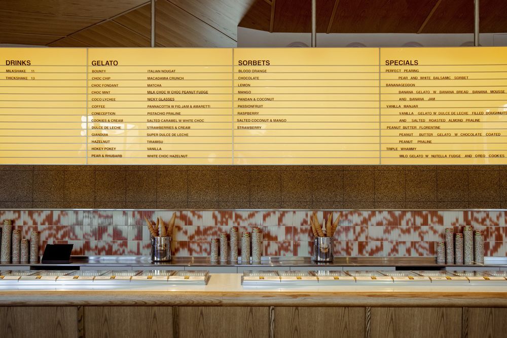
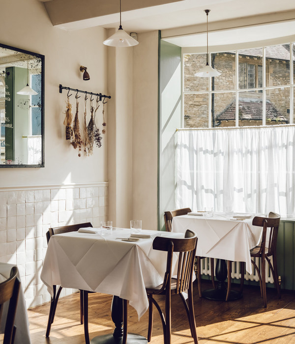
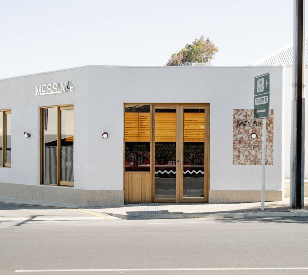
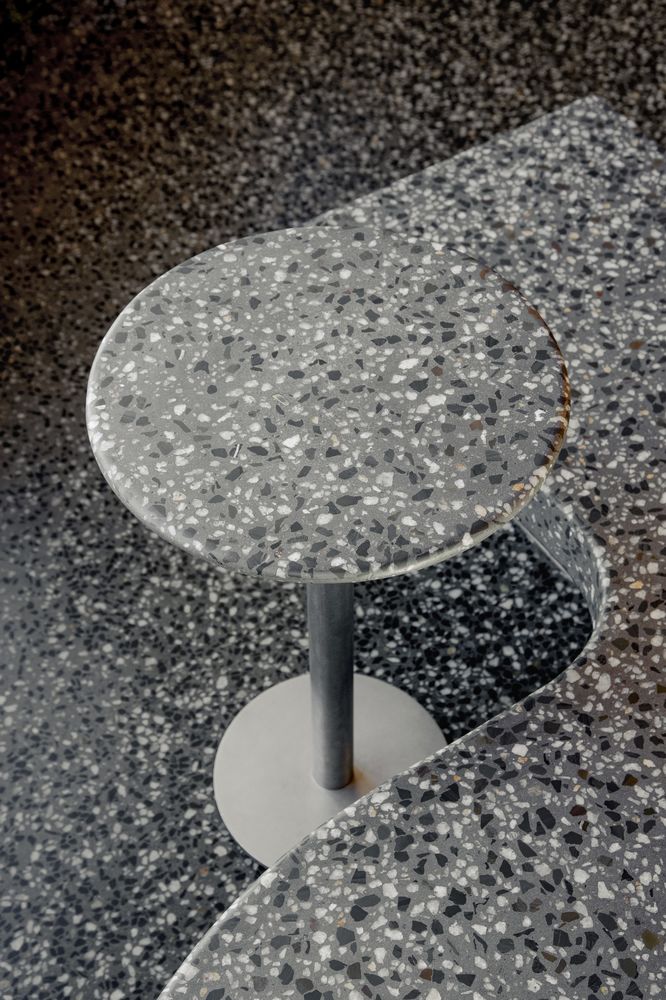
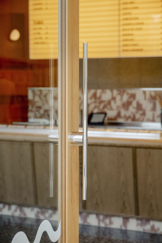
A flagship store for Gelato Messina and most likely the only store in Adelaide (for a while). The clients wanted the materials to be robust and long-lasting and the design to be unique and memorable. The fit-out channels the original Messina aesthetic of a bit retro and a bit mid-century. There is a leaning toward the use of terrazzo and tiles, referencing the yellow terrazzo porch of the attached house (and future restaurant) and as materials that connect to the Aus-Italian housing typologies of suburban Australia.
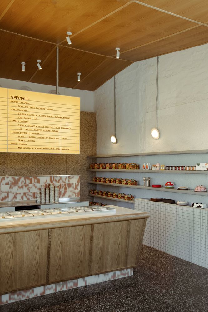
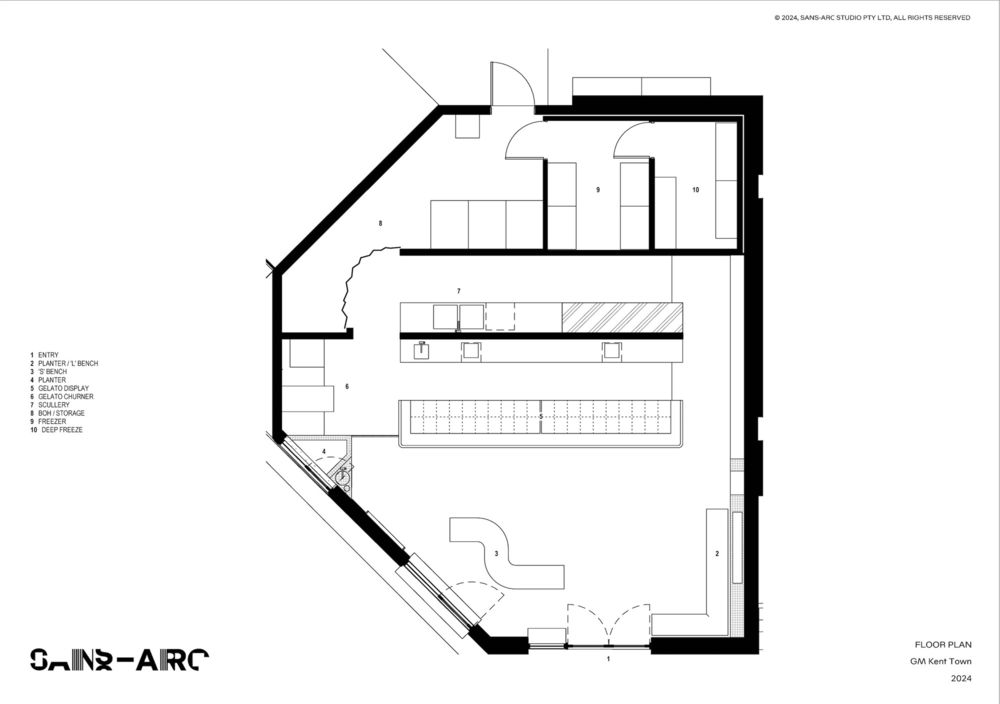
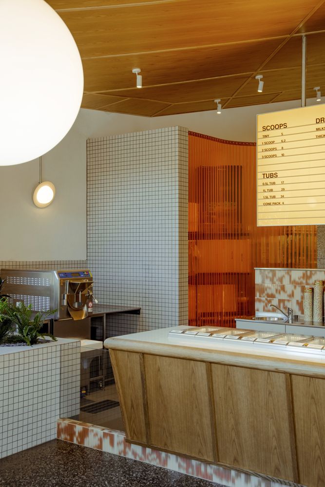
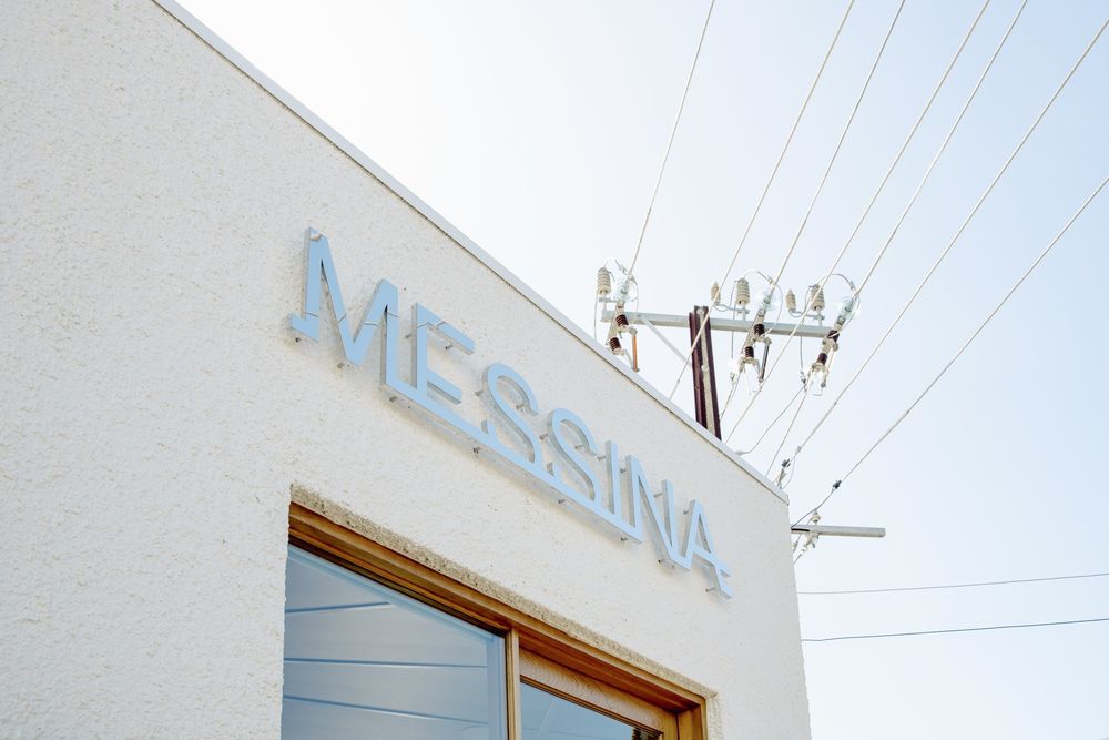
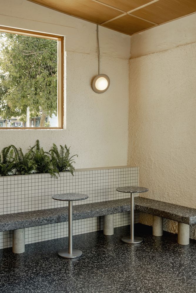
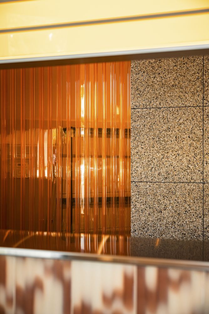
On an obtuse corner site, the old workshop openings were maximized, with large timber windows flooding the space with light and creating a visual connection to the street. Limited pedestrian access dictated the location of the front door, the concrete furniture designed to facilitate and channel large numbers of people in and out. Our approach to the aesthetic composition was to restore the existing shell, blending in the existing blue stone, old concrete, and existing and new brickwork to make a textural envelope and backdrop. Then, we used ‘retro’ feeling materials in playful and strong contrasts. White speckle against orange vinyl. Golden lightbox against timber ceiling. Industrial vs. retro, etc.
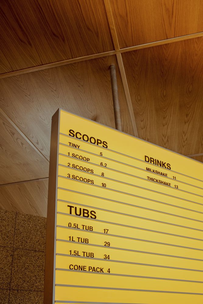
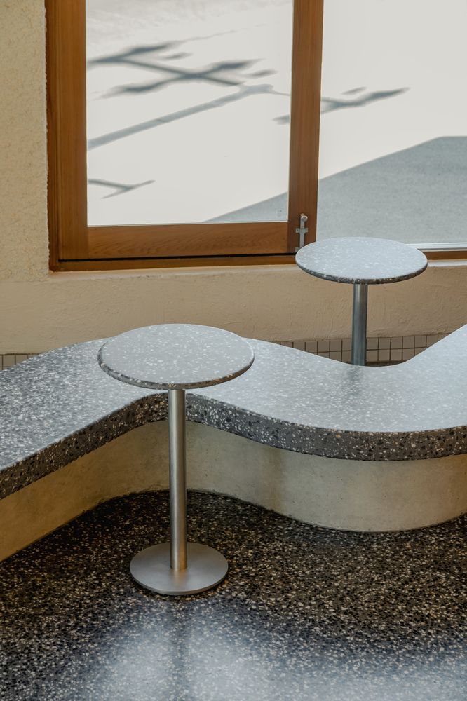
Acting as good custodians of the building, we’ve focussed on restoring the existing to a good and flexible state for future use. We’ve used robust and functional materials in a design that responds to the client’s brief and the context whilst designing with flexibility for current and future occupants. We like the idea of timeless design, quality materials, and efficient construction as a foundation of inherent sustainability in a project. Avoiding trends and developing a project’s visual identity from the business it is representing gives the space a uniqueness that will not date with passing trends. The use of limited but considered fixed furniture to manage and facilitate crowds is something we are quite happy with. The concrete benches give just enough (not that comfy) seating for people to have their gelati and move on. Heavy, loose tables provide flexibility when things are either busy or quiet.
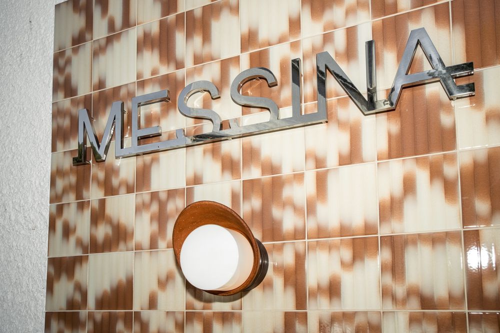
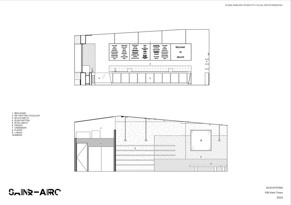
The material treatment of an old workshop is innovative, expressing some interesting elements and textures, cleaning up other areas, and creating a new life for the building that acknowledges its past. Each material was chosen for its relevance to the identity of the clients / the business, the site, and the context, along with its function and practical requirements. This weaving of an emotional/memory element into the material selection is key.
设计师:Sans-Arc Studio
语言:英语

