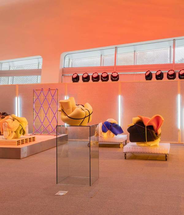
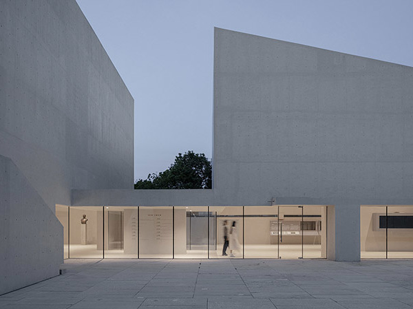
X sign Space 是国内为数不多的仅面向设计展览的空间,包含平面、建筑、产品、服装、数字媒体等设计思维的交流场所。项目空间面积580m²,主体展区向南,北侧规划了设计部、会议、接待、茶室、仓库等功能空间。
X sign Space is one of the few spaces in China that is only oriented to design exhibitions, and contains a place for the exchange of design thinking in graphics, architecture, products, clothing, and digital media. The project area is 580m², with the main exhibition area facing south and functional spaces such as design department, conference, reception, tea room and warehouse planned on the north side.
项目位于杭州天目里隔壁的联合大厦A座,区块内包含了天目里美术馆、游牧画廊、B1OCK 时尚买手店等,是面向公众开放的商业及文化活力街区。而X sign Space对其既有的、当代艺术的主力定位构成补充。
The project is located in Block A of the Union Building next to Tianmuli in Hangzhou, which contains Tianmuli Art Museum, Nomad Gallery, B1OCK fashion shopping stores, etc. It is a commercial and cultural vitality block open to the public. The X sign Space complements its existing, contemporary art anchor positioning.
原建筑南侧繁琐的铝合金幕墙拆除后,大面积落地玻璃为展馆区域引入充分自然光线,带来通透感。同时外部以定制花坛作软隔断,形成公共空间与城市的温和过渡,以更自然的方式同社区交互。
After the removal of the cumbersome aluminum curtain wall on the south side of the original building, the large floor-to-ceiling glass area brings in sufficient natural light and a sense of transparency to the pavilion area. At the same time, the exterior is softly partitioned by custom-made flower beds, forming a gentle transition between the public space and the city, and interacting with the community in a more natural way.
设计逻辑由展览空间的公共性及功能属性所定义:强调作为“容器”的包容性,像一张白色哑粉纸,预先接受了将要发生的、加之于上的创作。
The design logic is defined by the public and functional properties of the exhibition space: the emphasis is on inclusiveness as a "container", like a sheet of white matte paper that precedes and accepts the creation that will occur.
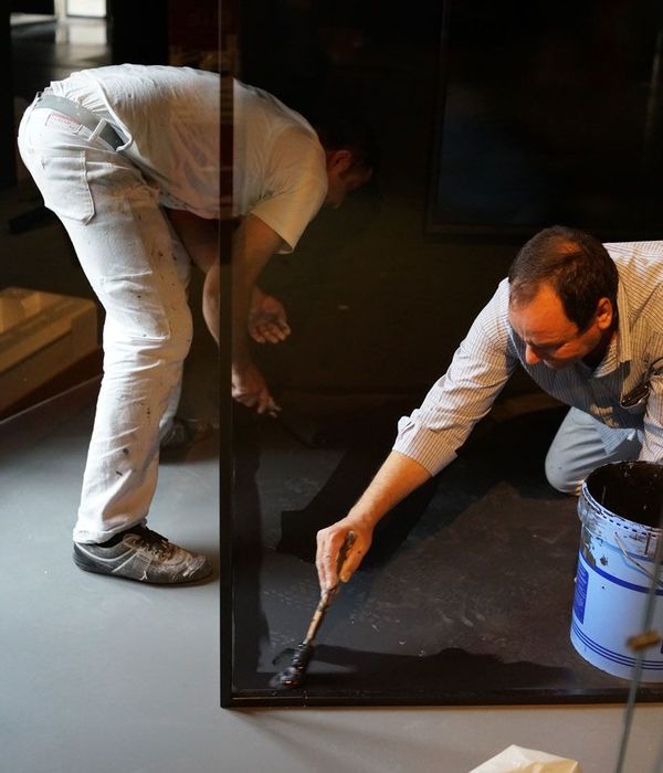
墙面阴阳角均嵌入铝条收口,使空间呈现精确的直线。地面使用了德国panDOMO磐多魔工艺,混凝土与水泥组合的成分呈现自然浅灰,并提供更优的耐磨性与防滑度。墙顶面使用了美国BenjaminMoore涂料,一款高环保标准的百年产品,并由专门工匠师傅进行粉刷;白墙看起来几乎完全平滑,实则略有不规则磨砂肌理,轻柔地反映自然光线,形成精致的阴影。
The wall corners are embedded with aluminum strips to make the space appear precisely straight. The flooring is made with PanDOMO, a German panDOMO process, which is a combination of concrete and cement with a natural light gray color and provides better wear resistance and slip resistance. The walls and roofs are painted with BenjaminMoore, a century-old product with high environmental standards, and by specialized master craftsmen; the white walls look almost completely smooth, but are in fact slightly irregularly frosted, gently reflecting natural light and creating delicate shadows.
馆内配置专业展馆照明系统,由Artemide灯光提供。为最大化展区面积,我们利用层高规划出实用紧凑的两层功能空间,以一个狭窄的通高内核解决所有功能间的入口与交通问题,形成一个L形的“核心筒”。
The pavilion is equipped with a professional pavilion lighting system, provided by Artemide lighting. In order to maximize the exhibition area, we use the floor height to plan a practical and compact two-level functional space, with a narrow through-height core to solve the problem of entrance and traffic between all functions, forming an L-shaped "core cylinder".
不锈钢阶梯扶手尽可能纤薄,保留了打磨过程中的“未完成状态”与手工质感。深入检视落地细节,可见对结构、构成、尺度、材料与工艺的理解贯穿建筑、室内与家具,形成从全局到细部的连贯性与一体性。
The stainless steel handrail is as thin as possible, preserving the "unfinished state" and handcrafted texture of the polishing process. A deeper look at the details of the landing reveals an understanding of structure, composition, scale, materials and craftsmanship throughout the building, interior and furniture, creating a coherent and integrated approach from the whole picture to the smallest detail.
当人在空间中,物性将直接转化为人的体感与情绪。从展区、会议室向内至二层的接待与茶室,私密性在空间分区间递进,材质与色调出现更为丰富和细腻的变化。
When people are in the space, the physicality will be directly transformed into human body feeling and emotion. From the exhibition area and conference room to the reception and tea room on the second floor, the privacy of the space is progressively divided into zones, and the materials and tones appear to be more rich and delicate.
我们认为空间本身应是安静和内敛的,无须展露多余表情;容器与其内容物的平等观念令空间具备自信与沉着的气质,话语权得以让渡,空间中的人与物件成为情绪的主体。如此,通过有意识的、精准的“省略”,揭示空间构建的核心实质,并借由对材料与构建工艺的极致探索,展现作为创作者的自我。
We believe that the space itself should be quiet and introverted, without showing unnecessary expressions; the concept of equality between the container and its contents gives the space a self-confidence In this way, through conscious and precise "omission", the core essence of space construction is revealed, and through the ultimate exploration of materials and construction techniques, the creator's self is revealed.
Interiors:蒋杰室内设计
Photos:WenStudio
Words:洪加路
{{item.text_origin}}


