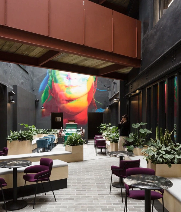
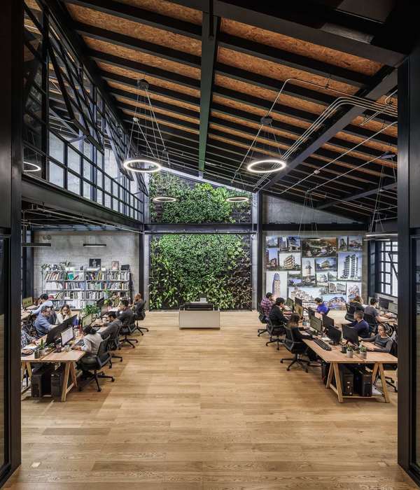
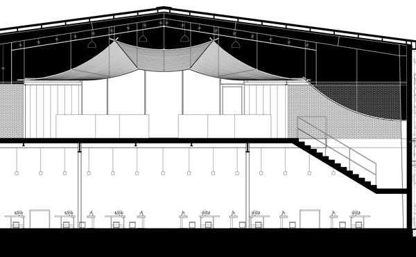
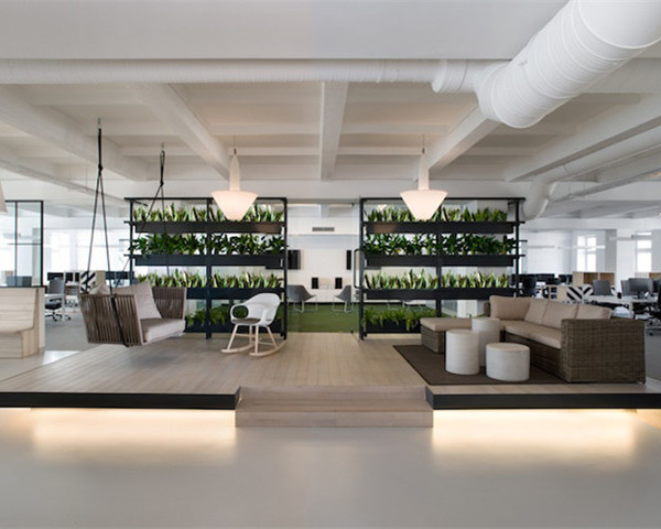
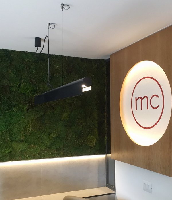
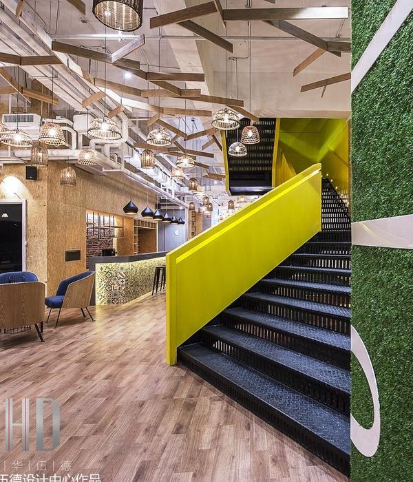
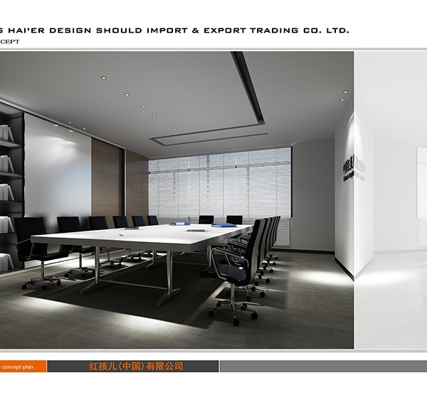
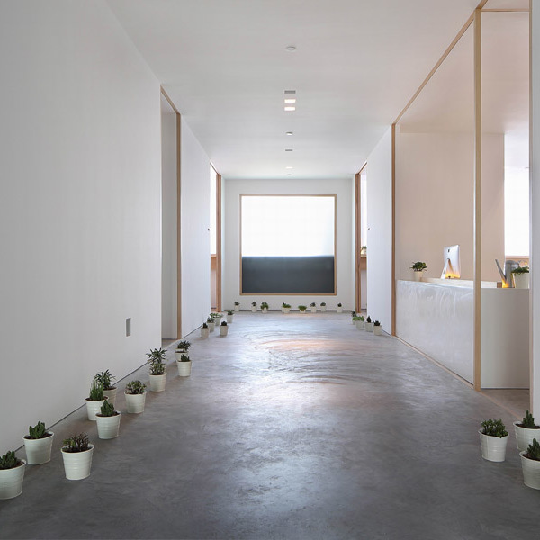
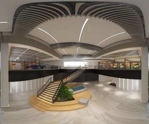
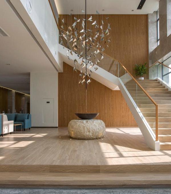
The conceptualization of the office started with the idea of optimum space utilization. Hence this space has benefit of open terrace area adjoining to it, concern was to use the optimum space for work space and keep rest of the area as open terrace to enjoy natural environment in typical commercial building. Basic design of the office kept contemporary with minimal furniture. Use of colors were done carefully to enhance the space and add lift to it. During the planning and placement of spaces the main user of the office are kept in mind which are design team and clients. They are allocated proper space and divided through strong axis. Axis is clearly visibly as one enters the office with the Buddha’s statue as a focal point placed in terrace. A strong axis gives the idea of a scale of the office space and Buddha’s face gives calming positive impact on the visitor. Client areas in the office –conference room, meeting room, and lounge area – are executed to give a lavish feeling and a soothing experiencing while meeting. While workspaces enjoys major views of the terrace. During the design using the natural light was key aspect, so major areas have windows opening outside giving proper light inside while spaces like lounge has skylight to give natural light, while meeting room in the center of the office has all glass partitions. In workspace interaction between team without any discrimination was an important aspect, so open planning has been done. Readymade workstation with low height soft boards gives more openness to the space. In office storage spaces designed extensively hidden in partitions and corners, which also serves acoustic purpose in the office.
{{item.text_origin}}

