英文名称:Spain Dra Dental Clinic
位置:西班牙
设计公司:Jaime Sepulcre Bernad
摄影师:David Frutos
这是由Jaime Sepulcre Bernad设计的Dra. Campoy口腔诊所。该项目位于设有哦四根中央支柱、-15 x 15 m的正方形房间里,以非常类似比例的三个组团空间形成了未来感的诊所结构:等候区、牙科空间以及服务空间。同时使用了通透的玻璃、中央的铝制金属盒以及温馨而亲切感的木质地面三种材料创建了连续的、与职业相关的空间。建筑立面采用了诊所的碎片LOGO,并扩大到城市尺度。
From the architect. On a perfectly square diaphanous room -15 x 15 m- with four central pillars, the project proposes the structuring of the future clinic in three programmatic bands of very similar proportions:The first band is the most public, which is accessed and basically contains the reception and a large waiting room. All this generous space of reception and waiting opens its views towards an outer square through the great circles that make up the facade. The reception, organized in a circular piece of furniture, becomes the centerpiece of this first space and from it is controlled its operation. After the reception, there is a small administration office and a small relaxation room.
Dental Space:The most intimate and protected part of the clinic is the properly clinical band that appears alongside the back facade facing a boulevard. This dental care space is composed of a battery of five cabinets connected to each other visually. In this band also appears a secondary access for exclusive use of the personnel.
Server Area:Finally, between the most extrovert and the more introverted space appears an intermediate band that makes of filter and that contains all the uses properly servants. This servant band is carried out by the sterilization room around which the functioning of the dental offices gravitates. In this band are also the ray room, the laboratory, the engine room, the staff room, the wardrobe, the office of the doctor and the toilets for patients.
Three material ideas formalize this space with vocation of continuous space - constant height 2.70 m-:1 / The idea of achieving maximum transparency through the use of "glass"; 2 / The idea that the only pieces that appear loose are the three boxes that make up the intermediate band and that materialize like metal boxes, of "aluminum"; And 3 / the idea that the whole plane of the ground is a single material, continuous, and warm, human, "wood" - which is finally a good laminate-. And the rest, white.
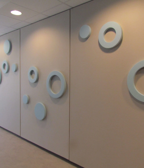
Urban Logo:The idea for the facade was to take a fragment of the logo of the clinic and expand it to scale city. The new facade therefore relies on a corporate image that was already consolidated and now acquires an urban scene size.
西班牙Dra. Campoy口腔诊所外部实景图
西班牙Dra. Campoy口腔诊所内部实景图
西班牙Dra. Campoy口腔诊所平面图
西班牙Dra. Campoy口腔诊所剖面图
{{item.text_origin}}

