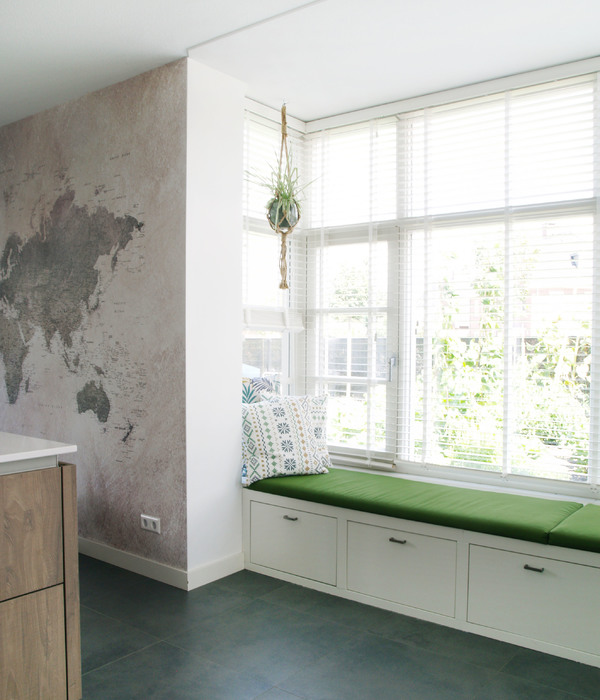
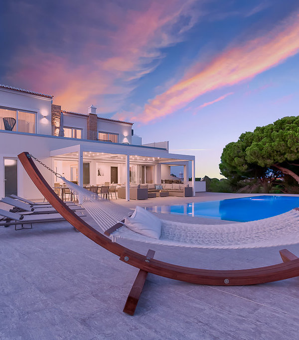
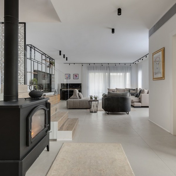
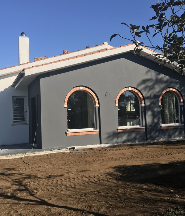
这个项目是在江滨花海公园附近,难得的弧形大阳台设计一线江景住宅,在这个原始结构的改造上我们调整了多稿给业主做选择,难得的大阳台我们是希望能够保留不做区隔,但是还是考虑小孩子学习居住空间要大一些就形成了分区.
整体空间
采用低饱和度的艺术涂料和亲切的木色而明净透亮,
业主希望和朋友们相聚时,能沉浸在一个舒适的空间中,反映人与周围环境的联系,同时也与地理位置联系起来.
The project is near the riverside flowers park, large balcony design a rare arc line furnished house, on the modification of the original structure we adjusted the draft to the owner to make a choice, more rare big balcony we are hope to be able to retain don't separate, but still consider children learn living space to larger partition was created.
The overall space is bright and clear with low-saturation art paint and friendly wood colors. The owner wanted to be immersed in a comfortable space when gathering with friends, reflecting the connection with the surrounding environment and also with the location.
THE MODERNIST HOUSE
现代主义住宅
━
这个家庭人员涵盖了三代人的居住空间,一定是希望能找到一个适合整体家庭人员的一个平衡点。于是选择了现代低饱和度的风格,以涂料和低饱和度的材质进行混搭,达到一种温馨舒适的状态。
This family covers three generations of living space, must be hoping to find a balance for the whole family. So I chose the modern style of low saturation, mixed with paint and low saturation material, to achieve a warm and comfortable state.
客餐厅一体化的设计从视野上让空间一览无余,也从空间动线上弱化了原有过道的狭长感。门口还增设了艺术镜面,方便出门时整理衣冠,这种细节考虑是周全的。
侧面墙体一通到底的墙面在视觉上也是增加了空间的尺度感。
The integrated design of the guest restaurant makes the space unobstructed from the view, and also weakens the narrow and long sense of the original aisle from the space moving line. The door also added an art mirror, convenient to go out when finishing clothes, this detail is considered to be comprehensive. The side wall passes through the end of the wall surface in the vision also increases the sense of scale of space.
门厅处出于对餐厅的储物考虑,增设了大体量储物柜也相对弱化了侧面冰箱带来的厚重感。厨房面积相对较小,如果冰箱放置在厨房内,台面几乎被占用,并不符合家庭生活使用。好的设计一定是在功能使用的前提下进行美化及改善。
The integrated design of the guest restaurant makes the space unobstructed from the view, and also weakens the narrow and long sense of the original aisle from the space moving line. The door also added an art mirror, convenient to go out when finishing clothes, this detail is considered to be comprehensive. The side wall passes through the end of the wall surface in the vision also increases the sense of scale of space.
SECOND LIE THE SPACE
次卧空间
━
小孩房最主要的是学习,把采光最好的一间留给了孩子就足以说明对孩子的爱。原本设计的桌子朝向是在朝窗的部分,家长给出的意见是看见外面会对孩子的注意力进行干扰,一想也是哈。所以看是从哪个角度去看问题,设计是依附在人的行为习惯之上的,是用来解决问题的。
The most important thing in the children's room is to study, and leaving the best room for the children is enough to show the love for the children .The original design of the table orientation is in the window part, parents give the opinion is to see the outside will interfere with the children's attention, a thought is also ha. So depending on which Angle to look at the problem, design is attached to people's behavior and habits, is used to solve problems.
把地面抬高后原本的阳台进行了分区,在上面休闲和玩玩具都是非常惬意的一件事情。因为孩子成长较快,并没有把孩子的房间设计成幼龄化的设计,并不符合家长对于孩子成长的需要。
After elevating the ground, the original balcony was partitioned, and it is a very pleasant thing to relax and play with toys above. Because Because the child grows rapidly, the child's room is not designed as a child-friendly design, which does not meet the parents' needs for the child's growth.
THE MASTER BEDROOM SPACE
主卧空间
━
考虑到书桌边拿取书籍和简单的化妆品较为方便,局部采用开放架形式把最内侧不好利用的空间全部展现,也把柜面的沉重感打破,重新分割了块面关系。
Considering that it is more convenient to take books and simple cosmetics by the desk, the open shelf is partially used to display all the space that is not well-utilized on the innermost side, which also breaks the heaviness of the cabinet and divides the block-surface relationship again.
只需要计算一下平时待在浴室的时间,和想要从中获得的放松,那么卫浴空间的确需要投入更多的心思来平衡。
Just need to calculate the time you usually spend in the bathroom and the relaxation you want to get from it, then the bathroom space does need to put more effort into balance.
Space plane planning
空间平面规划
━
DESIGNER
设计师
━
COOPERATE WITH THE DESIGNER
执行设计师
陈才慧
━
━
商务负责人
创意总监
Past cases
往期案例
━
北城梁筑 /
爱好收藏者的家
庭艺术廊
北城梁筑 / 和家居博主一起打造治愈系住宅
北城梁筑实景 | 158㎡极简设计 空间情绪
新案/平潭 · 渔屿海景民宿
{{item.text_origin}}


