Architect:Jost Architects
Location:Elwood Victoria, Australia; | ;
Project Year:2020
Category:Apartments
Stories By:Jost Architects;Articolo Lighting
The project came about with the development of a large residential block close to the Elwood foreshore and Port Philip Bay. The brief simply requested a spacious apartment product that was cutting edge and contemporary, but subtle both inside and out. The concept of a large apartment resulted in six single level dwellings, each with the proportions of a small house. The apartments are low maintenance, functionally adaptable to appeal to a range of potential residents, and highly sustainable.
Externally, rather than go for a standard “stacked wedding cake” form, the building was set back significantly from the adjoining properties on the lower levels. This allowed the main volume of the building to have vertical sides and reduced footprint creating a larger landscape strip between adjoining buildings. The design strategy was to keep the building facades simple and at a scale which could be understood from a distance but on approach, the building is visually stimulating as the varied texture of the building materials begin to reveal themselves. These can then change again in different times of the sunlight, day and season.
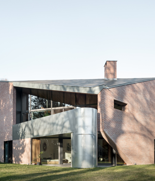
Automated operable louvre screens to either end of the building is used for controlling light and ventilation as well as privacy. They are able to orientate almost 180 degrees, making them completely shut or stacked to the sides for a clear opening, even in high wind conditions. Other than their environmental function, they add to the constant changing aesthetic by adding a living, moving aspect to the façade. The solid white textured concrete balustrades deliver sun control below and privacy between dwellings but allow a clear view beyond. The black stainless chrome clad circular column ties the building together vertically and gives it a touch of bling. As with the other finishes, it works at different visual scales. The column’s reflectivity camouflages its width and size through shape, tone and reflection, but doesn’t disappear completely and looks amazing when standing right next to it.
Everything in this building was considered and detailed to achieve an incredibly simple and completely seamless combination of finish and function. This included not only standard items such as materials, claddings, fixtures, joinery and concealing building services, but integrating all the elements required to achieve a high performing, thermally efficient and sustainable building (average 8 Star NatHERs rating with the highest at 8.6). The building’s efficiency was evident very early on in the construction phase and we’ll be monitoring how it is functioning with the residents both economically and with level of comfort over the next 12-18 months.
We had the opportunity to produce a “Building User Manual” which has been an idea of mine for many years. It’s a manual required as part of the council’s Sustainability Compliance Assessment at the end of construction. Knowing that people don’t read manuals we designed an A4 double sided laminated page which instructs the resident on how to use their home efficiently and sustainably. It is very generic to all dwellings, has very little text and was based on aircraft safety cards in planes, so anyone can understand what they are looking at and all in 2-3 mins of reading it. This also resulted in the Building User Instructional Video which can be accessed from the QR code on the card the building can have the highest rating in the world, but if you don’t know how to use it properly this becomes irrelevant.
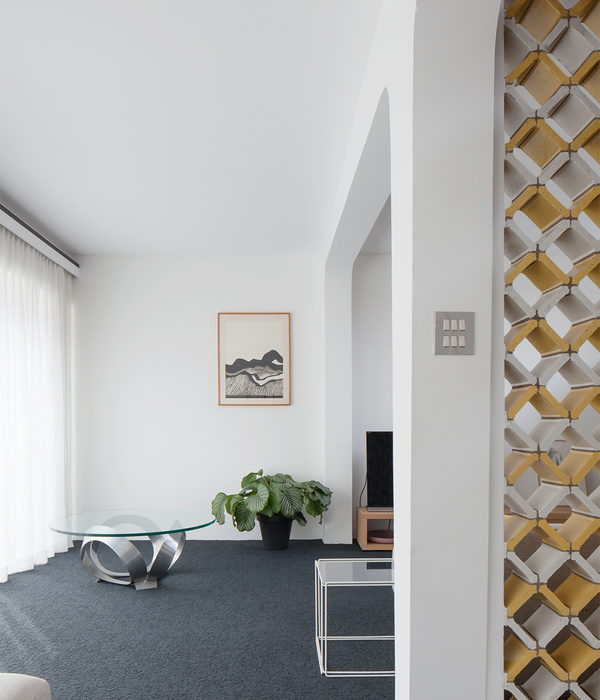
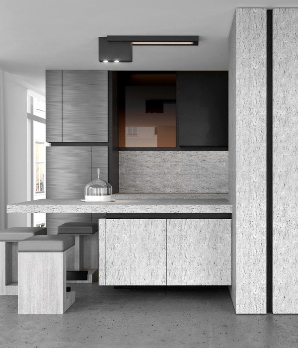
Internally, there are some really clever functional layout arrangements that increase the floor plan efficiency, giving back as much liveable area as possible. The spaces are warm and finishes robust but comfortable. A “flex room” was incorporated to provide a multi-functional space that could suit the occupant’s personal needs. The glazed walls with double doors and internal drapes allow for it to be open and absorbed into the open living spaces or closed and private, with the option for multi-purpose use such as a second living, a bedroom, a yoga retreat or an office etc.
Sustainability was a really important aspect of the project for us and we wanted to show that a really good piece of unique architecture can be highly sustainable. To the credit of our clients, they fully supported our vison and it was embraced pretty unilaterally across the team involved.
We’re really proud of the outcome and think that it’s a building that integrates itself, and visually enhances the space it occupies.
Walls
1. Brightonlite off-white cement Reckli 2/169 Columbia concrete formliner
2. Concrete façade with Uni-Dry Cote Uni-Rock Grey finish
3. Concrete façade with Uni-Dry Cote Uni-Rock Deep Grey finish
4. Vitrapanel exterior Metallic black
5. Nero Lucido Stainless Steel
6. Lysaght Spandek with Colorbond Surf Mist finish
7. James Hardie Axon Cladding
8. Austral Masonry GB Aspect Porcelain
9. PowdercoatedAluminium Black & white
Flooring
1. Fibonacci Stone Terrazzo honed Idol
2. Spotted Gum natural timber boards
Window Frames: Thermeco thermally broken double glazed window system
Door Hardware: Pittella
Feature Lighting
1. Articolo Architectural Lumi Wall Sconce
2. Zero Lighting Fog Pendant Large
Sanitaryware, fixtures & joinery
1. Broadware, Reece, New Form Concreting, Hafele, Blum, Studio Bagno
Fans
1. Big Ass Fans Haiku I Series Fan: 52
Walls
1. Porter's Fresco "Pavimento" Feature Paint
2. Elton Group
3. Eveneer Prefinished Antique Oak
Floors
1. Royal Oak Floors Architect Range – Smoked and Limed
2. Signorino Terrazzo Tile Motecarlo
3. Prestige Carpets Classic Styled Level Loop Oakford Square “Eldon”
Benchtops:
1. SignorinoDuma - Honed Lime Stone
2. CDK - Calacatta Marble, Twilight Marble, Lord White Limestone
3. Apex - Stone Mont Blanc Granite
Kitchen Appliances & Fixtures
Barazza, Qasair, Fisher Paykel, Beefeater, Asko, Miele, Vintec
With generous proportions, the homes that comprise Adela Apartments combine subtleties and calm to match their location. Jost Architects and Hecker Guthrie propose a series of considered homes that bring modern sensibilities together with crafted and thoughtful tactile details.
Calmly muted, Adela Apartments responds to both its setting in Elwood and emerges in response to the established environs it finds itself surrounded by. As an offering of increased density within a predominantly single-residential area, the resulting homes combine a sense of discretion and muted-ness, brought together through a clean and contemporary lens. Occupying similar proportions as a small house, each apartment captures a familiar scale and volume, separating them from the traditional apartment offering, with matched generous outdoor terrace spaces to allow an extended sense of space and openness. Close to both the Elwood foreshore and Port Phillip Bay, a casual tonality is utilised throughout, making references to the proximity of the coast, while still being within a familiar urban context. Jost Architects together with Hecker Guthrieemphasise texture and materiality in proposing an appropriately responsive formal mass within the established residential context.
Built by Visioneer Builders and with landscaping by Jim Fogarty Design, Adela Apartments is a responsive and a responsible development. Both in its engagement with its site and also in its embrace of sustainable principles to ensure integrated systems that support a lower dependency on external energy and ensure climatic comfort all year, Adela Apartments achieves an 8-star NatHERs Energy Rating. Both present- and future-focused, the formal vernacular approach establishes the homes as durable and timeless through a simplicity and use of clean lines. Materials of muted and warming timber with textured glass, stone and exposed concrete all ensure the spaces have a wider demographic appeal and an emphasis on quality and detail over a trend-driven methodology.
Articulating its corner site, each level is expressed through a banded approach. Deeply set terraces offer a reclusive feel from within, while creating a private reductive space. Carefully curated landscaped beds are dotted throughout the development that both add movement and steer circulation through the stepped addition of hierarchies of form. Internally, emphasis is placed on a shared openness and connection expressed in the living areas as the main focus while still allowing for flexibility with the planning, ensuring the connected living areas could be utilised in any number of ways.
Words - Bronwyn Marshall via The Local Project
Photography - James Geer
Styling - Hecker Guthrie
Architecture - Jost Architects
▼项目更多图片
{{item.text_origin}}

