- 项目地点:上海市黄浦区外滩
- 项目面积:265平方米
- 完工时间:2023年9月
- 设计单位:方居建筑设计
- 主持建筑设计师:王乐,林磊,杨晓娇
- 项目顾问:朱琥
- 项目摄影:上海四目摄影
- 材料品牌:panDOMO磐多魔(德国),厨房整装定制博洛尼Boloni,实木皮TABU(意大利),费罗娜Florina岩板,
- 家具品牌:Rochebobois,Poltrona Frau,Baxter,Knoll,CondeHouse
- 灯具品牌:FLOS,ziilamp
- 卫浴品牌:DURAVIT,GESSI
方居作品 FOUND works
删繁就简下的精确表达
——外滩顶复私宅改造
Precise Expression Through Simplification
Interior Design of a Duplex Apartment on the Bund
© Angie
项目是一套位于上海外滩的顶层复式公寓,向外拥有遥望陆家嘴的绝佳景观,向内则拥有大隐于市的松弛氛围。女主人是知名企业高管,她希望这里能够成为自己退休后的一处既平静质朴又丰富实用的居住空间。
The project is a duplex apartment located on the Bund zone in Shanghai, with great views out to Lujiazui and a relaxing atmosphere inside that is different from the busy city. The owner of the house, a well-known corporate executive, wanted it to be a calm and peaceful yet rich and functional living space for her retirement.
住宅的物质空间是人精神世界的外化
我们采用了一种心理分析的方法作为设计切入点,通过一份涉及生活习惯、喜怒好恶等的问卷来进行客户内心画像,并最终确定了如下设计策略:通过删繁就简的操作使空间关系简洁而明确,同时通过对构图、视线、色彩和细部的精确控制来回应对丰富性的要求。
"The physical space of a home is an externalization of one’s spiritual world."
We adopted a psychoanalytic approach as an entry point for the design, using a questionnaire involving lifestyle habits, likes and dislikes, etc. to conduct an internal portrait of the owner, and finalized the design strategy as follows: Spatial relationships are made simple and clear through simplification, and the demand for richness is met through precise control of shape, sight, color and details.
布景Scene
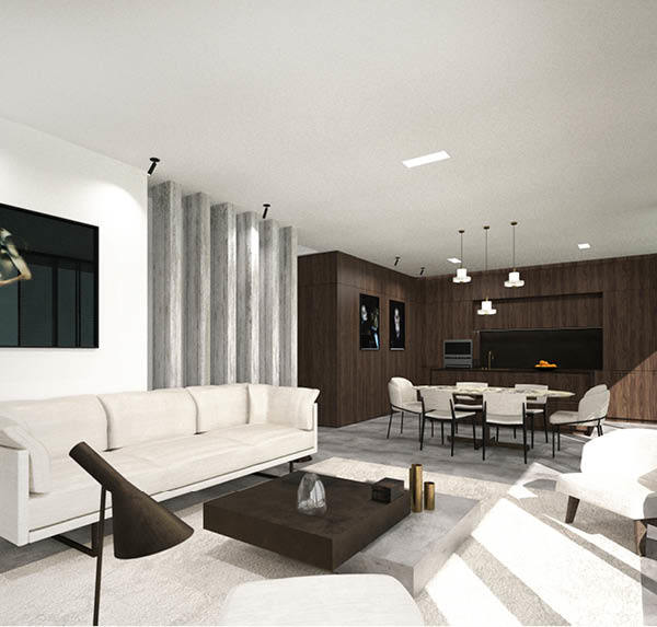
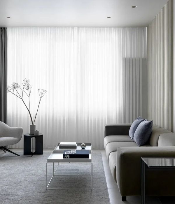
起居室二层通高且拥有整面的落地玻璃,使得这个活动频率最高的空间拥有充足的自然采光。我们不希望人在这种超高的空间中产生一种尺度上的迷失感,因此起居室的视觉重心被有意压低,将人的感知控制在整个空间的下层。墙面和顶面用圆弧过渡,一定程度上也模糊了空间的上限边界。
The living room has high ceilings and floor-to-ceiling glass, allowing for plenty of natural light in this most active space. We don’t want people to feel a sense of scale disorientation in this extraordinarily high space, so the visual center of gravity of the living room is intentionally low, controlling human perception to the lower level of the entire space. The curved transition between the wall and ceiling also blurs the upper boundary of the space to a certain extent.
© Angie
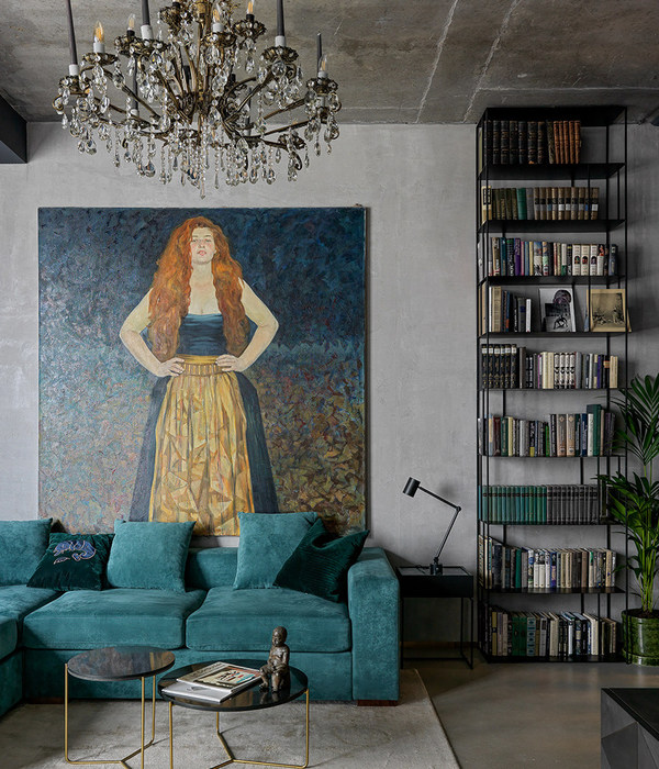
墙上的画作来自匈牙利艺术家Márta Kucsora,这位女性艺术家利用流体力学原理并借助混合材料完成了这幅打破空间和方向界限的作品,在视觉上创造出一种抽象自然的表达。
The painting on the wall comes from Hungarian artist Márta Kucsora, who used fluid mechanics principles and mixed materials to create this work that breaks spatial and directional boundaries, creating an abstract and natural expression visually.
© Angie
© Angie
The interface with stairs is designed as the most important "scene" in the living space. The first floor is mainly used for public activities such as living room and dining room, while the second floor is a more private space such as the main bedroom and tea room. Therefore, the stair, as a transition between public and private, naturally has the metaphor of "rising curtain" and "falling curtain". We translate this implicit relationship into an abstract expression such as the one below: The high background wall is preceded by a short wall that slopes downward, and one descends along the slanting line early in the morning to unfold the day’s drama, while at night one picks up the steps and returns to one’s inner world behind the curtain.
© Angie
© Angie
© Angie
© Lin
© Angie
© Angie
© Angie
起居室的三个窗口分别从不同角度和高度引入自然光,墙面的弧线和光线的交织映射出了一个动态的光影剧场。楼梯的硬朗线条与墙面的柔和曲线相形成对话,互为衬托。
Three windows in the living room bring in natural light from different angles and heights, and the curves of the walls and the interweaving of light create a dynamic theater of light and shadow. The hard lines of the stair contrast with the soft curves of the wall, complementing each other.
© Angie
© Angie
© Angie
© Angie
© Le
© Angie叙事Narrate
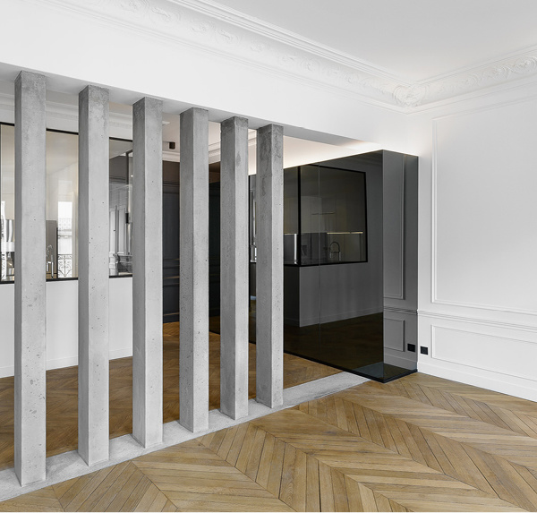
我们以纵深的叙事感来进行二层卧室场景的营造。十字形空间结构将四周的卧室、通廊、琴室、更衣室组织起来。由四根“柱子”围合成的十字中心为目光提供了视觉引导,使其沿着轴线进入各个空间。视觉通廊是此纵深结构的关键,就如同一个精确的视觉桥梁,通过精准的比例和节奏感来为各功能空间建立关联。
We create bedroom scene through a sense of depth and narrative. The cross shaped spatial structure organizes the surrounding bedroom, pathway, piano corner, and dressing room. The center enclosed by four "pillars" provides visual guidance for the eyes, allowing them to enter various spaces along the axis. The visual corridor is the key to this depth space, just like a precise visual bridge, establishing connections between various functional spaces by means of precise proportions and a sense of rhythm.
© Angie
© Angie
其中一侧的墙上设计了整面的穿衣镜,创造出一种现实和虚拟交错混织的效果,这个视错觉进一步放大了空间的纵深感。
On one side of the wall, a full mirror is placed, creating a blend of reality and virtuality, which further expands the depth of the space.
虚实交错的“十字空间”© Angie
© Angie
© Angie
© Angie
© Lin
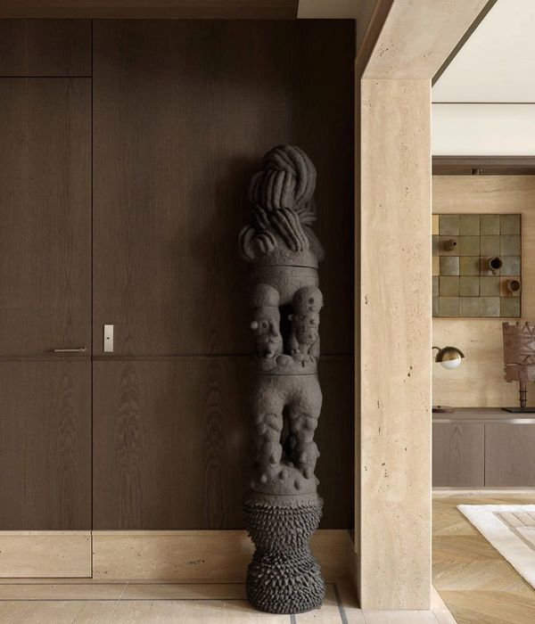
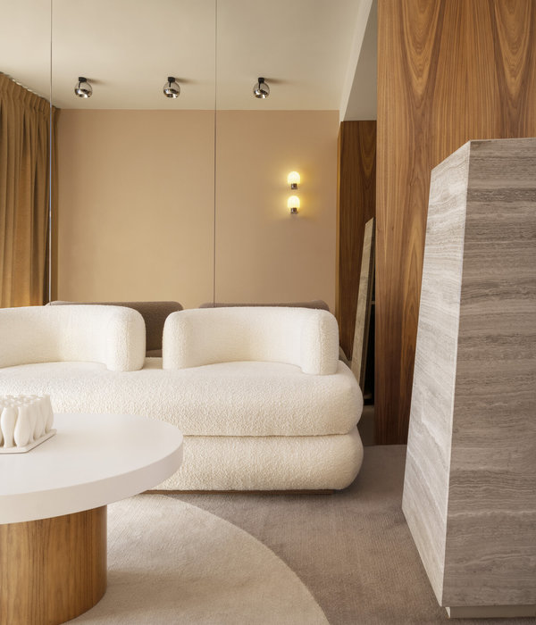
墙面采用了暖色的磐多魔涂料,并且保留了施工过程中的手工涂抹痕迹。其他主材则采用了天然木皮和天然洞石。我们希望通过这类丰富且随机的肌理来唤醒空间中的人对自然和时间的细腻感触。
The wall is painted with warm colored PanDOMO and retains the traces of manual brushing during the construction process. The other main materials are natural wood veneer and natural stones. We hope to awaken people’s perception of nature and time through this rich and random texture.
细节Details
© Lin
© Angie
© Lin
© Lin
© Lin
© Lin
项目图纸
Layout
完整项目信息
项目名称:外滩顶复私宅改造
项目地点:上海市黄浦区外滩
项目面积:265平方米
完工时间:2023年9月
设计单位:方居建筑设计
主持建筑设计师:王乐,林磊,杨晓娇
项目顾问:朱琥
项目摄影:上海四目摄影
材料品牌:panDOMO磐多魔(德国),厨房整装定制博洛尼Boloni,实木皮TABU(意大利),费罗娜Florina岩板,
家具品牌:Rochebobois, Poltrona Frau, Baxter, Knoll, CondeHouse
灯具品牌:FLOS, ziilamp
卫浴品牌:DURAVIT, GESSI
{{item.text_origin}}

