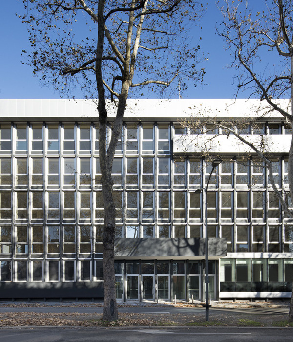
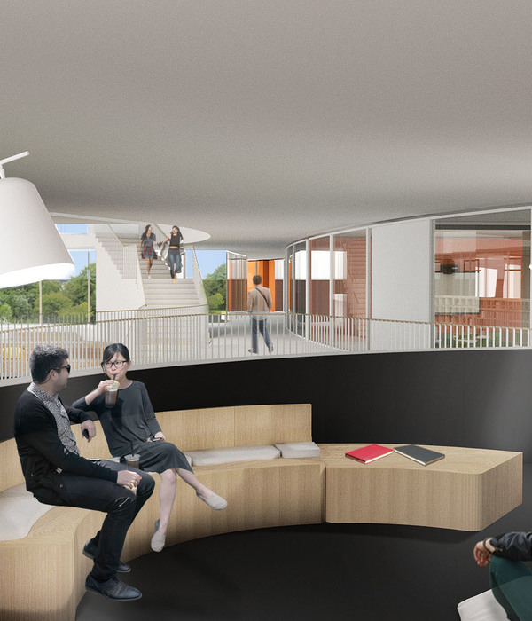
We transform an Amsterdam business landmark into an engaging and dynamic multifunctional centrepiece for the newly revived Zuidas district. Ever since the earliest days of Zuidas, the prestigious Amsterdam business quarter, the Atrium building – located on the corner of Strawinskylaan and Parnassusweg – has been a familiar landmark. However, after many successful years, the 1976 structure, like the neighbourhood itself, was in need of a new impetus to keep pace with rapid changes in the world of work and in Amsterdam’s urban fabric.
Embracing history
From the 1970s onwards, the Atrium has housed a succession of prominent Dutch and international companies. Consisting of a central core and three towers, the building owes its enduring popularity to its unique transparency, the result of large, open atria that allow daylight to enter unobstructed, and its extensive floor surfaces, with rooms up to 4,500 m2 in size, combined with a functional layout.
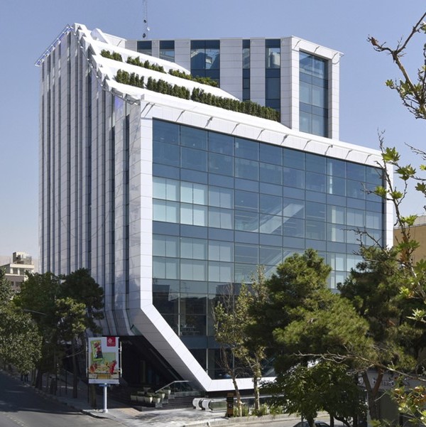
Called in to rework the building to fit with its new role in the regenerated area, MVSA saw the task as preserving and enhancing its best qualities – its openness and spaciousness. The design therefore respects the original design and extends it, adding two new towers and so creating another 25,000 m² of extra office space. The towers embrace the old building with their own atria and their meandering aluminum awnings.
Grand plans
The newly renovated Atrium is at the heart of a much bigger scheme. Zuidasdok is the City of Amsterdam’s large-scale urban planning project to transform the Zuidas area into a dynamic new urban quarter featuring a much higher building density. The new roads and connections place the Atrium at the centre of this grand plan. It was therefore time for the building’s owners to reconsider its role in line with changing times and with the ‘living and working’ objectives set by Amsterdam City Council. In addition to modernizing the building while enhancing its unique character, our redesign gives the Atrium a new, broader role in the area, making it a place where people can work, meet, relax, and feel thoroughly at home.
Two towers
As well as renovating the existing building, we added two new towers, which also feature public and commercial spaces. These towers with their expressive canopies complement the existing complex. Our use of glass and a harmonious materials and colour palette ensures visual unity between the old and new elements of the building, and between exterior and interior spaces.
Open to the core
The original building consisted of a central core with three towers, to which we have added two new towers. We connect all five towers with each other via a first-floor ‘heart’, from which spaces open out in all directions. We created two more atria, adding to the original three, to smoothly bridge the gap between the existing and the new buildings. Thanks to the spacious atria, each of the five towers benefits from optimal daylight.
The existing building already had a particularly clear layout, which has proved enduringly popular over time. Together with the client, we decided to maintain this original floorplan. The existing public areas were renovated with the aim of improving comfort and furnishing quality.
Flowing façade
Our new façade achieves subtly flowing lines that integrate the building beautifully into the public context – with the boulevard and commercial functions – while adding to the beauty of its design. Specially manufactured glass allowed us to incorporate rounded corners, with special curved -lass windows each consisting of a single pane with a 2.4m span. These large windows provide panoramic views of the Zuidas for those inside. Passers-by, on the other hand, can enjoy glimpses of the building’s landscaped winter gardens, which are visible from the outside.
Matching look and feel
For the new façade, we choose a material that would match the look and feel of the pink marble of the existing structure. Both the plinth and the upper storeys of the new towers utilize sun-protection glass, placed in anthracite-coloured frames. Aluminum floor edges, which are matched in colour to the brown-pink natural stone used in the original building, are the perfect visual complement to the original scheme.
In the shade
To optimize movement in the public space on the boulevard side, we opted for column-free overhangs. In the interests of a good pressure distribution via the columns on the bottom three storeys, the floor on the third level is 1.2 m thick, forming a transitional construction. This intervention also adds great visual interest.
By playing with the depth of the façade, we carefully modulated sunlight and shade in the building. The protruding floor panels are longer on the sunnier sides, providing shade and adding a sophisticated look to the building.
A public face
On the ground floor, the Atrium’s public areas harbour restaurants, cafés and shops for visitors, as well as the office tenants. The general public, including local residents, are thus included in the Atrium community. The adaptation of these public spaces is an important aspect of the design, helping to avoid the ‘office ghetto’ feel of yesteryear by mixing and blending functions.
The building’s tenants meanwhile benefit from the many office facilities, such as extensive meeting and conference rooms, and also from inhouse services such as dry cleaning and a car wash, plus a large gym and a fine office restaurant.
Glorious gardens
The new towers feature beautiful indoor gardens, which are arranged at various angles over two or three floors and are visible from outside the building. Every rooftop has also been ‘greened’ with its own rooftop vegetation. On its boulevard side, the building flanks a landscaped 15,000 m2 garden, which (like the interior gardens) can function as a meeting place.
Life on the boulevard
The final phase of the development plan includes the construction of a pedestrian boulevard with public transport facilities. This will complete the revitalization of the public areas around the Zuidas and Strawinskylaan. The Atrium is of course located on this future boulevard.
Meanwhile a tunnel for the A10 ring road will have been constructed between the RAI station and the Parnassusweg: the Zuidasdok.
Cars go underground
Placing car parking underground results in more space for the pedestrian zone, which will have lots of greenery and benches, attracting people to spend time walking or sitting in the pleasant surroundings. The existing parking garage, which was located under the A10, had to be moved because of the future tunneling, and a two-storey car park with 525 places was realized beneath the Atrium’s two new towers. From the subterranean car park, drivers reach the central hall via two shuttle lifts.
Kiss & ride
In order to help solve traffic issues and to meet demand for this particular mode of transport, a kiss & ride has been positioned under the awning on the Strawinskylaan. A parallel road on the spot allows people to be easily dropped off or picked up.
Sustainability strengths
As co-founder of the Dutch Green Building Council (DGBC), G & S Vastgoed, one of the two clients, was one of the developers of the Dutch version of the BREEAM method, an innovative approach to measuring the sustainability of new and existing real estate. The renovation of the Atrium scores high on this sustainability scale. The design for the new building meets BREEAM Excellent standards. For tenants, these high standards not only contribute to a healthier environment for workers, but also reduced energy costs.
Year 2018
Work finished in 2018
Status Completed works
Type Office Buildings
{{item.text_origin}}

