Challenges:
A small size of public space at the entrance of the complex.
The proximity of the busy road to the pedestrian promenade along the complex.
The main façade faces the North side.
Solutions:
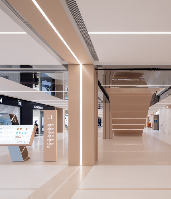
Plastic facade, light structural glazing of the entrance area, the paving pattern extending from the landscaping to the interior, visually combine the outside area with the interior, increasing it. Such a decision, despite its Northern location, allows you to cover the entrance area with sun, to open the sky for the views and make the architecture more inviting and friendly.
The main principle of the landscaping is the organization of the buffer green zone between the motorway and the promenade along the facade. The location, the profile of the benches, geoplastics, types and location of plants aimed at the protection of the person from negative influences of the highway. The promenade along the facade, through a series of small squares, is transforming into the main square of the main entrance. These semi-closed spaces (areas with benches, sculptures, outdoor cafes) help to activate a social life along the facades of the complex.
One of the important components of the facade became the steel slats rotated at different angles. In the daytime these items are allowed to make the facade lighter, more textured, helped to transit smoothly from the walls to the glazing and advertising surfaces. In the evening they are the basis for a backlight unit. Lighting and media functions of the facade and architecture are inextricably linked in this case. Software features of lighting equipment provide various options for colour-dynamic solutions.
Each of the main entrances to the complex has the media screen. Control systems allow you either to sync the picture with color dynamic images or to implement the independent lighting scenarios. The power of light, color, and scripts can respond to time of day, weather and light conditions. The entire surface of the facade could be transformed into a single media body.
"Our task was to create an object out of style, which would be look beneficial at the context, contrasting with the surrounding buildings and will be as comfortable as possible for all groups of visitors. We have paid great attention to the landscaping: it gave us the possibility to create not just a shopping space, convenient for customers, but a complete environment for relaxing and socializing. The project managed to realize almost without any changes of the original concept ", commented Eric Valeev, head of architectural Bureau IQ.
Shopping center “Khorosho!”("All right!") was designed by the architectural Bureau IQ. The total area amounted to 114 thousand sq m.
Awards:
- The Golden symbol of the festival "Zodchestvo 2016" in the nomination "Multifunctional urban ensembles and complexes".
- The Golden A design Award in Architecture, Building and Structure design category in 2016-2017 period.
{{item.text_origin}}

