颠覆传统的 Fastrack 商店设计
Firm: Studio Lotus
Type: Commercial › Retail Shopping Mall Showroom
STATUS: Built
YEAR: 2013
SIZE: 0 sqft - 1000 sqft
Photos: Mallikarjun Katakol (10)
The design brief was to create a space that exudes irreverence, a key brand characteristic for Fastrack. This root expression guided our approach to the space. We set about creating a space that would be edgy and cool, seemingly put together at random without thought or purpose. One of the principal tenets of the design was thus to provide a space that looks uncomfortable to reasonable adults.
At its core the space is subversive to mainstream retail experience. Forming a complete contrast to the polished and clinical retail expression that permeates the Indian market, this space feels like a found object, a mad-hatter’s curio collection. When the customer buys something here, he walks away with a part of the store.
Fastrack’s stores occupy between 500 sq. ft and 800 sq. ft. The flagship store is located in a popular Bangalore high street market, spread across 1000 sq. ft on one floor plate, with a back storage space of 120 sq ft.
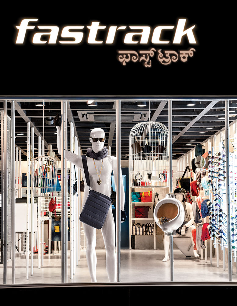
The facade has been designed as a precursor to the store experience. With charcoal grey ACP panels as the ground, the 8’ large signage takes over the store front, becoming a landmark feature along the street. The signage, much like the brand, does not take itself too seriously, and is a riot of blinking colour changing lights that are representative of lighting from the high streets of Broadway, NY. The small open space in front of the store houses a bike rack and a folding bench.
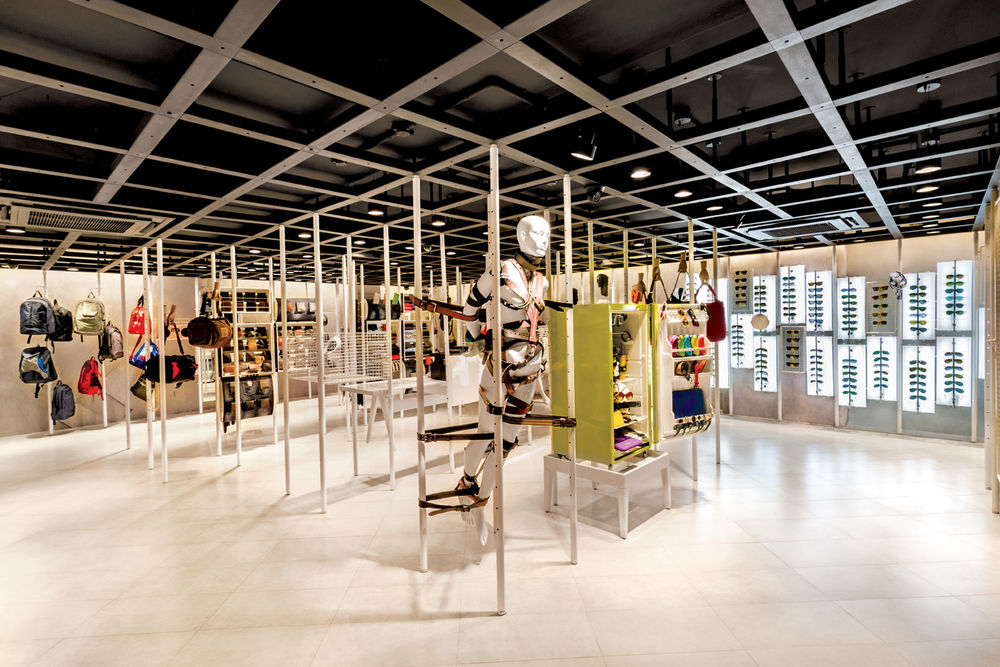
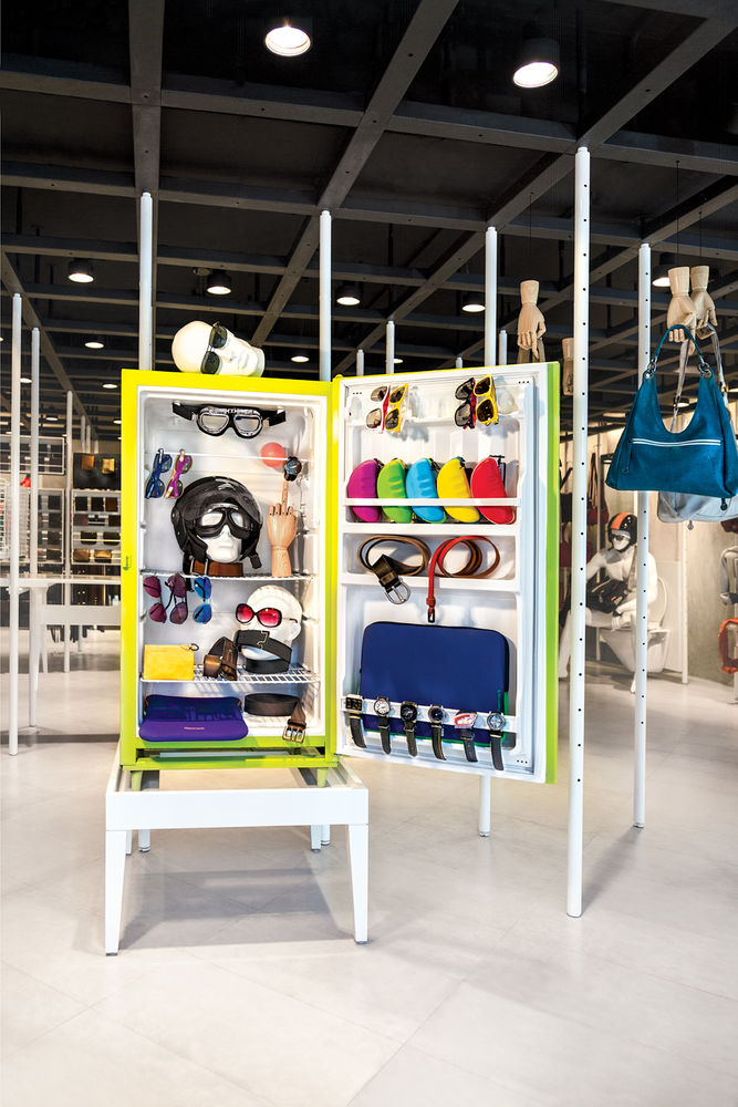
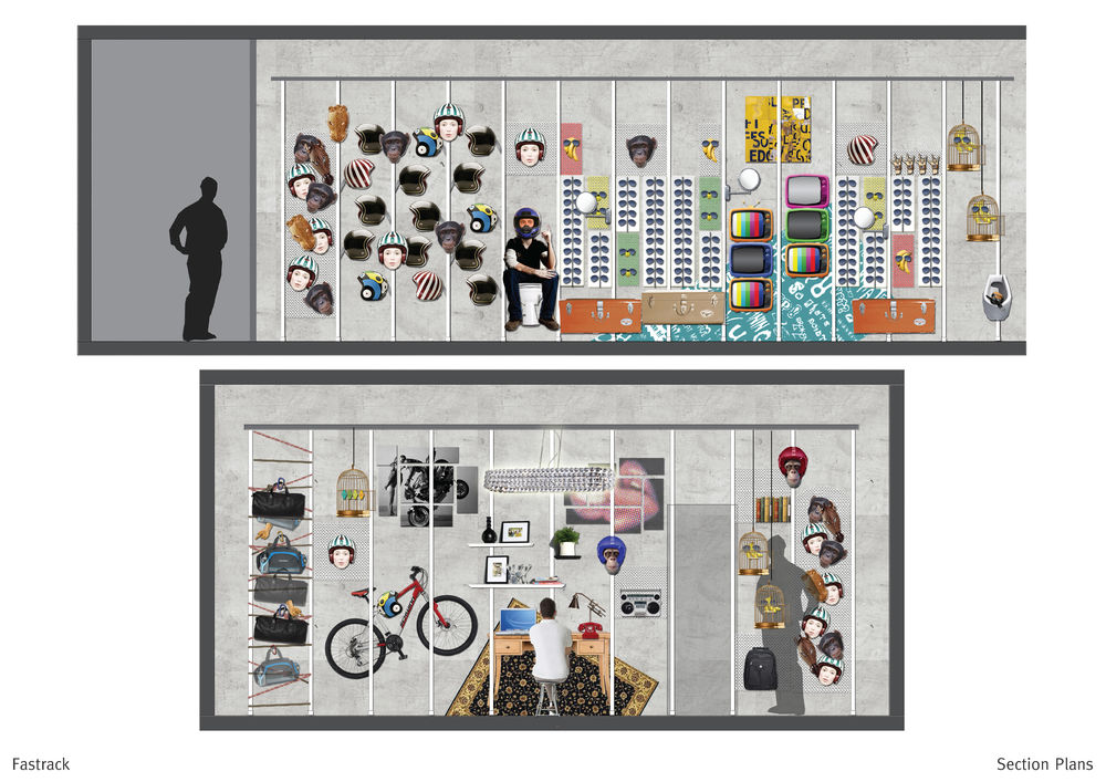
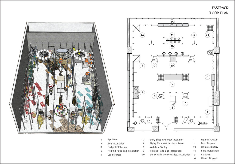
The space unfolds through a series of installations and events. A physical grid of white pipes forms the basis for a grid, from which various display systems are suspended. This meshwork of grids hides away services and lighting, and supports various display systems. The merchandize is a complex mix of watches, wallets, bags, belts, helmets, eye wear, etc. objects of various scales that needed equal presence in the store.
The store also does not rely on conventional materials apart from a basic vitrified tiled floor- the walls are plastered to provide a neutral backdrop to the hierarchical installations with the ceiling painted dark.
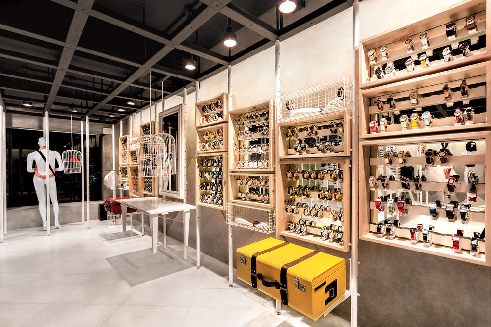
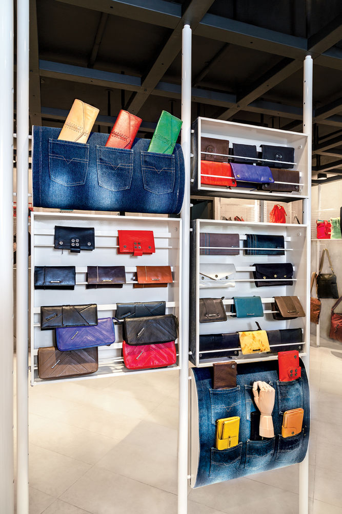
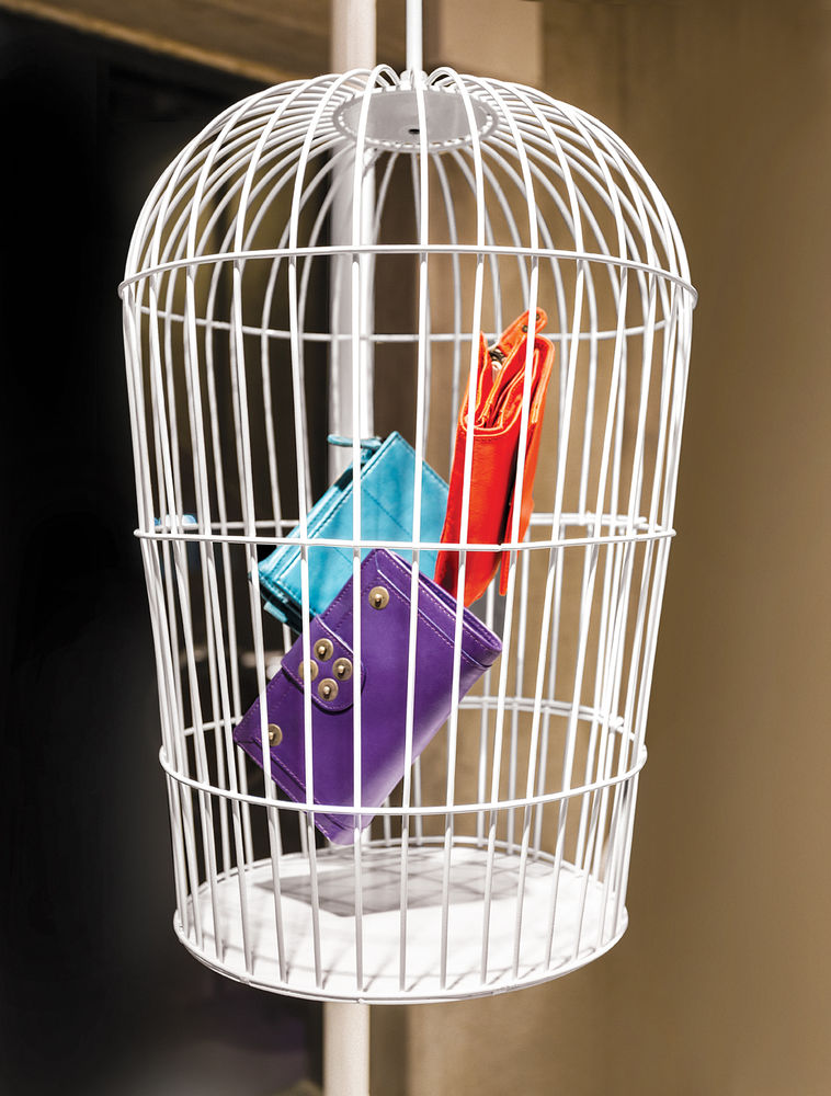
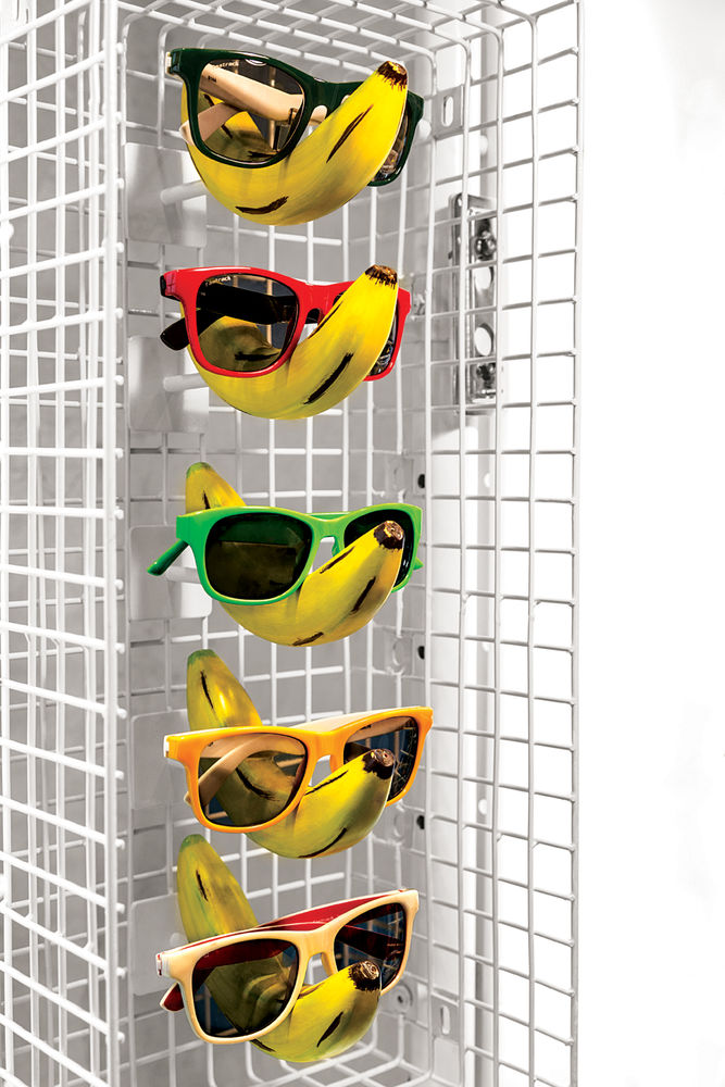
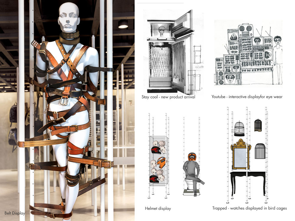
Each category was designed as an installation, with a clearly recognizable character of its own. The watches are displayed inside bird cages, the belts are casually worn around a mannequin (our Iron Lady) with surrounding poles covered in leathers and studs. The bags are suspended in rope using carabineers, wallets lie hanging out from back pockets of denim wear from where they are meant to be pick pocketed. Eye wear is displayed on bright yellow bananas, helmets are mounted on expressive trophy heads, and old beaten up trunks, floating tables, mirrors, reconditioned refrigerators, urinals and WCs are used as display devices. Even the transaction desk is centered in the middle of the store becoming an intrinsic part of the retail experience. The interiors exude an order in the apparent chaos, but there is an underlying sense of exploring a bazaar.
The lighting unfolds in three different layers. The primary layer provides an even ambient light to the store, sufficient for general product browsing. The second layer enhances the floating displays on the gird by giving a strong wash of light to the walls. The final layer of the lighting highlights specific installations scattered through the store and along the window. They are left on through the night as well, allowing the entire space to be seen as a large display window to passers-by.

