The aim of the project was to develop a comprehensive vision of the new headquarters of Pivexin Technology.
The designed space consists of an office building with social facilities, a warehouse and the land around the buildings including a driveway, parking area and decorative greenery.
ARCHITECTURAL COMPOSITION Although the office building and the warehouse serve different functions, they needed to be connected to each other (due to the company’s activity). Therefore, we have merged the structures of both buildings and created a coherent and functional system of independent elements – one cuboidal block that includes different types of spaces. The outer skin of the building is black, however, the two functional blocks - office and industrial - have been diversified.
The elevation of the office building is largely glazed, open and three-dimensional. It has vertical pilasters and horizontal cornices that emphasize the representative front part of the building. The elevation of the warehouse is simple and modest - adapted to the industrial character of this part of the building.
The Pivexin Technology building is noticeable from the busy Gliwicka street - it became a landmark. The black cuboid combining office and industrial functions is the dominant feature in the landscape.
URBAN DESIGN A plot of one hectare has been divided into three zones: 1. Building zone – Cubature 2. (industrial) zone of access, parking and delivery 3. The (office) zone of access and parking in the front
The area at the back of the building was preserved and leveled as a reserve for the possible extension of the warehouse. The plot declines southwards. The difference in height within the boundaries of the property is about 1.8 m.
The building was located entirely in the upper part of the plot. The office part of the building faces Gliwicka street and clearly exposes the front elevation. The building is highly visible from the road (Gliwice - Racibórz).
The foreground of the office building is paved and includes low greenery and parking area. Both the office building and the warehouse are accessible from the west, that is, from the central part of the plot.
ARCHITECTURE The building and land development result from the investor's guidelines as well as from the idea created during the design process. According to the basic objectives, the project includes two buildings: OFFICE BUILDING and WAREHOUSE.
The two buildings were combined into one with external dimensions of 61.5 x 45 metres. The total area of the building is 3800 m2, including: warehouse -2150 m2 and office building - 1650 m2,
The office area - a representative, two-storey part of the building - is accessible from the front car park.
The entrance zone consists of an open, two-storey high space with a reception area. It has direct access to the conference room and to the spacious lobby and offices.
The office area is arranged into three groups. Along the windows of the north-east elevation there is a row of office rooms. At the other side there are toilets, social rooms and stairs connecting the floors.
On the ground floor, all three groups are connected by a spacious lobby. Owing to the large cut in the ceiling, the lobby creates an open, two-storey space, lit by a roof skylight.
On the first floor, by the open space offices, there are walkways and a seating area for employees with access to an external terrace.
Between the office and industrial parts of the building, there are technical facilities of the warehouse. This space also includes social facilities (cloakroom, toilet, social room) for the employees of the warehouse.
The storage and production part of the warehouse is an open space. The area was divided into two sections: manufacturing and high storage.
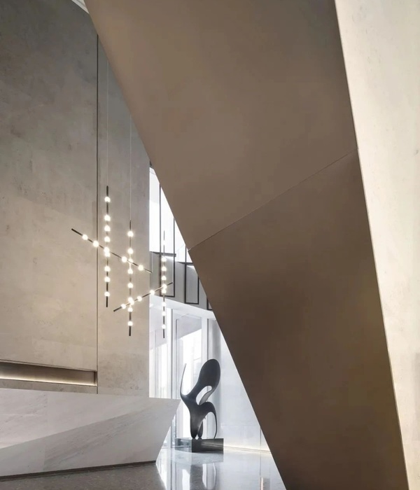
COMPOSITION OBJECTIVES – INTERIOR The design of the new headquarters of Pivexin Technology is functional and modern, while at the same time being compact and minimalist. The clear layout of the space has been tailored to the investor's needs, providing comfortable and functional working conditions.
The interior is mainly white, contrasted with timber cladding and smaller black objects that emphasize the composition. The whole design is complemented by furniture also adapted to the specific functions and the composition objectives.
The interior is clearly minimalist. Glass vertical divisions provide transparency, aesthetic consistency, visibility as well as free flow of daylight flooding in through large facade glazing and the skylight in the central part of the roof.
The office space combines minimalism with indoor greenery. Desktops in the offices contain plants that clearly divide desk islands into individual workplaces. Such an approach provides an element of nature inside the office.
The office is democratic, modern, contemporary. Full of light. It allows for work, but does not forget neither about the symbiosis of man with nature nor the need for interaction between colleagues.
{{item.text_origin}}

