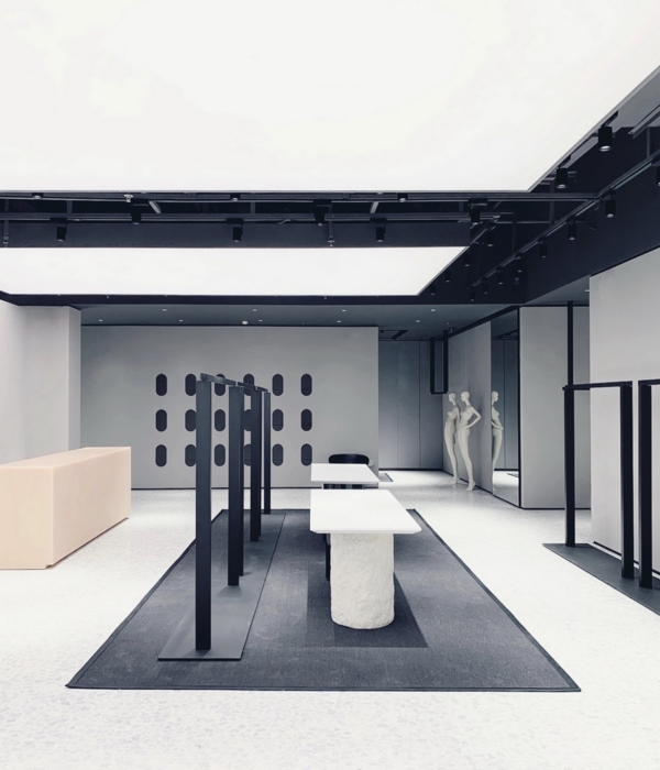
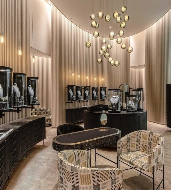
A space where the product is the protagonist.
The existing set shows us a significant lack of exhibition space. The sales mechanics consisted of the optics staff showing the frames. The claim is that, without losing that personalized attention, the customer can see and touch the product. That you have the freedom to move freely through the store and can go to the specialized staff to ask any questions or to request a more specific product.
Previusly, the image was very old with a choice of colors and materials not adequate and outdated. The project was carried out without any pattern or concept that provided a common thread.
Our option was to give a strong and forceful image.
We cover both the interior and exterior vertical walls of gloss black ceramic, which gives it a very homogeneous appearance. The idea of opting for this color was to darken the environment to make the product stand out with artificial light by means of perimeter shelves that support, expose the product and place it so that it is available to everyone.
The place is shown as a continuous "slide" of mounts that run through the entire space, including the shop window. The idea is that these elements become the protagonists of the premises supported by the light and the differentiating material from which they are constituted.
The light, as we noted above, has a leading role playing with different types of applications. We take great care of the intensity of the general light to highlight those aspects that we consider most important.
Make a “box” of a continuous material.
The floors have different treatment since we have different heights and for a practical reason we differentiate the pavements.
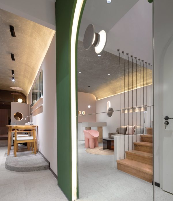
On the one hand, a “terrazzo” with texture is chosen that contrasts in a strong way with the vertical treatment and on the other hand a paint on leveling paste more consistent with the tonality of the walls is chosen.
{{item.text_origin}}

