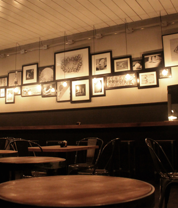
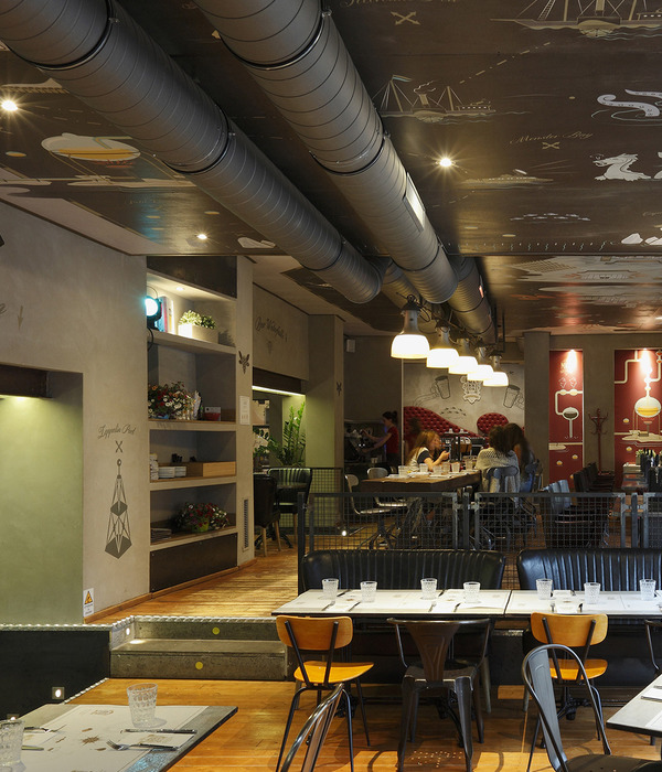
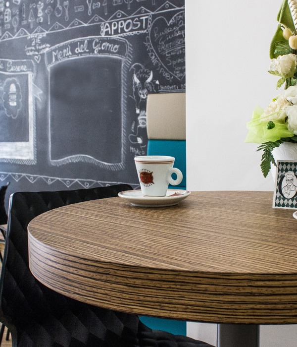
Art meets pop culture and the digital world at PONG Popkultur & Gastro in Stuttgart, a cosy and welcoming restaurant and bar designed by Studio Komo.
Outside – rigid symmetry, archaic and monumental, and an expressionist brick facade. That’s how you could describe the architecture of the NRW-Forum in Düsseldorf. It is heritage-protected and part of the Ehrenhof ensemble, which includes the Tonhalle Düsseldorf.
Inside – art meets pop culture and the digital world. According to the management: “An international exhibition centre and lively place of inspiration for the whole family.”
PONG is right in the architectural centre of this symmetrical building from the 1920s. A restaurant conceived as a bridge between the past and the future, between traditional and experimental. For the client and the architect, a variety of requirements had to be fulfilled. It was to be an event venue. A restaurant at its core, a bar at night, and always: a café. The Forum management wanted it to be a place for concerts and readings; in sum: an urban centre for all those who love pop culture.
The design created by Studio Komo – interior designers in Stuttgart was defined by the 11-metre-high dome with double stairs and the distinctive brick walls. Through the use of acoustically effective PET panels in furniture and cladding, upholstery elements and carpet spaces, the planners were able to give this building, formerly in a high-traffic location, a cosy, welcoming atmosphere.
PONG has a harmonised interior with carpets, textiles and woodwork in shades of blue. CI-suitable pop colours add accents to the space that are complemented by natural materials like cork and wood, creating a conceptual bridge to the culture of the building.
The design language sets forth the existing situation: there is a platform plus bench that expands the oval room and makes it an arena. Flexible lounge furniture in the middle of the space provides additional seating. The bar with high tables creates a corresponding contrast. With its white ceramic tiles, it contributes a further accent. To the extension, the architects have added an order counter for the take-away section. Its curvy shape serves as a welcoming gesture and, together with the menu board, as an orientation point and meeting place. Indirect lighting on the platform, the padded wall, and the bar in combination with a light bulb installation and spotlight in the dome room allows a variety of lighting moods.
Design: Studio Komo Photography: Philip Kottlorz
10 Images | expand images for additional detail
{{item.text_origin}}


