When asked to design a new townhouse as a ‘starters home’ by AG Vespa, we decided to literally think of the house as a starting point: A Simple House, as a first step to fulfill the principal demand in the most economic and rigid way. But together with the main house, anticipating growth and rising budgets, we also designed a series of complementary add-ons.
Rather than giving way to a series of Belgian-style ‘ad hoc’ extensions, we created a set of ‘toppings’: seemingly independent architectural objects providing different spatial qualities and accessory functionality. Dispensable yet essential, just like the chocolate sprinkles on your frozen yogurt.
The single-family house is constructed using CLT (cross-laminated timber) that is left visible to give the rooms their distinct interior quality. The rational ground plan is the same on every floor: a central staircase with two adjacent spaces. The result is a series of rooms able to ‘house’ whatever is needed in that particular phase of life.
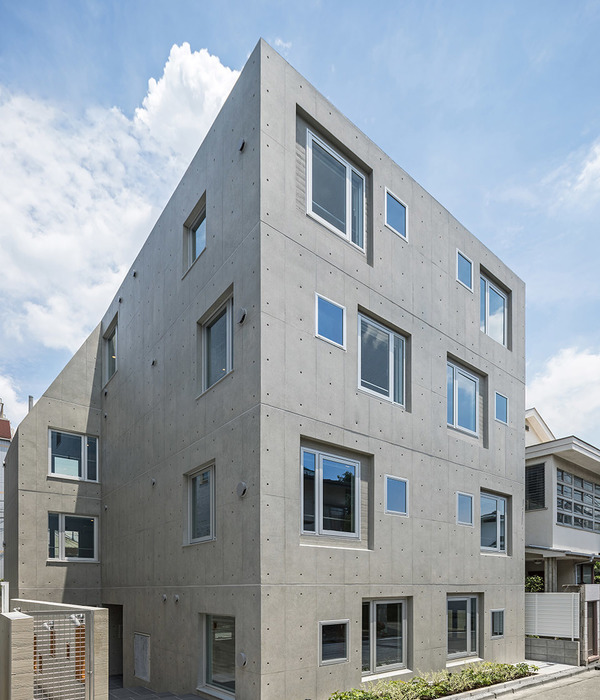
The front facade is characterised by a high plinth in blue tiling, giving the house an idiosyncratic appearance in the street that non the less pursues the horizontal articulations of its neighbours. This clear-cut image was then copied at the rear side. Making the best of this temporary state by creating two identical facades and thus emphasizing symmetry in the plan and the apparent simplicity of the house.
{{item.text_origin}}

