创意别墅设计 | Kelloggs Room 1860
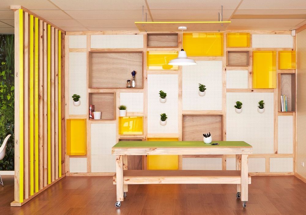

The brief for this project was to create a functional space that inspired employees and enabled a culture of creativity and entrepreneurial spirit.
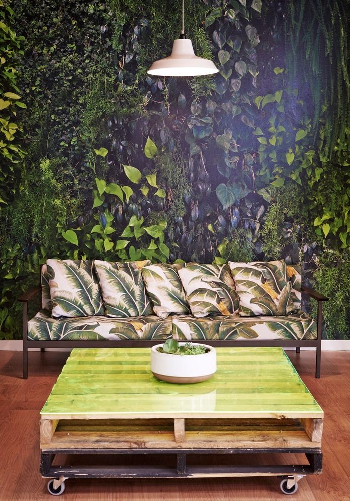
In terms of sustainability, we considered current conditions of the area to leverage anything readily available. A number of furniture items were salvaged from the basement of the building for use in the room. In doing so, we minimised resources used and waste generated. The lighting and ventilation system we specified allows for individual occupant control so that energy isn’t wasted if the whole area isn’t being used. All of the furniture can be easily disassembly for recycling or reuse and we specified salvaged or refurbished materials wherever possible, such a recycled fence palings and a re-purposed lounge frame, which in turn reduces packaging waste and extends a product’s life cycle.
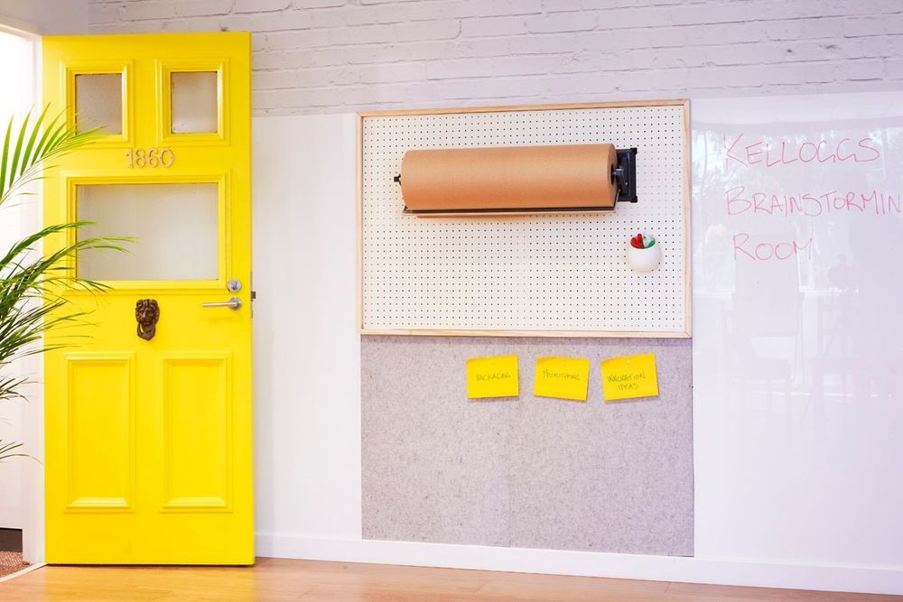
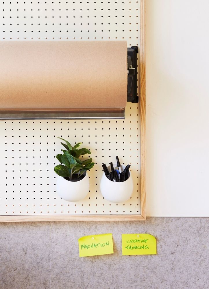
Promote creativity and facilitate ideas generation. The concept behind the design is embodied in a sticky note. The simplicity of the note’s purpose and the powerful means to quickly express ideas and thoughts was translated into the physical space by using flexible surface treatments that allow for temporary notes and ideas to be recorded.
Accommodate multi-purpose meetings, such as team training, ideation sessions, prototyping, informal and formal business meetings
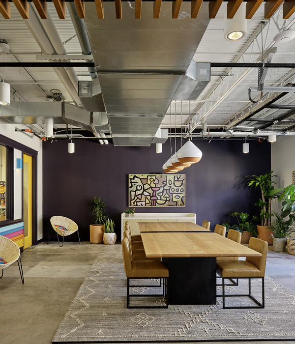
We had to design a space that allowed for large open areas that could accommodate team training and formal business meetings and could also be made into smaller areas for ideation sessions, prototyping and casual meetings. All furniture had lockable castors fixed to it so that it could be moved around the room freely and quickly.
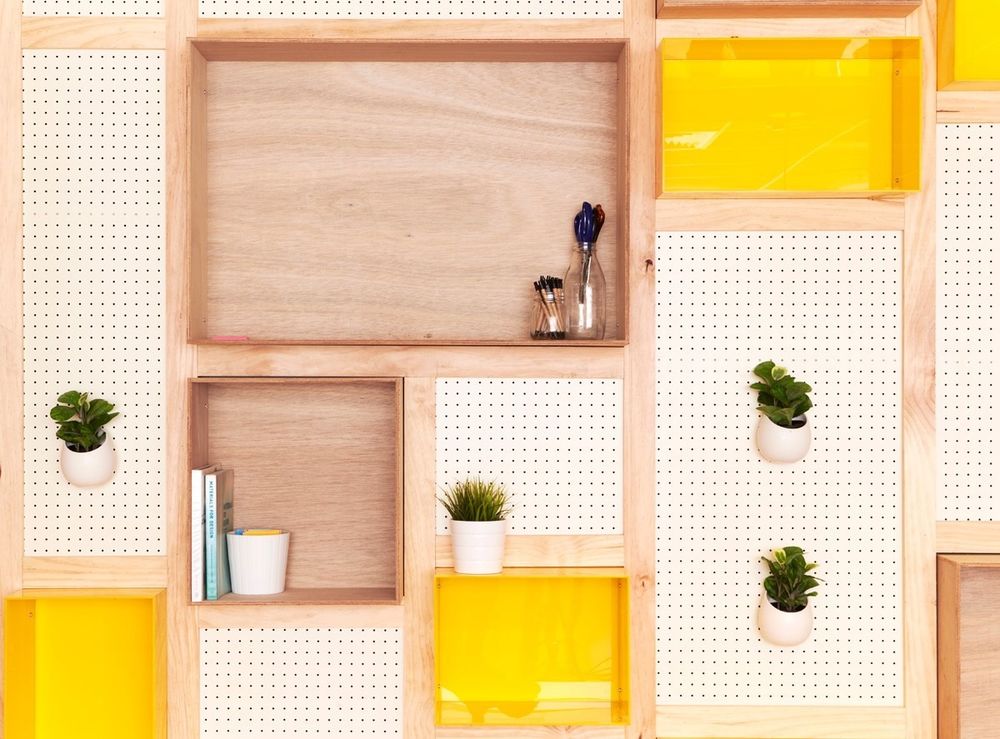
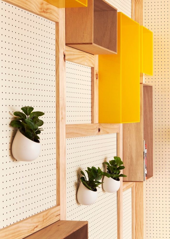
We implemented pegboard on the walls for prototyping tools to be hung on so that users had access to creative tools and prototyping materials whenever needed.
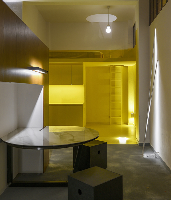
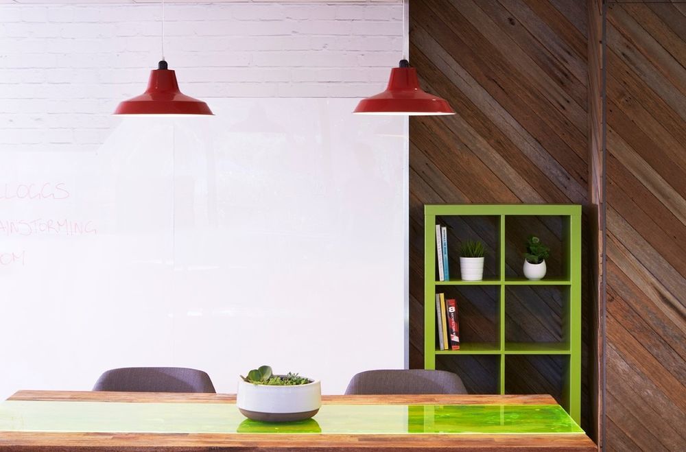
We maximised workable space by extending work areas to the walls. A combination of Perspex, acoustic felt and brown paper rolls were fixed to the walls that could be either written directly onto using whiteboard markers, ideas pinned up for further ideas generation and access to paper for note taking. We also had Perspex riveted onto tabletops so that ideas could be expressed quickly and freely as they came to mind for those seated.
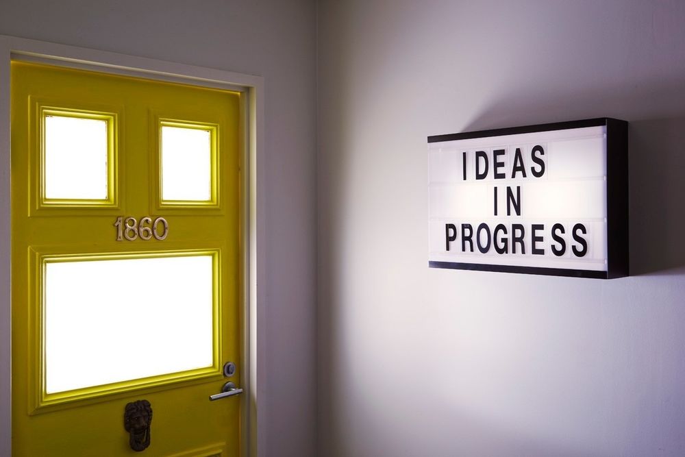
The space that we designed felt completely non-corporate, not what you would expect in the headquarters of an international FMCG company. Our concept was the sticky note was further applied by the use of the colour yellow, with fluorescent accents to stand out from the company’s red branding that is used through out the rest of the building.

