- 项目名称:21gram 咖啡馆
- 项目类型:咖啡馆
- 建筑师:所在设计研究社 | ATELIER SOOTSAI
- 客户:21gram 咖啡
- 地址:禾祥西路2-116,思明区,厦门市,福建省,中国
- 商务及项目管理:林婉惜
- 主创建筑师:石磊
- 设计团队:石磊,林婉惜
- 摄影创作:林永晨,罗联璧
- 项目年份:2017年
- 石材供应及制作:黄裕辉
- 灯体膜制作:罗永红
- 材料:瓷砖,外墙涂料,大理石卡拉拉白,免漆生态板,钛金板,冷弯折钛金板U型槽,水泥压光,红橡木原木木材,玻璃,型钢烤漆拉手,水泥纤维板,LED灯带,射灯,灯体膜
- 结构顾问:肖祖辉
咖啡师为中心 排排坐与台阶的坐席方式 Barista-centric Stairs as a way of sitting
项目之初甲方21的理念就十分清晰,他希望这个空间里要以咖啡师作为中心,通过提供更优质的服务,来凸显咖啡馆的空间本质;同时,21体现出了对台阶式的座位的强烈兴趣,并且在建筑师面前多次展示了这个建筑构件类型的意向。
At the beginning of the project, the ideas from boss of 21gram were very clear. To highlight the essence of the cafe he hoped that the barista should be the center in this space and provide better services. At the same time, 21gram showed the strong interest of stepped seats, and this type of component has been shown many times to the architect.
▼咖啡馆室内概览,overview of the coffee ©林永晨
空间当中凌乱的结构梁。 16m长、4米宽的狭长空间比例。 Messy chaotic structural beams in space A narrow space ratio with the 16 meters long and 4 meters wide
原来的空间里的结构梁和上部的建筑空间有直接的关系,却这个商业空间带来了相对较为复杂的状况,然而并非设计的前提是为不利条件就无法扭转局面,建筑师通过巧妙的吊顶的处理,将一道“天光”引入这个空间,一片倾斜的墙体从光线进入的地方向下延伸,在建筑师期待的“2.4米”的位置戛然而止,这个“天井”的正下方,是吧台和咖啡师。
▼顶面仰视图,top vertical plan ©所在设计研究社
The structural beam in the original space has a direct relationship with the upper building space, but it brings a complicated situation for this commercial space. However, it doesn’t mean that the situation cannot be reversed under those adverse conditions. We provided the “skylight” into the space by a trick of ceiling treatment. A sloped wall extends downward from where the light enters and stops at the position of “2.4 meters high” as our expectation. Right below this “patio” is the bar counter and barista.
▼咖啡制作区,上方的顶灯创造出一个“天窗”,the bar counter, above which there is a “skylight” made of the top light ©林永晨
如何坐? How to sit?
如何通行到储藏间和卫生间?台阶不仅仅抬高了人们在这个空间坐下来的高度,而且也创造出了吧台的中心感,通过台阶的抬升,吧台俨然成为了一个舞台,把优质的服务和精品咖啡作为中心并非是将客户排除在这个空间之外,而是呈现客户作为空间主要服务对象的可视化过程。客户可以直观地享受服务和咖啡的制作过程,将这一刻回归自我。
▼座位区概念图, concept diagram of the seating area ©所在设计研究社
How to get to the storage and toilet? The steps not only raise the height at which people sit down in this space, but also create a sense of centrality of the bar. Through the rise of the steps, the bar has become a stage. Putting the quality of service and specialty coffee as the center doesn’t mean to exclude the customer from this space, but the visualization process of customers as the main service object of the space. Customers can visually enjoy the service and the coffee making process, and returning to self at this moment.
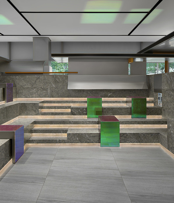
▼从座位区看咖啡馆室内,台阶创造出了吧台的中心感,interior view of the coffee from the seating area, steps create a sense of centrality of the bar ©罗联璧
▼座位区,台阶抬高了人们在这个空间坐下来的高度,the seating area, steps raise the height at which people sit down in this space ©罗联璧
▼座椅区局部,partial view of the seating area ©林永晨
当设计团队在进行立面设计的过程中,我们遇到了一个难题:当我们需要一个更为亲和外部空间又必须创造一个立面的厚度时,公共性的要如何表达?因为决定使用便宜又耐候的水泥纤维板,材料的厚度也必然会成为建筑形式表达的一部分。而45度倒角的材料处理因为工艺和对材料的韧性要求过高,而不列入考虑当中。材料的厚度会被表现,由哪一个面的材料正面来压哪一个面的材料侧边就成为了这个立面上最需要思考的选项:1.正立面的材料正面压侧面材料的侧边;2. 侧立面的材料正面压正立面的侧边;3. 正立面和侧立面交替压对方。为了提升立面厚度的公共性,让材料的交接构造形成无方向感,无等级化的形式表达方式,设计团队选择了选项3的构造方式。从而打造出没有因为正立面或者侧立面产生的等级关系,从而让立面的公共性的传递更为平顺。
这样的材料构造方式并没非模仿砌筑材料的构造方式而形成砌筑的意向,而是从上文论述的思考中得出的原则。这一构造方式的案例并非少数,也较为集中地存在于西班牙、葡萄牙等南欧国家。
We encountered a problem when we were in the process of designing the facade: How do we express publicity when we need a more intimate space but the thickness of the façade is still necessary? Because of the cheap and weatherable cement fiberboard which we decided to use, the thickness of the material will inevitably become part of the architectural form. The 45-degree chamfer material treatment is not considered because of the high requirements of the process and the toughness of the material. Because the thickness of the material will be expressed, which side is pressed by another side has become the most important option when considering on this facade: 1. The front face of the material presses the side face. 2. The material of the side face presses the side of the front face; 3. The front face and the side face alternately press each other. In order to enhance the commonality of the façade and make the connection structure of the material a non-directional and non-hierarchical form of expression, the design team chose the third construction method. Under this way, there is no hierarchical relationship caused by the facade or the side facade, so to make transmission of the publicity of facade more smooth.
This kind of material construction mode does not form the intention of masonry by imitating the construction mode of masonry materials, but it’s a principle from the thinking discussed above. There are not a few cases of this construction method, and they are concentrated in southern European countries such as Spain and Portugal.
▼建筑主立面及其细节,the main facade and its details ©罗联璧
“天井”的边缘未如建筑师期待压低到2.4米。甲方对钛金板以及钛金板U型槽的设计保留意见。在项目中期最大的争论就在于吧台上部的“天井”的下边缘离地面完成面的高度问题。建筑师一再坚持2.4米的净空高度,2.4米是一个很有趣的高度,它会形成一种若即若离的身体感知,在我们平均身高的人们看来,这个距离的物件即触碰不到,又具有一种即将碰到的期待感,并且这个高度又在两侧逐渐升高,可以说2.4米就是一个点的时刻,在这样的感知过程当中,观察者从3米的高度逐渐过度到2.4米的吧台区域,吧台中心又突然急升到6米高度,之后再突降为2.4米,到达台阶位置继续升高,这样的过程在2.4米这一刻被赋予了“若即若离”的感知而与身体建立一个感觉上的关联。而甲方21及其朋友们则认为在这个点位的高度至少要有3米才不会觉得“小气”或者“矮小”,在不断地解释和辩论当中,2.7米的妥协成为了几乎是最后的甲方指令,建筑师在遗憾当中推进项目,但是超越了2.4米的2.7米则与3米无异,最终还是给建筑师留下了不可挽回的遗憾。在21gram coffee项目这个最大的遗憾当中可以看出,建筑设计在其所期待传递的感知方面的的精确性,这种精确性如果意图在常识的认知当中建立陌生感,则需要甲方的绝对的信任与勇气。
The edge of the patio was not lowered to 2.4m as the architect expected. Client has reserved opinions on the design of titanium plate and U-groove of titanium plate. The biggest debate in the middle of the project is the height of the lower edge of the “patio” on the top of the bar from the ground. We insisted on the height of 2.4m. 2.4m is a very interesting height. It will form a kind of fuzzy body perception. At our height, it cannot be touched at this distance, but also have a sense of expectation that it is about to encounter, and the height gradually rises on both sides. It can be said that 2.4m is a point. In this process of perception, the observer gradually transits from the height of 3 meters to the height of 2.4 meters in the bar area, and the center of the bar suddenly rises to the height of 6 meters, then suddenly drops to 2.4 meters, and then continue to rise when reaches the position of step. Such a process is endowed with the perception of “ambiguous” at the 2.4 meters and establishes a sensory connection with the body. While client 21 and his friends think that the height of this point should be at least 3 meters to avoid “stinginess” or “shortness”. In the constant explanation and debate, the compromise of 2.7 meters has become almost the last instruction of client. We continued push the project in regret, but 2.7 meters which beyond 2.4 meters is no different from 3 meters, which ultimately leaves the architect irreparable regret. It can be seen from the biggest regret of 21gram coffee project that the accuracy of architectural design in the body perception is intended to create a sense of strangeness in the cognition of common sense, it needs the absolute trust and courage from client.
▼一层平面图,1F plan ©所在设计研究社
▼剖面图,section ©所在设计研究社
项目名称:21gram coffee 项目类型:咖啡馆 建筑师:所在设计研究社丨ATELIER SOOTSAI 客户:21gram coffee 地址:禾祥西路2-116,思明区,厦门市,福建省,中国 商务及项目管理:林婉惜 主创建筑师:石磊 设计团队:石磊 林婉惜 摄影创作:林永晨 罗联璧 项目年份:2017年 建筑面积:50㎡ 石材供应及制作:黄裕辉 LOGO制作:吴凯华 灯体膜制作:罗永红 材料:瓷砖、外墙涂料、大理石卡拉拉白、免漆生态板、钛金板、冷弯折钛金板U型槽、水泥压光、红橡木原木木材、玻璃、型钢烤漆拉手、水泥纤维板、LED灯带、射灯、灯体膜 结构顾问:肖祖辉 建筑造价:人民币160,000
Project Name: 21gram coffee Project type: Cafe Architect: atelier sootsai Company: Sootsai Xiamen Architectural Design Consulting Co., Ltd Customer: 21gram coffee Address: 2-116 Hexiang West Road, Siming District, Xiamen City, Fujian Province, China Business and project management: Lin Wanxi Senior Architect: Shi Lei Design team: Shi lei, lin Wanxi Photographer: Lin Yongchen and Luo Lianbi Project year: 2017 Building area: 50 ㎡ Stone supply and production: Huang Yuhui Logo design: Wu Kaihua Lamp body film production: Luo Yonghong Materials: ceramic tile, exterior wall coating, marble Carrara white, paint free ecological board, titanium board, cold bending titanium board U-shaped groove, cement calendering, red oak log wood, glass, steel type paint handle, cement fiberboard, LED light belt, spotlight, light film Structural Consultant: Xiao Zuhui Construction cost: RMB 160000
{{item.text_origin}}

