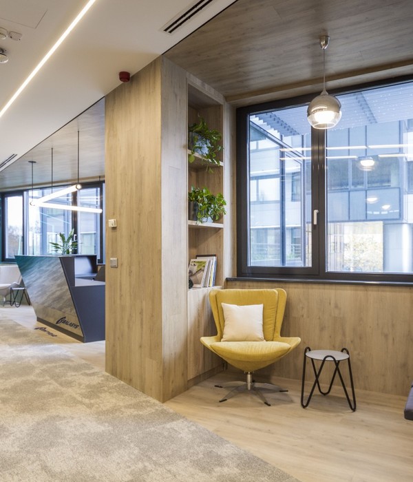
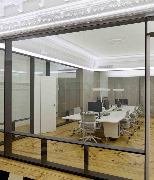
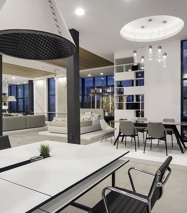
The Project is designed as an Office and showroom for Olka; Turkey’s main import supplier for numerous international sportswear brands. From the start; the biggest challenge of the Project has been dealing with the constraints of the available space. We had to create a comfortably spacious and sunlit in an office floor with a very low ceiling height and can only receive direct sunlight from one side.
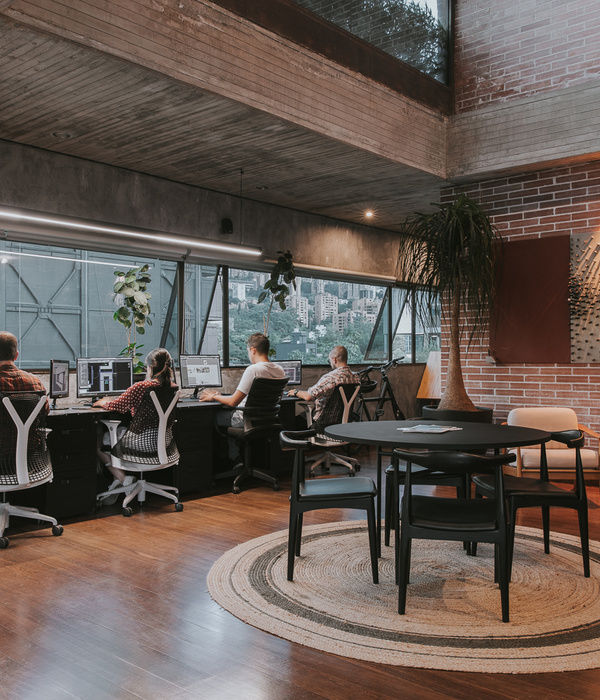
In this context; the first step was to create a a layout plan in which the enclosed rooms are located in the darker inner perimeter in order to bring the sunlight in trough the open Office without any obstacles. All the technical decisions were made in the very beginning with the aim of creating the highest ceiling height possible. While using glossy concrete surfaces to increase the sense of spaciousness in the vertical plane, we tried to create a more warm and tactile effect on the horizontal. The materials on these surfaces were handled with a tactile and an inductive approach.
Every single component on these surfaces such as a single natural terra-cota brick, or a wooden board is unique despite looking similar to each other. They come together to create holistic and rhythmic surfaces, symbolizing unique individuals coming together in one place crating the holistic Olka Team. Because of the remote location of the Office, there were no opportunities for the workers to go out for coffee breaks during the day. In order to amend this; the main break area is designed with a different approach than the rest of the office. This cafe acts as an actual branch of Grandpa, one of the leading third wave coffee franchises of Turkey. This provided a much needed escape from work for the Office residents, creating a feeling of “going out”.
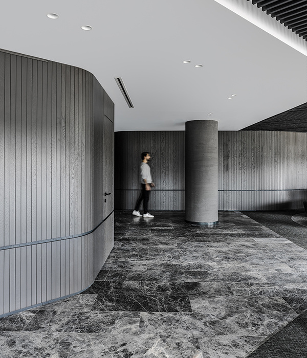
The showroom is placed in the darkest area of the Office floor. We tried to turn this apparently disadvantageous situation to our advantage. We created a dark background to the play of light. The light coming from the bright showrooms is filtered through wooden blinds and colored glass façades, overlapping and interloping in the dark corridors. Another tactile surface found its place here, in the Wall of the main showroom created from rough structure components.
In the end, we think that we have obtained an open, spacious and bright office space where office workers can work happily without feeling any disadvantages of the existing space and location. By handling materials in different textures and rhythm setups, we created an office space that can appeal not only to the eye but also to the "eyes of the skin" and manage to stand out with its tactile aspect.
{{item.text_origin}}

