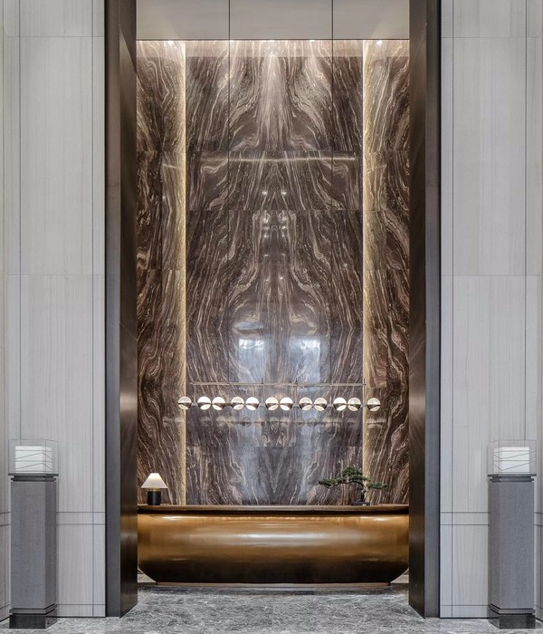
长沙龙皇长寿标燕窝店 | 红白交融的现代热带雨林
- 项目名称:龙皇长寿标燕窝店
- 空间设计:知白设计研究室
- 设计团队:周海飞,王子林,田静,况伟峰
- 灯光设计:石客照明
- 项目摄影:TT空间摄影
项目概况 · Project Overview
作为一个来自印尼的1974年创立的燕窝产品品牌龙皇长寿标,在新消费背景下,人们追求健康,渴望年轻时尚,线上线下体验结合形式,在推出了即食燕窝,现炖燕窝,燕窝露等产品,让燕窝成为一种精致便捷的生活方式。我们在区别于传统的中药铺售卖干燕窝的展示形式下,以全新颠覆的形象和方式,带给展示空间的全新体验。
As a bird’s nest product brand Longhuang Changshoubiao founded in 1974 from Indonesia, under the new consumption background, people are pursuing health, longing for youth and fashion, and combining online and offline experience. and other products, making bird’s nest an exquisite and convenient way of life. Different from the traditional Chinese medicine store selling dried bird’s nest, we bring a new experience to the exhibition space with a new subversive image and method.
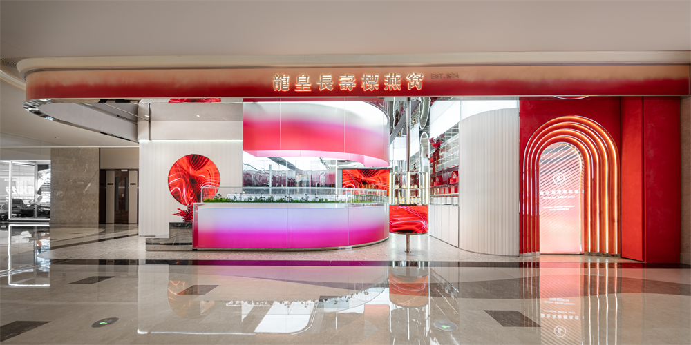
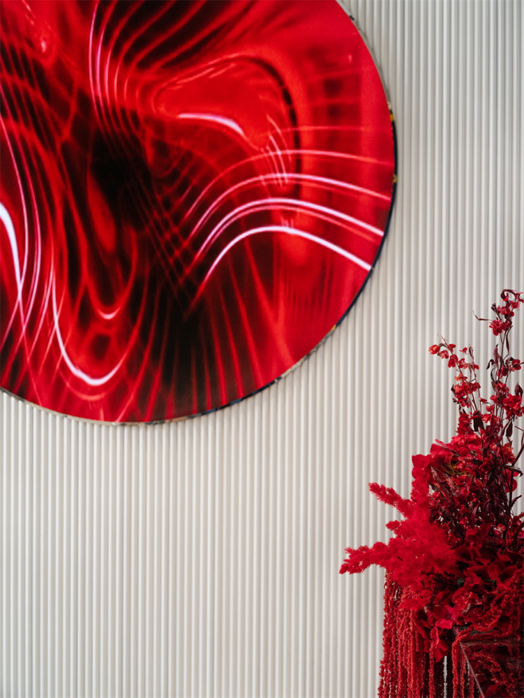
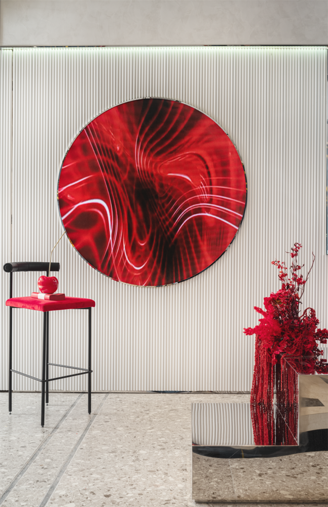
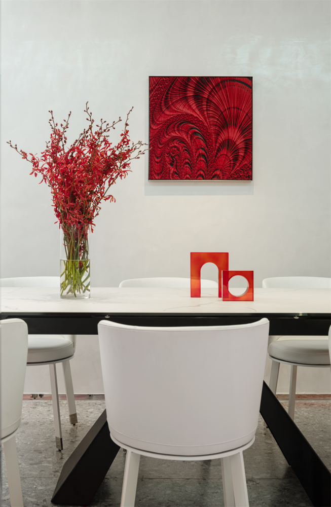
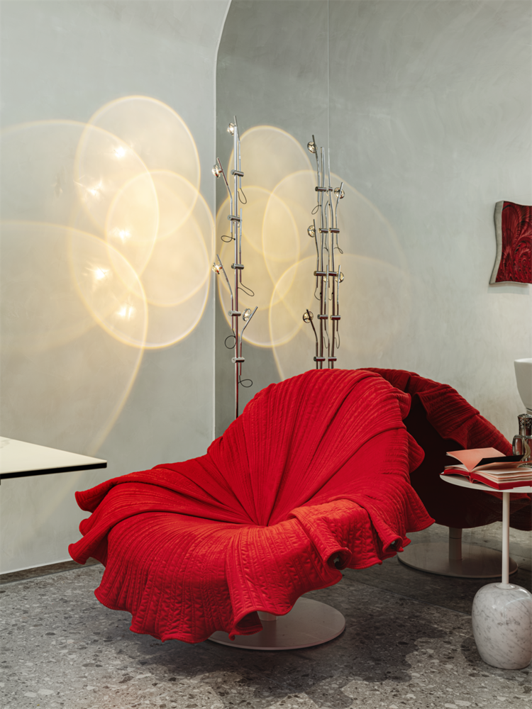
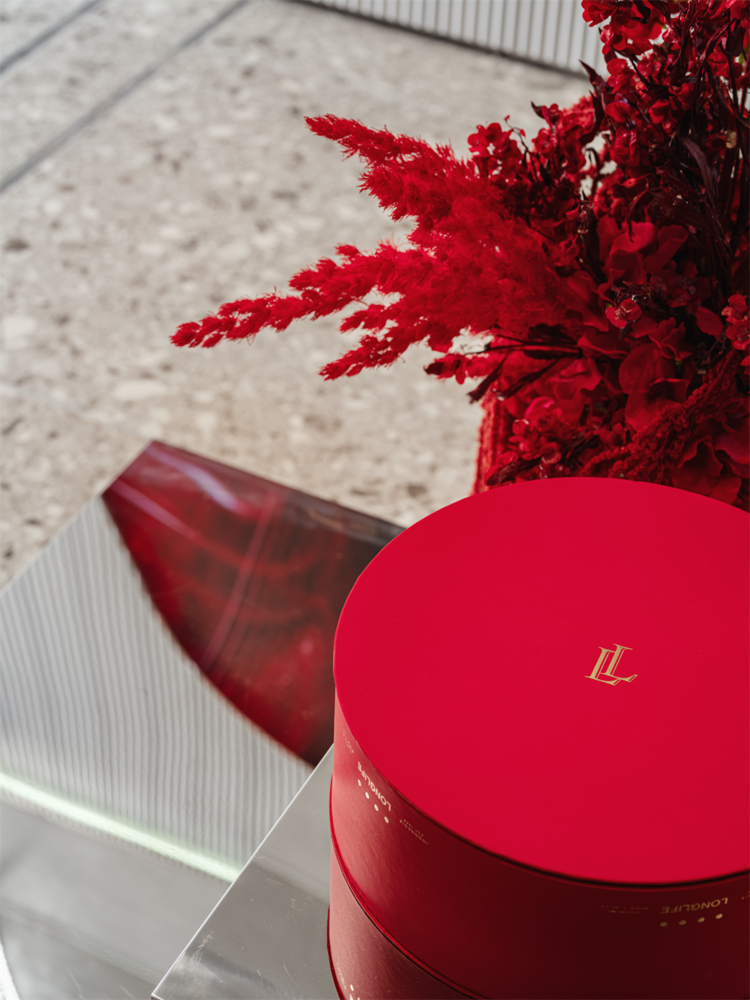
项目位于长沙运达中央广场购物中心中,在颜色上面我们选取了品牌的基调红色作为空间的主色调,结合了白色的作为空间的基底,空间“红”与“白”的交融、相互映衬,使其平衡、干净而纯粹。
The project is located in Changsha Yunda Central Plaza Shopping Center. In terms of color, we chose the brand’s keynote red as the main color of the space, combined with white as the base of the space, and the space “red” and “white” blended and contrasted with each other. Make it balanced, clean and pure.

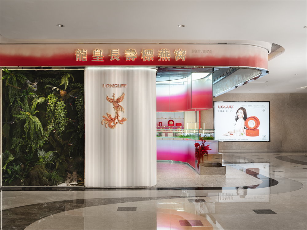
原始结构在位于商铺的主要展示面中有两根占地面积4.5m²的柱子,怎么展示主要的立面是主要面临的最大的问题。结合柱子的位置我们做了一个热带雨林的情景展示墙,展示了金丝燕的生活的场景。
The original structure has two pillars covering an area of 4.5m² in the main display surface of the shop. How to display the main facade is the biggest problem. Combined with the position of the pillars, we made a tropical rain forest scene display wall, showing the scene of the life of swiftlet. purely.

中岛做了一个弧形的岛台,用T台的表现形式来凸显整个空间的动线引导,结合沙盘内容展示了品牌生产基地印尼加里曼丹金丝燕屋的模型和现代化的工厂的制作流程和工艺,展现了燕窝的生产之路,从采摘,收取,清洗,加工,储藏,包装到运输,到最终呈现到客人手中的成品。
Nakajima made an arc-shaped island, using the expression form of the T platform to highlight the moving line guidance of the entire space. Combined with the content of the sand table, it displayed the model of the brand production base, Kalimantan Swiftlet House, Indonesia and the production of modern factories. The process and craftsmanship shows the production process of bird’s nest, from picking, collecting, cleaning, processing, storage, packaging to transportation, to the final product presented to the customer.
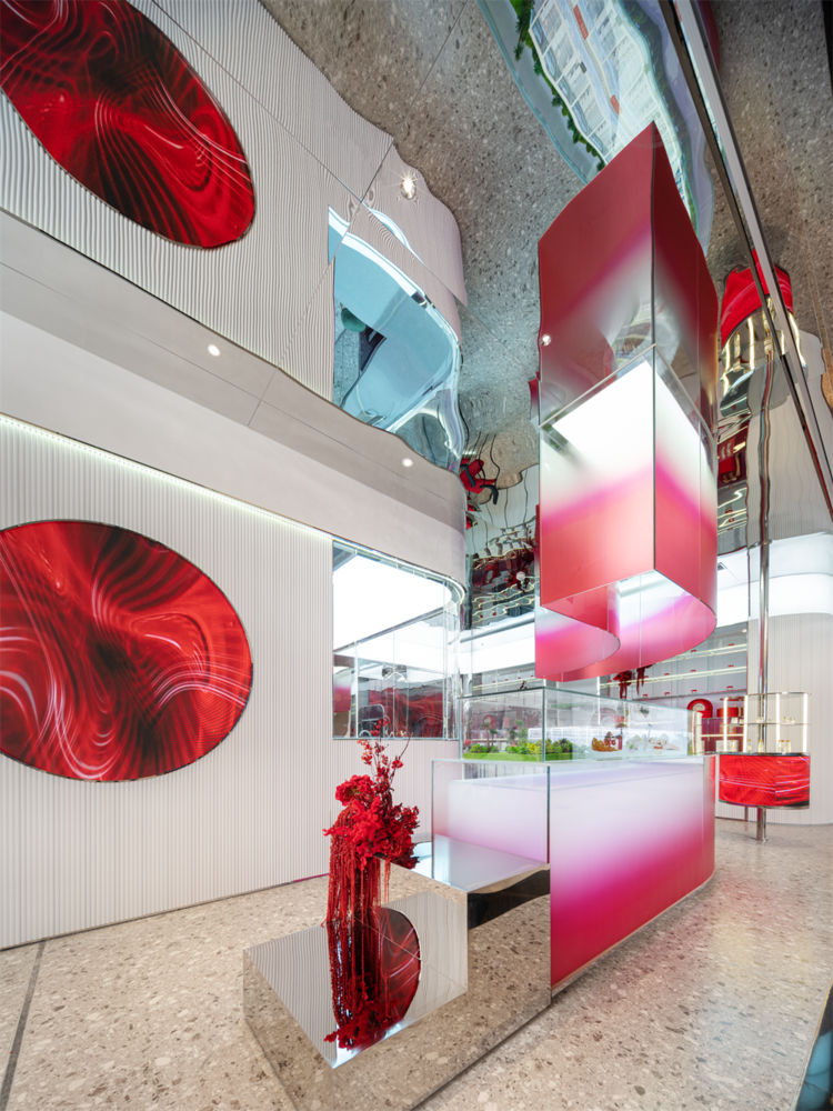
天花和部分墙面都用了镜面的不锈钢来视觉上拓展了空间的效果,金属的材料也体现了空间的现代感,玻璃盒子内置灯箱,红色到白色的渐变材质表现,契合了“白里透红”的理念,让更有美妆店的属性,也打破了对中药铺式的展示固有认知。
The ceiling and part of the walls are made of mirrored stainless steel to visually expand the effect of the space. The metal material also reflects the modernity of the space. The glass box has a built-in light box, and the gradient material from red to white is expressed, which is in line with the concept of “transparent in white”. The concept of “red” makes it more like a beauty store, and it also breaks the inherent cognition of Chinese medicine store-style display.
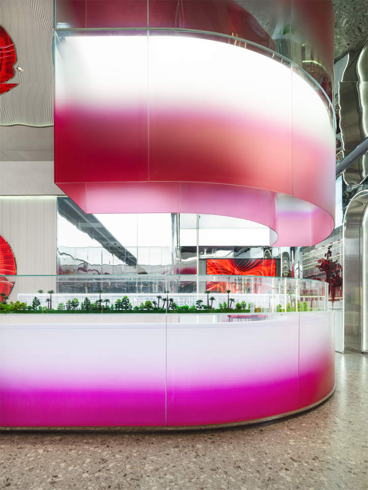
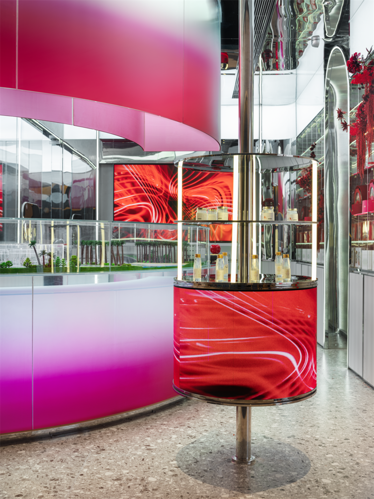
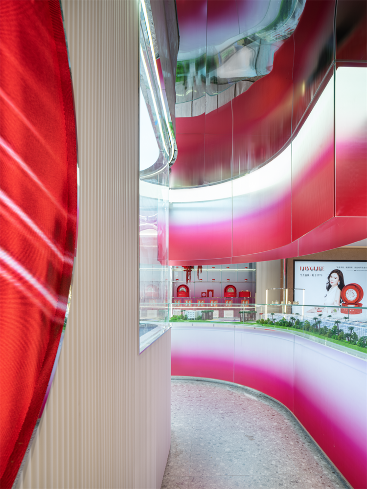
悬空的渐变玻璃界定了下面的空间的,与中岛相呼应,弧形的流线界定了客人步入的动线,在外立面狭小的开口体现了了店的记忆点。整面玻璃的柜子展示也分割了展示区域和VIP区域的,通透的材质的表达也最大限度的在小空间里最大化的利用空间,规避了空间的压抑感。
The suspended gradient glass defines the space below, echoing with the central island, the arc-shaped streamline defines the moving line where the guests step in, and the narrow opening on the façade reflects the store’s memory point. The whole glass cabinet display also divides the display area and the VIP area. The expression of transparent materials also maximizes the use of space in a small space, avoiding the sense of depressing space.
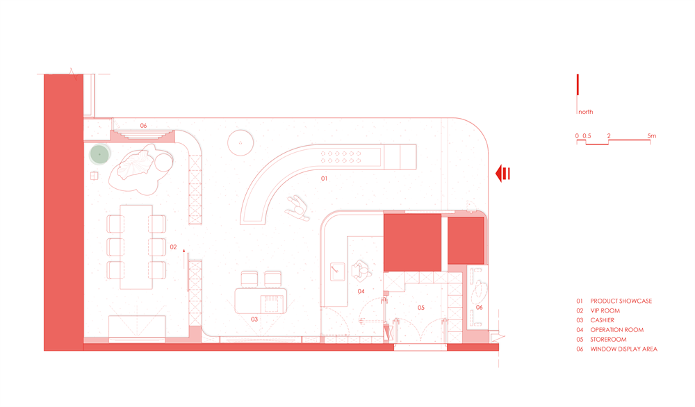
▲平面图,Floor plan © 知白设计

▲结构剖析,Structural analysis ©知白设计
项目信息——
项目名称:龙皇长寿标燕窝
项目地址:湖南长沙
建筑面积:72㎡ 设计时间:2021 .9
完成时间:2021 .12
空间设计:知白设计研究室
设计团队:周海飞,王子林,田静 ,况伟峰
灯光设计:石客照明
项目摄影:TT空间摄影
Project information——
Project Name: Dragon Emperor Longlife Bird’s Nest
Project address: Changsha, Hunan
Building area: 72㎡
Design time: 2021 .9
Completion time: 2021 .12
Space Design: Zhibai Design and Research Office
Design Team: Zhou Haifei, Wang Zilin, Tian Jing, Kuang Weifeng
Lighting Design: Shike Lighting
Project Photography: TT Space Photography


