Architects:NH Architecture, Warren & Mahoney
Area :97500 m²
Year :2021
Photographs :Simon Devitt, Barry Tobin, Sam Hartnett
Manufacturers : Parklex Prodema, Jura Limestone, The Tile People, ThermosashParklex Prodema
Builder :Fletcher Construction
Planning Consultant :Barker Associates
Project Manager :RCP
Civil Engineering :Tonkin and Taylor
Landscape :Landlab
Services, Lifting, Acoustic Engineering : NDY
Cost Consultants : RLB
Fire Engineering : Holmes Fire
Facade Engineering : Mott MacDonald
City : Auckland
Country : New Zealand
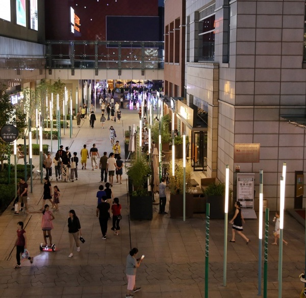
Turning the traditional idea of the ‘shopping mall’ inside out, Commercial Bay presents a new model for the retail typology: an open-air, laneway-based retail environment configured over three levels. The project embodies a spirit of generosity, creating two entirely new pedestrian routes through the city block, connecting transit nodes, and enhancing the pedestrian experience of the city center.
At the scale of the city, Commercial Bay seeks to build on Auckland’s emergent ‘sense of self as a laneway city – creating a globally unique laneway-based retail center that is the antithesis of the traditional inwardly focussed shopping mall. We wanted to create an open, connected, threshold-free environment where all felt welcome – turning the idea of the mall inside out.
This finds form physically in the design of a series of 6 individual buildings - rather than a homogenous podium - separated by lanes and the covered but open air environment; but also in the retail mix where we prioritized the experience of bringing people together with food and beverage over a traditional retail anchor.
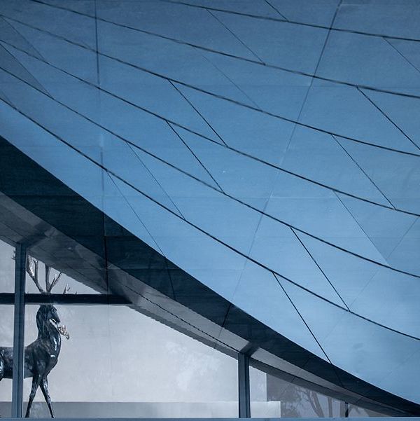
The design interprets the interior of the project as an extension of the external architecture - working with the existing street levels to create ‘multiple ground planes’ and deliberately blurring the lines between inside and out. The project delivers a simple and legible primary internal circulation sequence orientated by lanes, enabling a sense of urban ‘discovery’ with surprising ‘found’ spaces located within the building. We sought an outcome that was deliberately urban in its materiality – raw and tactile. We utilized a restricted palette of high-quality materials – stone, steel, concrete, and glass contrasted with gold aluminum highlights. Conceptually, we sought to create a series of related but individual ‘buildings’ each with its own identity.
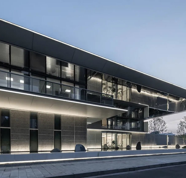
The external materiality wraps into the lanes, reinforcing the idea of the central lane bisecting city buildings. External lighting quality creates depth, shadow, and texture; planting is extensively integrated throughout. The result is a high-quality civic experience that acts as a consistent ‘frame’ for the individual design expression of the operators within.
▼项目更多图片
{{item.text_origin}}

