Lunet Signature Store | 温馨沉浸式的眼镜购物体验
Lunet is a brand that focuses on creating affordable eyewear with a strong accent on quality and design. Since their launch in 2019 the aim was a complete, effortless and seamless customer experience. At first active exclusively online, then transitioning to a more direct customer connection with the help of the Home Try On platform, allowing costumers during the pandemic period to order for free the models they liked and try them on before purchasing.
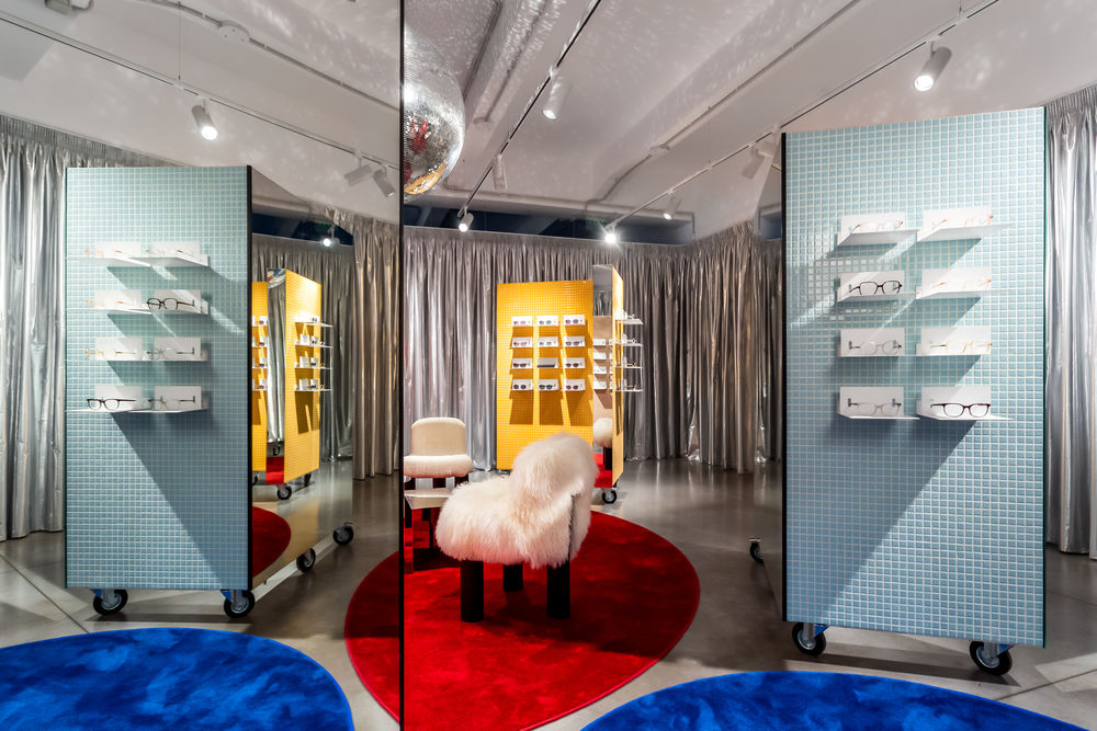
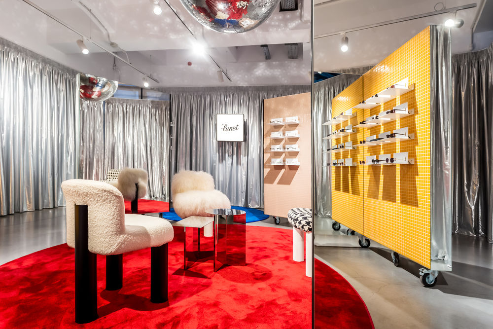
In a world slowly coming out on the other side of the pandemic to a new reality, human interaction and the connection with one another is more important than ever and this is how the brand's first signature store was born. Space is a visual continuation of Lunet's aesthetic, a playful and colorful universe meant to create an immersive experience, a place of friendly interactions.
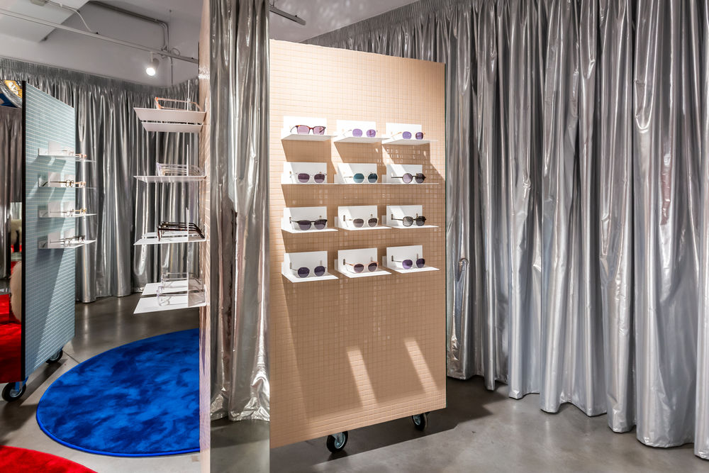

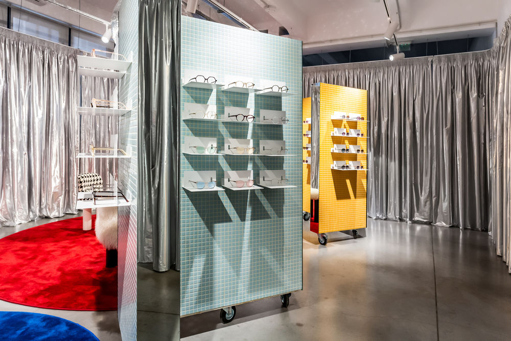
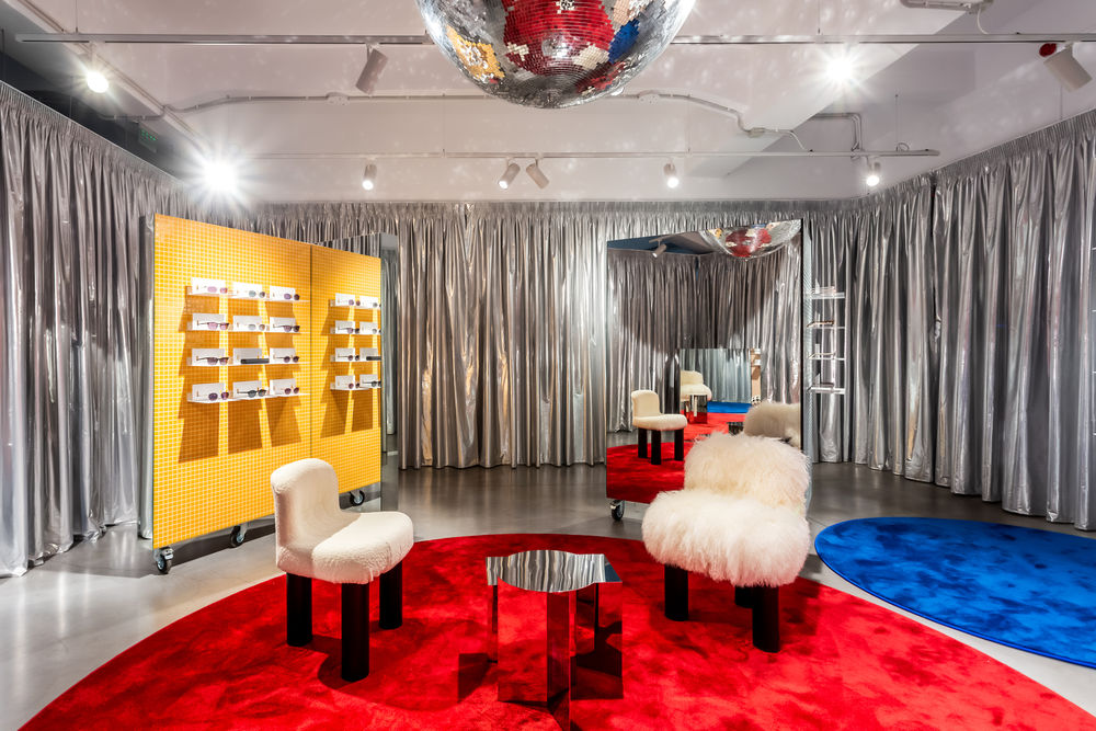
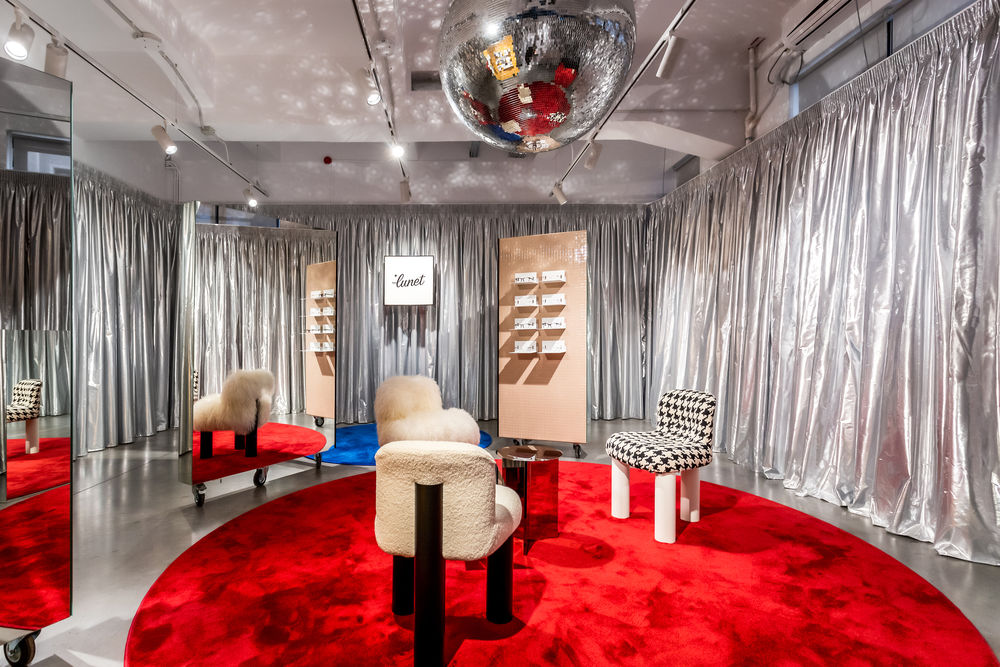
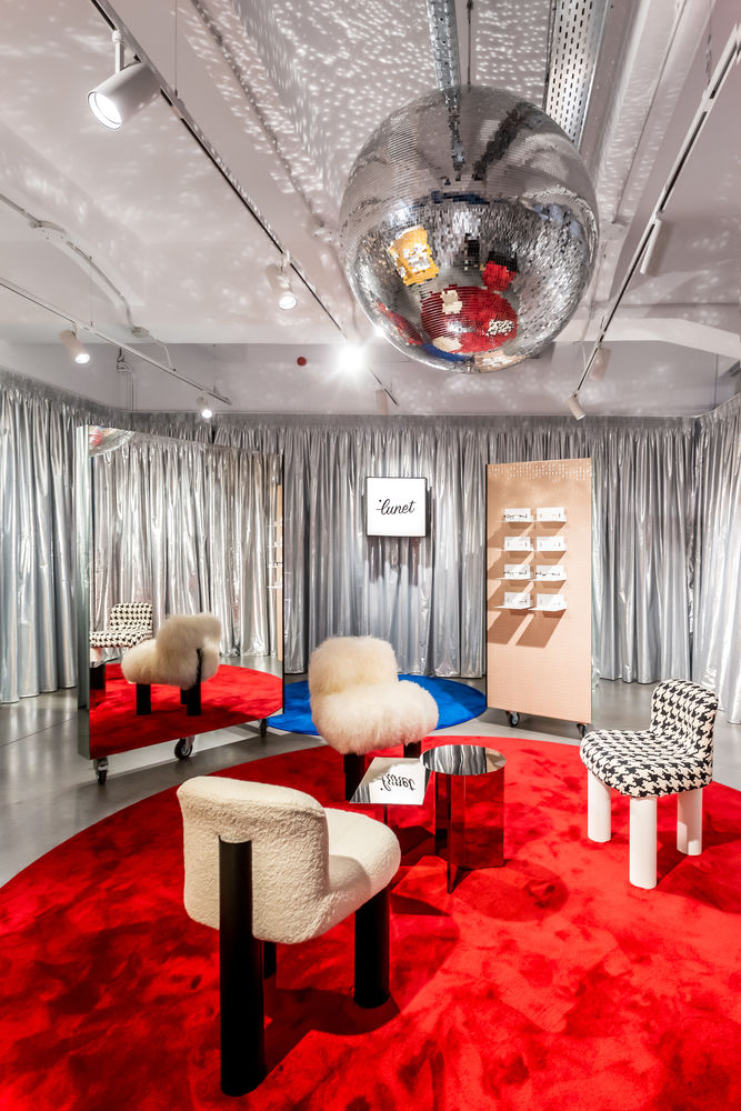
The concept behind the design was to create a space that is warm and welcoming, where the experience of choosing a pair of glasses, an accessory so important that can change the entire architecture of the face, becomes an intimate, relaxed one. The Lunet Signature Store design steers away from the typical austere, clinical-looking space usually associated with eyewear locations and aims to provide a familiar, calming experience: a colorful living room that allows both socializing and intimate discovery. Space tries to be as mindful as possible and uses only the essential elements.
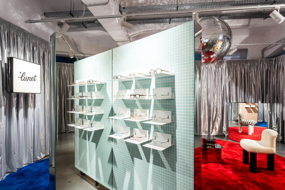
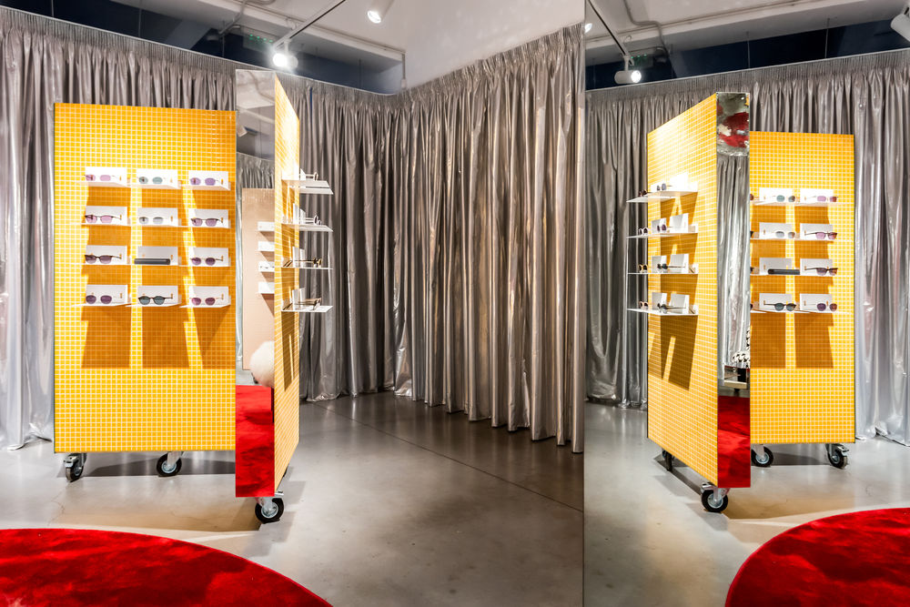
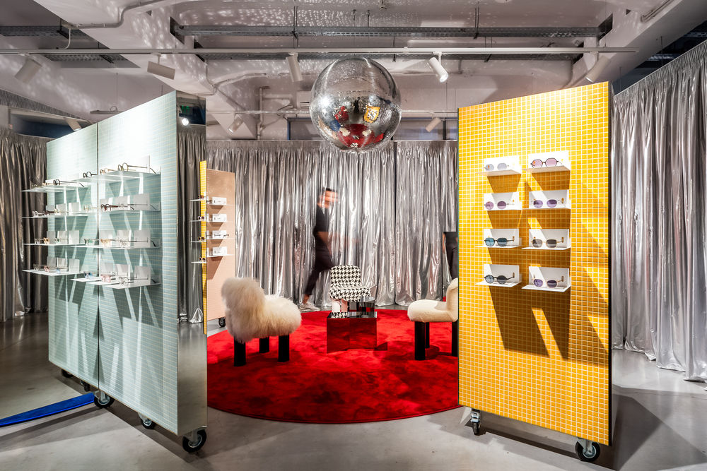
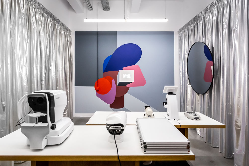
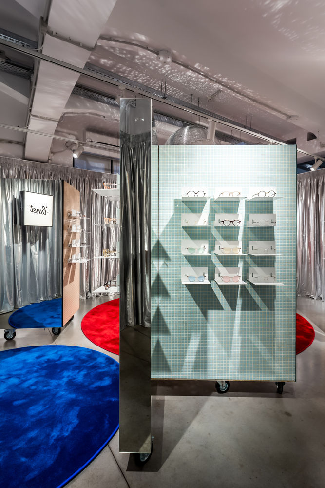
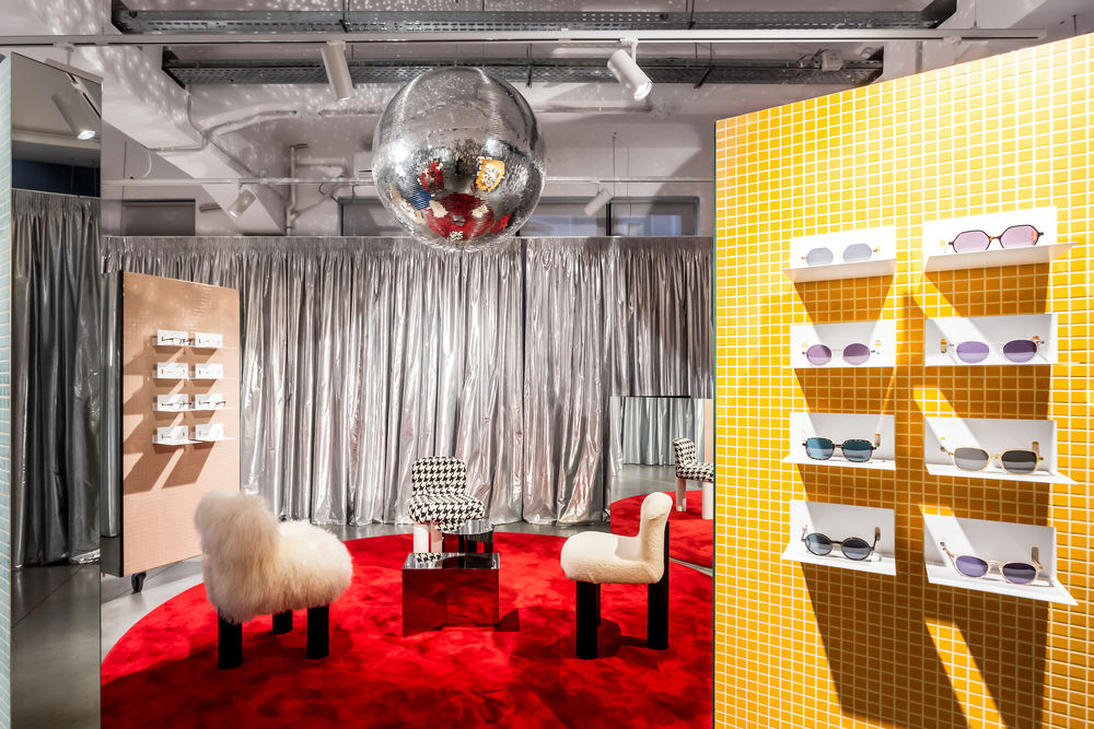
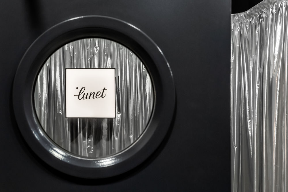
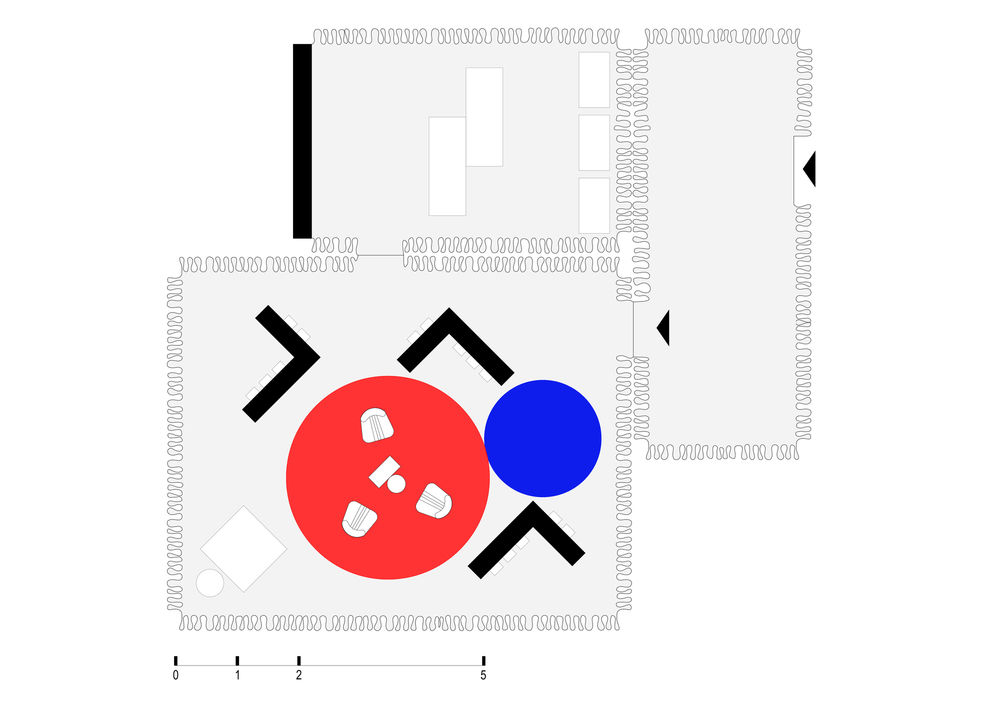
The physical environment is left untouched in order to have as few interventions on the building and also to minimize the building of unnecessary walls or partitions. Instead of fixed walls, the store uses a series of mobile curtains that absorb the sound and divide the space. In the center of the space lies the lounge area, a relaxed conversation space surrounded by the eyewear displays. Rather than having the displays on the perimeter of the space, intimate trying stations, cladded with colorful tiles, have been created. Multiple customers can try on glasses simultaneously and have a private area with enough personal space, adding to the tailored, client-focused experience. The interior is colorful with metallic shimmer and an array of
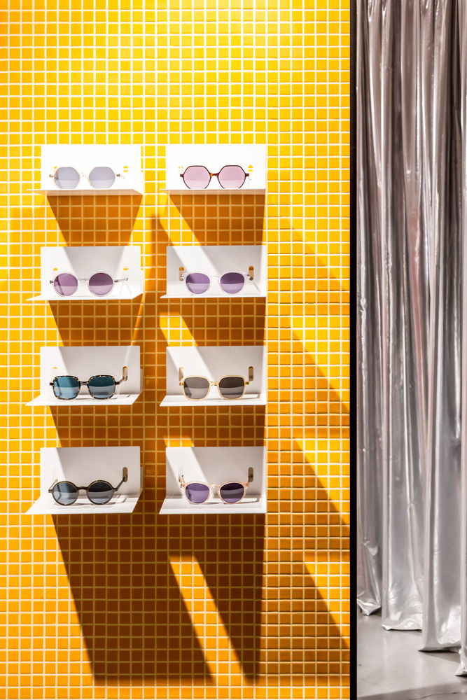
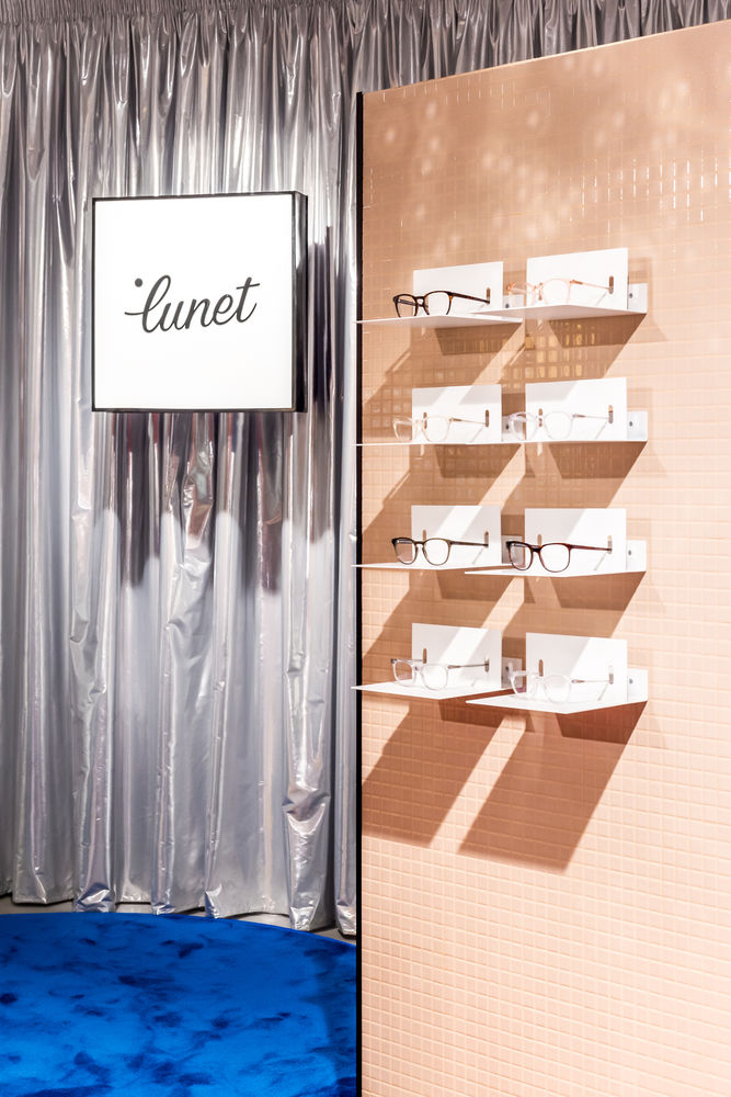
different textures focusing on quality design. In the relaxation area the Botolo armchair by Arflex, designed by Cini Boeri in 1973, an icon synonymous with timeless design, takes center stage. The store is coherent with the brand and with the customers’ needs, reimagining a new type of eyewear experience, one that focuses on emotions and human connection, making the purchase of glasses a memorable, positive interaction.
