01
关于设计
About the design
“我觉得装修这件事情是对自己前二三十年中,对于生活美好的向往、对美的理解、对生活空间的定义,一个很好的凝结。在设计这个房子的过程中,和设计师会不断有新想法的碰撞,看着房子慢慢成型,觉得自己所有对未来的想象越来越清晰,自己之前生活的想法与理解,也都会最终凝结到设计中。”
02
玄关
Entrance door
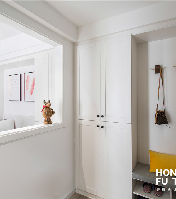
入户玄关半遮半掩,透过线性聚焦指引方可窥见室内一隅,墙顶地一体构成的整体感,搭配温润的木制元素,创造出多元而自由的居住空间。
The entrance hall is half-concealed, and only one corner of the interior can be seen through the linear focus guide. The integrated sense of the wall and the ground,combined with the warm wooden elements, creates a diverse and free living space.
03
客厅
Living Room
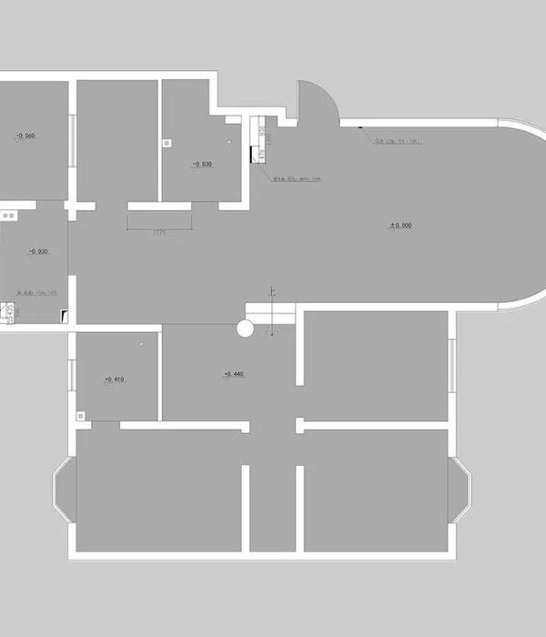
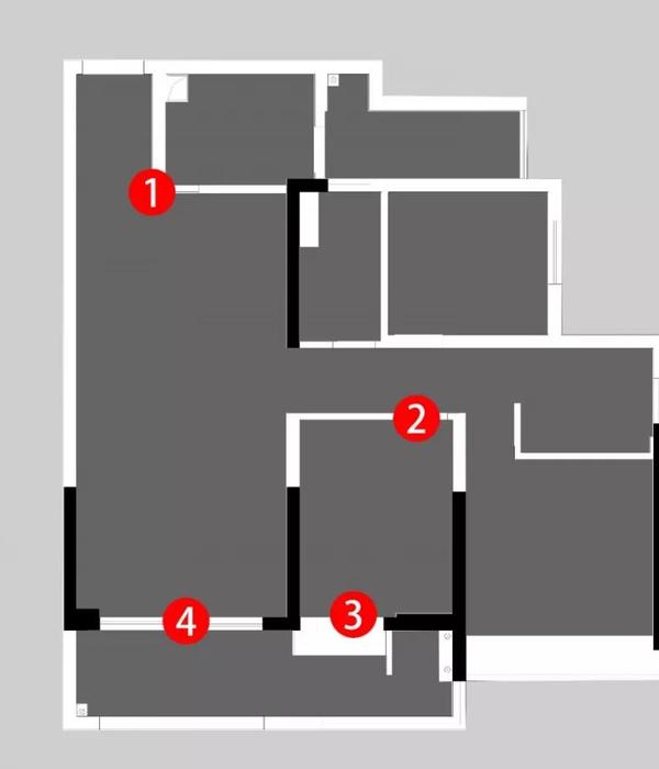
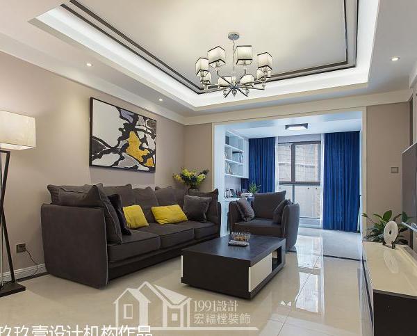
在“传统”布局横行的当下,为了给业主提供不一样的居住体验,我们将室内非承重墙体全部拆除,空间排序在被打破之后,让彼此之间的关联都发了质的变化。
At the moment when the “traditional” layout is rampant, in order to provide the owners with a different living experience, we demolished all the indoor non-load-bearing walls. After the spatial sequence is broken, the relationship between them has undergone a qualitative change.
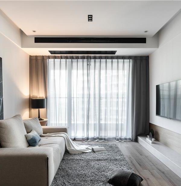
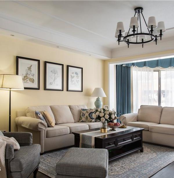
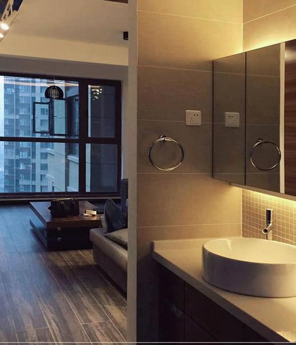
通过抬高地台与下沉顶面的手法,辅以超长地板加以修饰,在开放式空间中搭建出一个结构分明的休闲区。
By raising the platform and sinking the top surface, supplemented by the extra-long floor for modification, a well-structured leisure area is built in the open space.
没有墙体的阻隔,室外自然光可以通过窗户,洒进室内的每一个角落,材质的纹理、设计的细节以及体块之间巧妙的衔接过渡手法,让家中的小细节都显得独一无二。
Without wall barriers, outdoor natural light can be spilled into every corner of the room through the windows. The texture of the material, the details of the design and the ingenious transition method between the blocks make the small details in the home appear unique.
窗户就像相机取景器,在家中所见的每一帧风景,都拥有不可复制的美。
The window is like a camera viewfinder, and every frame of scenery seen in the home has an unrepeatable beauty.
过道中整面的储物柜与弧形柱体,其实是衣帽间外置到客厅区域的巧妙设计,柱体背面的镜子不仅能整理仪容,折射效果也让空间变得更具想象力。
The storage cabinets and arc-shaped columns in the aisle are actually a clever design from the outside of the cloakroom to the living room area. The mirror on the back of the column can not only tidy up the appearance, but also make the space more imaginative by the refraction effect.
04
餐厅
Restaurant
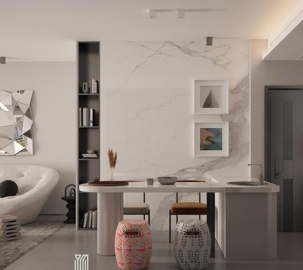
通过体块与色彩的纯粹衔接过渡,两侧窗户照射进来的流动光影,使得材质肌理之间的明暗对比尤为明显,运用不可捉摸的光影划分出不同功能区。
Through the pure transition of structure and color, the flowing light and shadow from the windows on both sides make the contrast between the light and dark of the material texture particularly obvious, and the elusive light and shadow are used to divide different functional areas.
05
主卧
Master bedroom
通过地台将睡眠区域抬高,让每次休息都充满仪式感。硬朗线条与柔软材质的交织,一切都是自己喜欢的模样,一切都回归到生活根本。
Raise the sleeping area through the platform, so that every rest is full of ritual. The interweaving of tough lines and soft materials makes everything look what I like, and everything returns to the fundamentals of life.
06
次卧
Second bedroom
席地而铺的随性慵懒感,无需任何繁杂装饰,这便是一个纯粹的休息空间。
The casual and lazy feeling of laying on the ground without any complicated decoration, this is a pure resting space.
07
卫生间
Bathroom
{{item.text_origin}}

