BuckleyGrayYeoman 重塑英国 Wickhams 部门商店,融合历史与现代设计
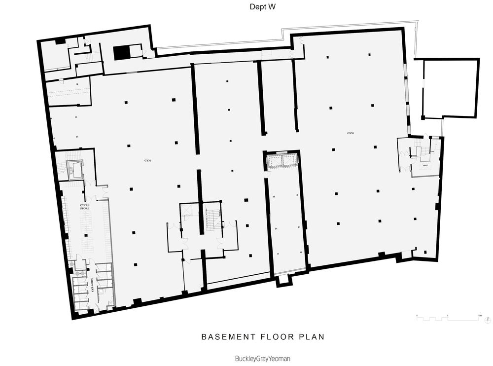
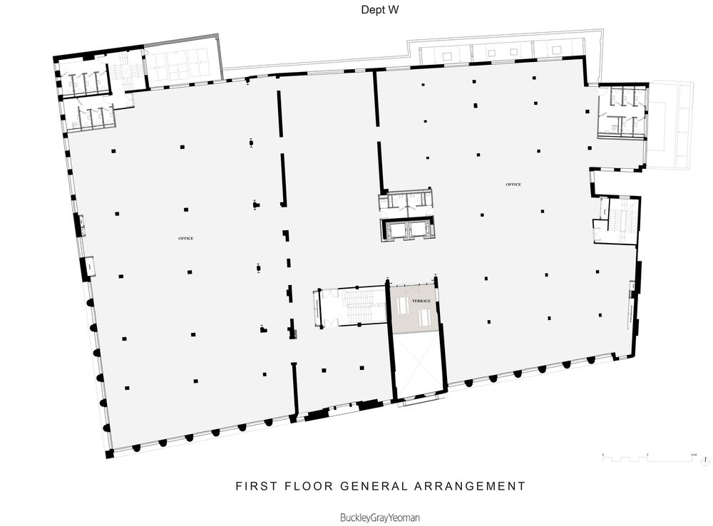
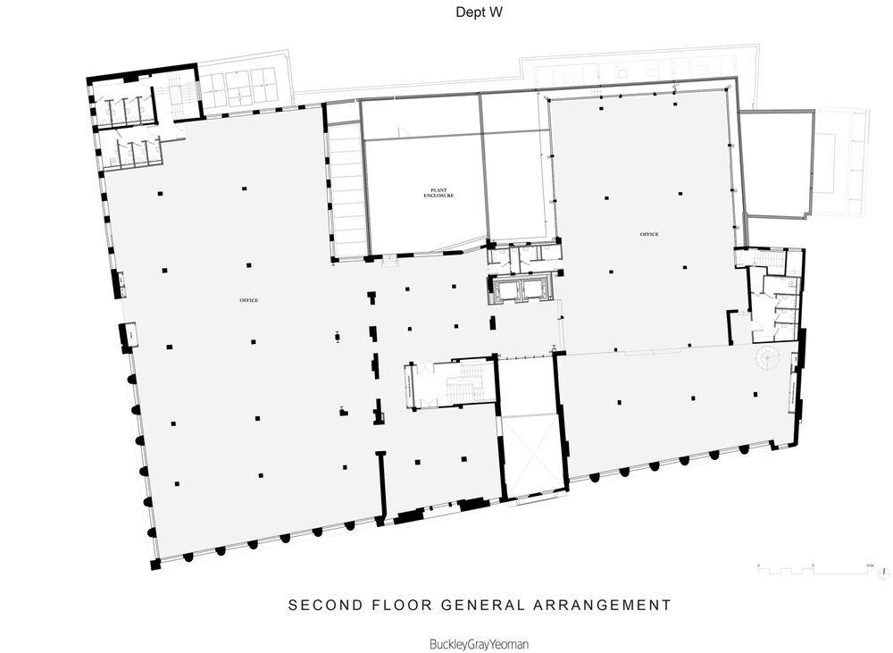
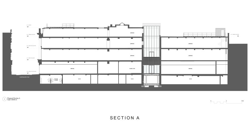
BuckleyGrayYeoman has been involved with design proposals for the former Wickhams department store since 2012. Aware that that this city-fringe neighbourhood would attract renewed interest with the opening of the Elizabeth Line station at Whitechapel, our client (Schroders Real Estate) sought to restore the Wickham’s building to its former grandeur, reworking the space to suit a mixture of uses including offices on the upper floors and retail facilities at street level. We were asked to carry out an extensive refurbishment of the building to create a high-quality and refined office space that was sympathetic to the building’s heritage.
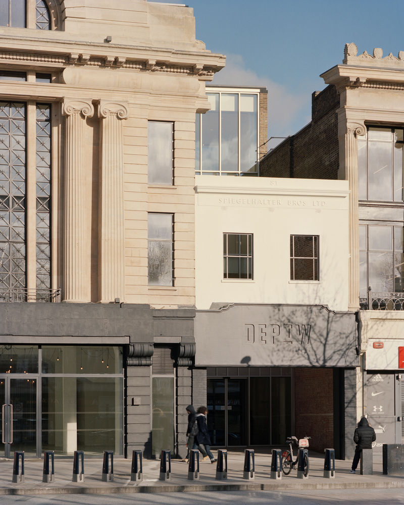
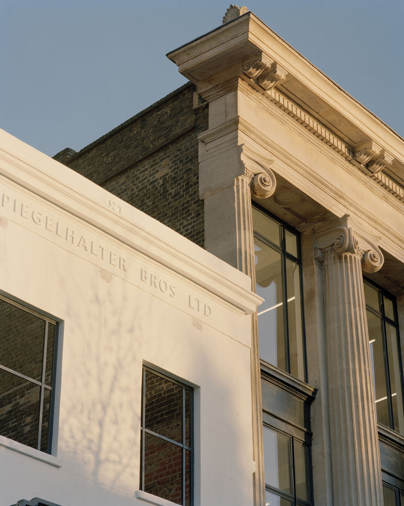
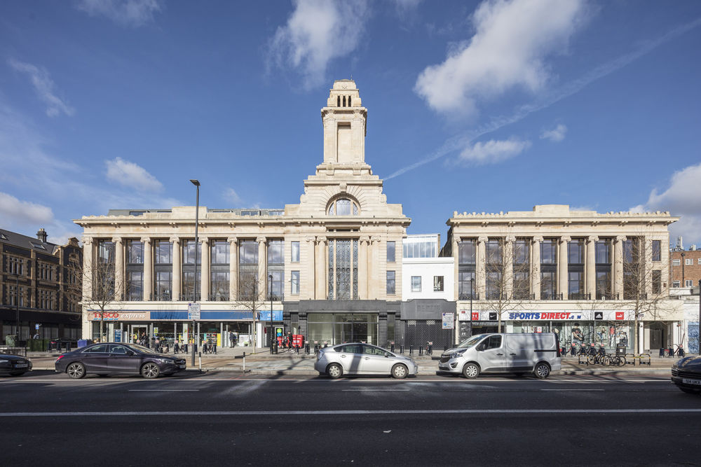
The building’s broken façade is the result of the family-owned Spiegelhalter jewellery store refusing to relocate at the time of the building’s development in the 1920s. Consequently, the ‘Selfridges of the East’ was built as an irregular beaux-arts building with a gap in its centre. Like many in the local and extended community, we loved the David and Goliath story of Spiegelhalter family versus the Wickhams. We recognised an opportunity to celebrate the history of the building by retaining the holdout unit, making it the new heart and soul of the building rather than the thorn in its side.
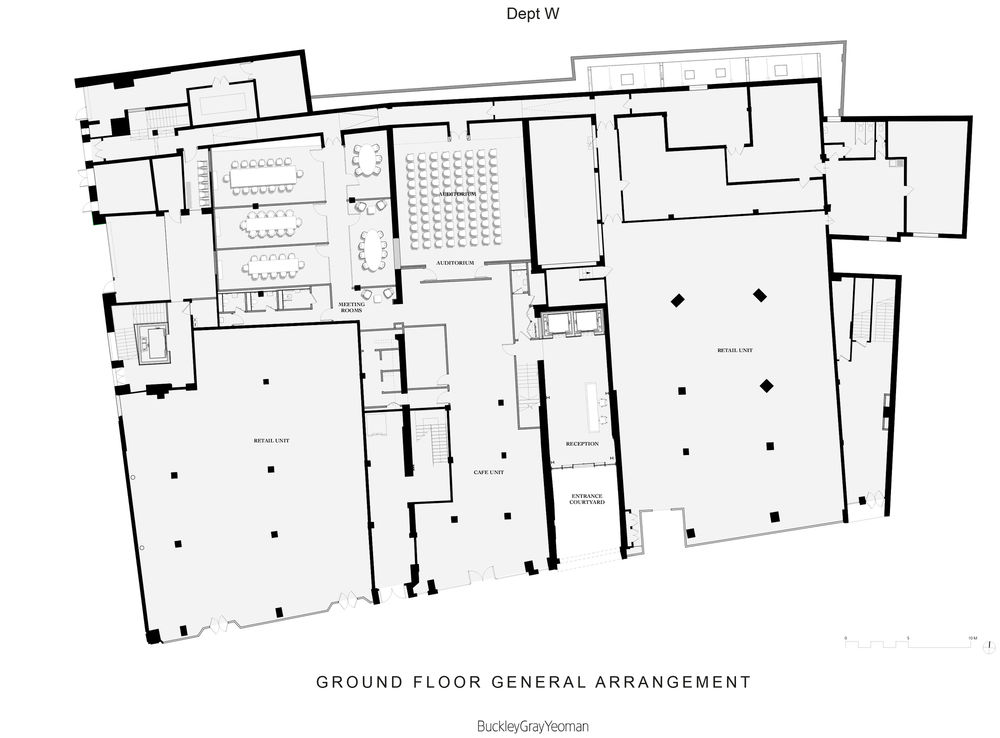
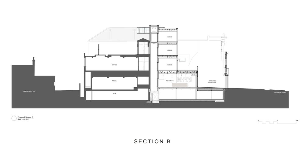
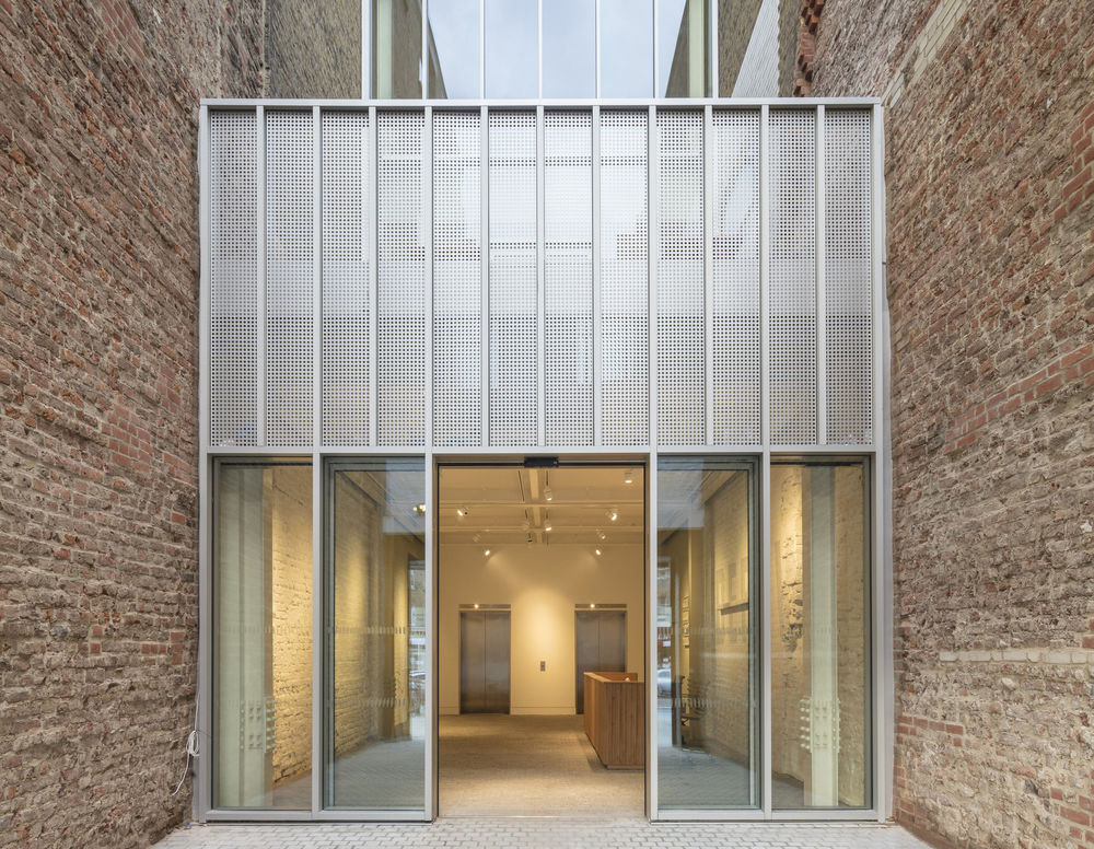
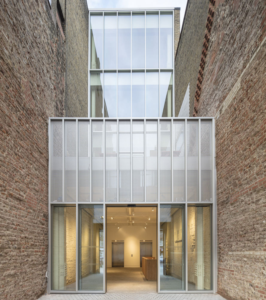
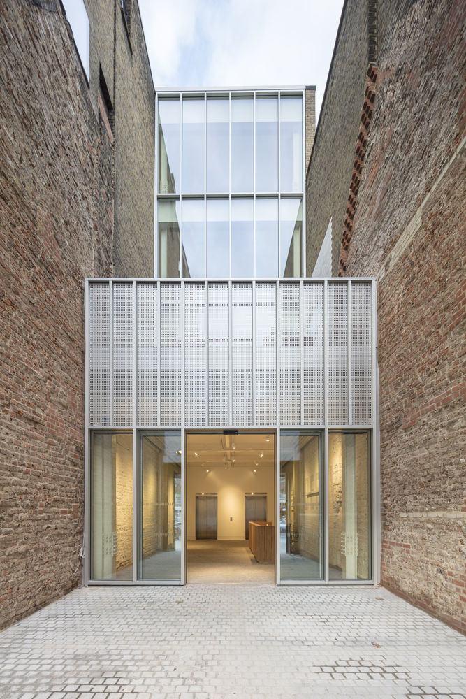
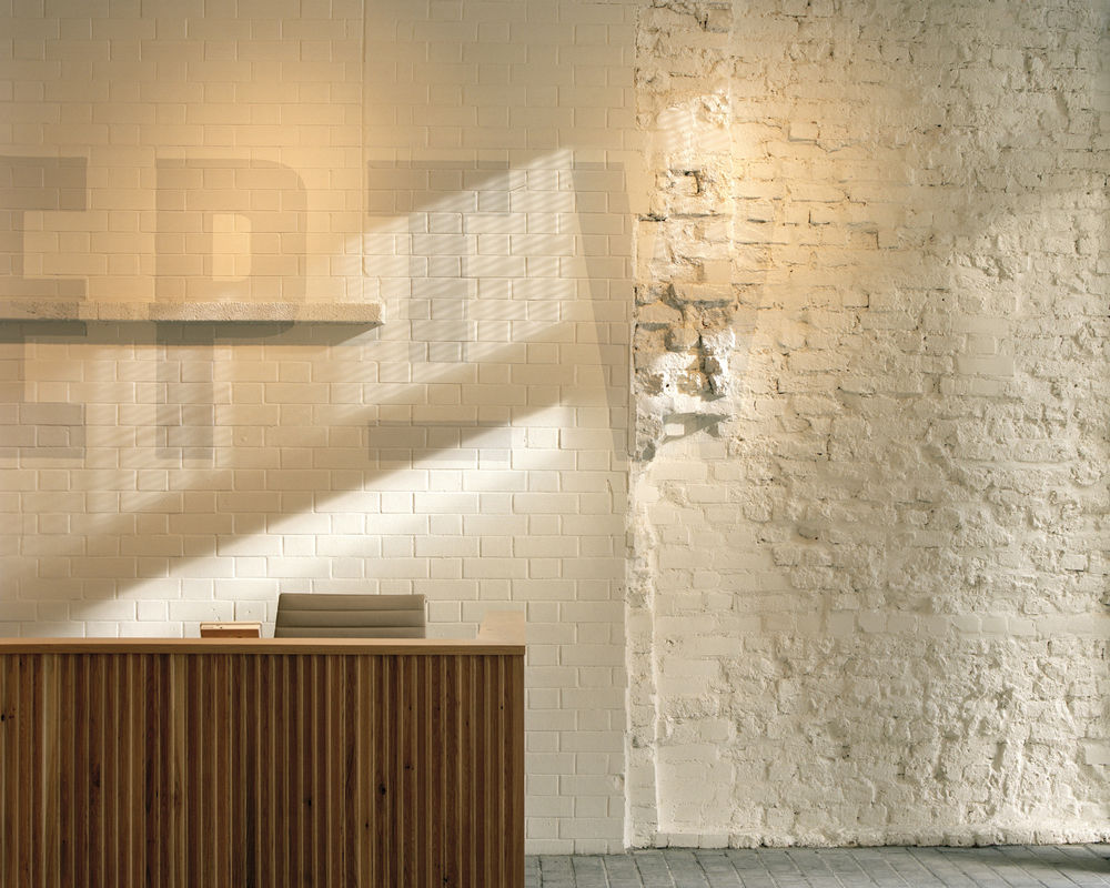
The design works within the existing fabric of the building’s history to create a modern new design which has radically improved the appearance and layout of the building. The existing and deteriorated structure meant that the original façade was badly in need of refurbishment. The original stonework façade has been repaired, removing pipework and other services that have been added over time. On entry, the materials of the new intervention - silver cladding panels and the colour of the glazing - were selected to contrast with the roughness of the existing brickwork. The design for the rest of the building followed a similar ethos: retaining and restoring the building’s quirks to allow the occupant to discover and experience its character.
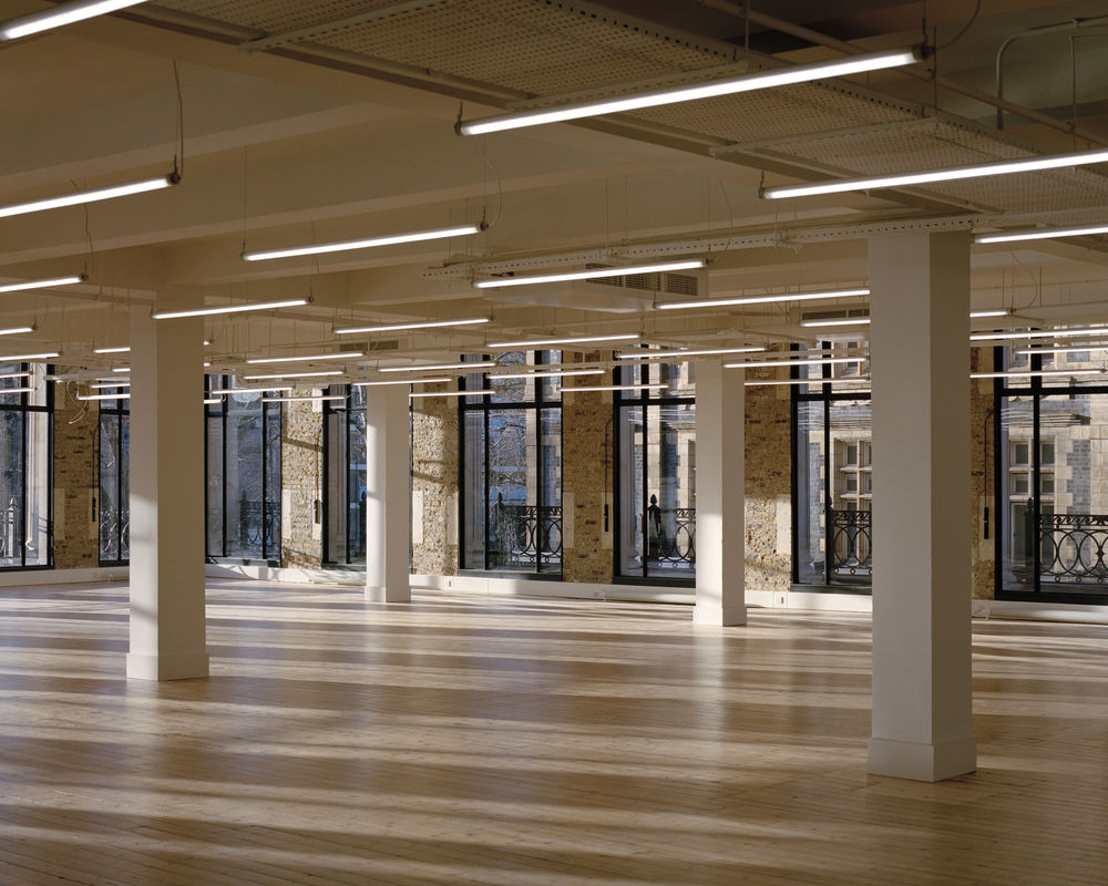
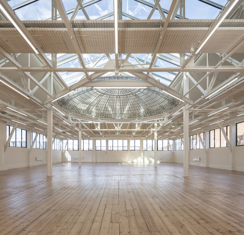
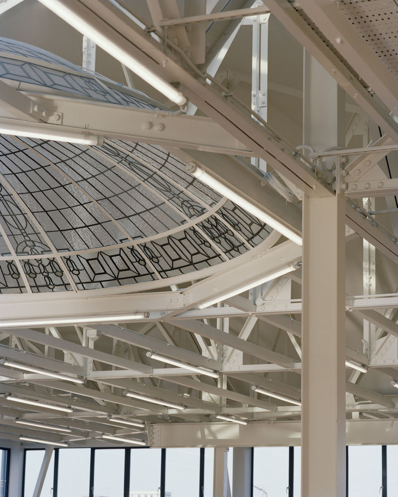
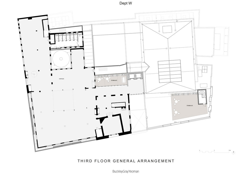
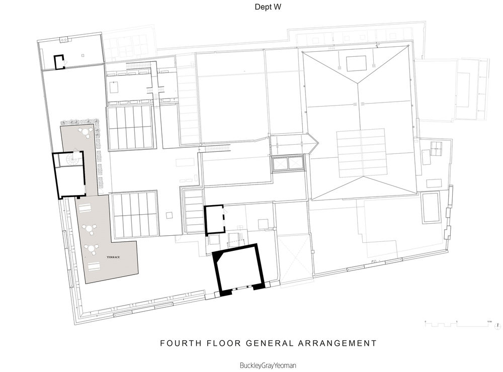
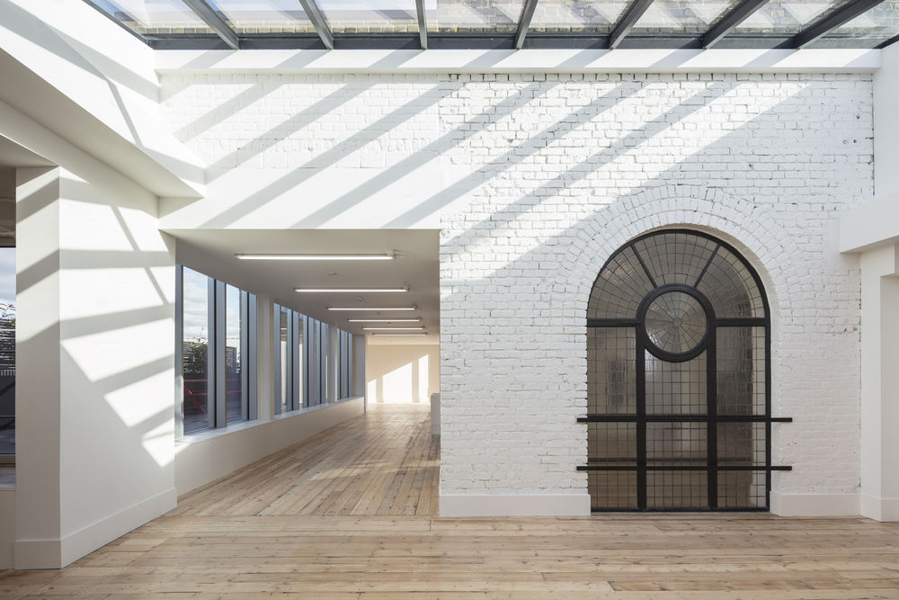
The third-floor has been remodelled with a sensitive glass infill, creating a continuous office floor. Outdated office elements and inefficient services have been stripped out and a natural palette retained to provide a blank background onto which the new tenants can project their own identities. This ‘under-designed’ approach allows the fabric of the building itself to be the main story. Features such as the original hardwood floorboards, balustrading, and domed glass ceilings have been sensitively retained throughout the building. On the ground floor, the building’s three retail units have been upgraded, with new steel framed windows and discreet signage more in-keeping with the original design of the building.
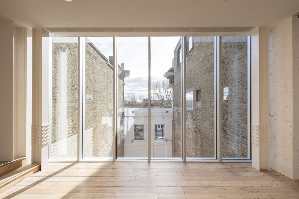
Community consultation and a carefully-managed planning process has resulted in a superior scheme which achieves its function without losing any of the building’s rich character and history. The Spiegelhalter shop is now the entrance through which all of the users pass on their way to the reception and core space behind. The original hanging façade, retained with a ghost of the original signage in its render, acts as both a relic of the building’s past and a signpost on the Mile End Road.
▼项目更多图片
