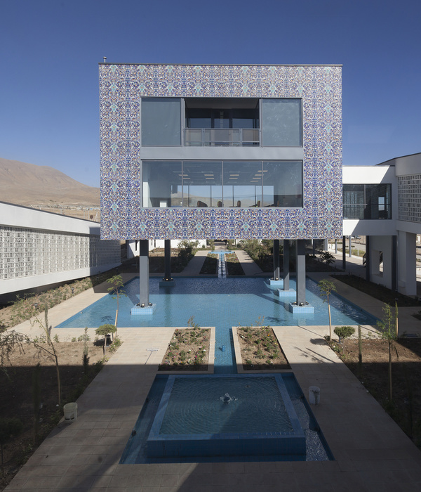
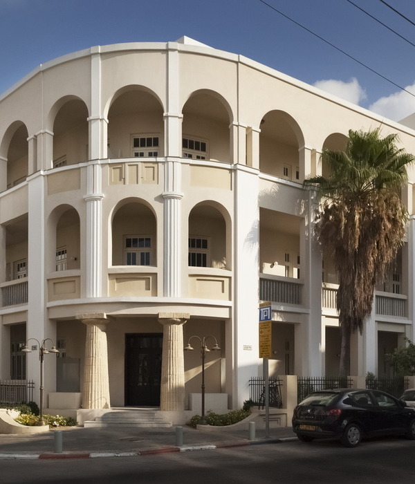
Switzerland HCP Office and Conference Building
设计方:ZüstGübeliGambetti
位置:瑞士
分类:办公建筑
内容:实景照片
图片:22张
摄影师:Valentin Jeck
这是由Züst GübeliGambetti设计的HCP办公与会议大楼,位于瑞士苏黎世。该建筑采用了细长的形态和阶梯式的建筑体块构成,外观极具标识性,是人们从市中心来到这座校园科学城时所看到的第一座建筑。它与毗邻的化学大楼不同(没有隶属关系),建筑高度比较低,与地面的接触更加充分。建筑师巧妙利用了场地地形,为这个200米长的建筑开发出了一个横断面,使其只需要一部电梯就可以服务于各个不同的楼层,同时可以形成更多的功能性空间和平台。建筑外观使用了棋盘式的立面装饰,突出了建筑的雕塑感,并起到了平衡作用,同时还确保了模块化的方式,更具灵活性。
译者:筑龙网艾比
From the architect. All the client initially asked for was a temporary, off-the-shelf solution to an acute lack of space. But sometimes the least promising of circumstances can give rise to architecture that is truly compelling, from both a financial and a design perspective. At least that’s what ZüstGübeliGambetti thought upon reading the ETH Zurich’s competition brief. To the young firm, the proposed program seemed to be a quick fix, the opposite of a sustainable solution. Yet they were drawn to the idea of contributing their own progressive architectural statement to the Hönggerberg—Zurich’s Mt. Olympus of architecture. Now their winning proposal stands on that very site, three times as large and three times as solid as the container village original- ly anticipated by the client. Moreover, for its size, it is the most cost- effective structure ever built by the university.
With its elongated shape and stepped massing, the iconic HCP building marks the start of the Science City campus for all who approach from downtown. In deference (though not subordination) to its architectural older brother, the adjacent HCI chemistry complex, the new arrival lies low and hugs the ground. ZüstGübeliGambetti make clever use of the site’s topography, developing a cross section for the 200-metre long project that requires only a single lift to serve its various floors. As an added bonus, this sectional solution generates multi- functional covered spaces and terraces. Flanked on the one side by the towering HCI building and on the other by expansive views, these out- door areas attain a careful equilibrium between enclosure and openness.
In its entirety, the building represents an intelligent synergy of economic and architectural considerations. On the outside, the wrap around chequerboard façade accentuates the balanced volume’s sculptural qualities while ensuring flexibility of use with its modular, repeat- ing open and closed elements. On the inside, the radically horizontal layout encourages communication and allows for efficient floor plans. Organizational efficiency is complemented by operational efficiency: the building taps into the campus’ ‘anergy grid’, an innovative system for harvesting, storing and distributing low-grade energy, and relies on a common-sense low-tech building services strategy for carbon-neutral energy delivery and ease of maintenance.
瑞士HCP办公与会议大楼外部实景图
瑞士HCP办公与会议大楼平面图
瑞士HCP办公与会议大楼立面图
瑞士HCP办公与会议大楼剖面图
{{item.text_origin}}

