Architect:WALA
Location:Melbourne VIC, Australia; | ;
Project Year:2014
Category:Shops
The design of the new addition to the Luxbite family, patisserie
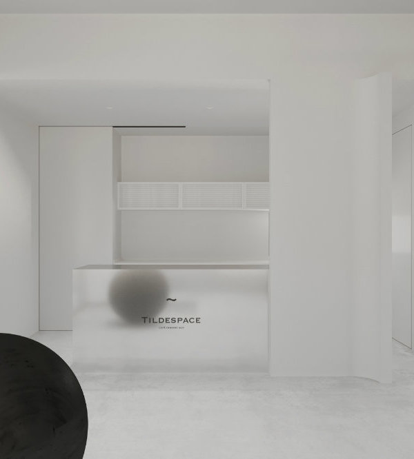
"T by Luxbite", aims to show that the best things can come in small packages, just like their pastries within. The overall design focuses on the presentation and quality of the shop’s unique products; complementing them without overshadowing them.
The shop's name is derived from their sale pastry of choice, tarts. Similarly, the meticulous interior design draws inspiration from the intricately crafted tarts. The shop's 19sqm ground floor corner location along Flinders Lane required a stronger emphasis on shop-front prominence, and maximizing the use of all available internal space.
The owners required 5 separate purpose-built fridges to fit within the shop's footprint. Inspired by cafes in Japan (which the owners adore!) where creative use of small spaces permeates through the design, a clever layout ensures that all kitchen equipment were well located for staff to work comfortably. The result is also a more-than-generous amount of storage throughout. The minimalistic approach continues with a simple material palette, coupling with straight geometries to achieve a regulated a sense of order.
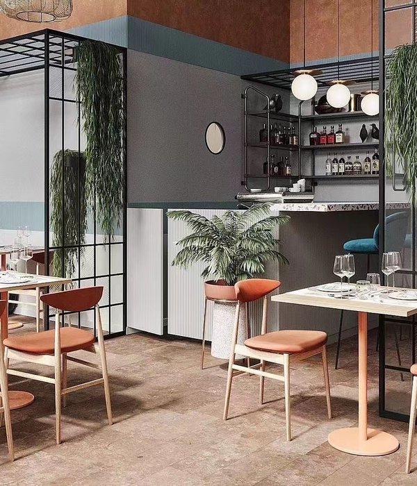
Overhead steel "cages" wrap from the ceiling and walls to conjure a sense of layered depth. This feature works in tandem with dramatic lighting (via striplights and suspended globes) to lend a sense of occasion to the space. An adjacent full-height mirror serves to not only to create the illusion of an enlarged space, but to also mirror the steel cages to display the letter "T", thereby reinforcing the shop's brand.
Despite the small footprint, the floor space has designated front and back-of-house areas where tarts are made in-house. However with no space to conceal kitchen activities, food preparation works becomes theatre. To minimize clutter, storage joinery was selectively designed to squeeze every last inch of useable space. Built-out veneered walls, overhead cupboards and counters all conceal access to services and storage.
Clean lines, geometric shapes and warm textures collective promote a more subdued backdrop for the products to shine when on display. This consistent palette also ensured all elements of the shop sit harmoniously with each other.
▼项目更多图片
{{item.text_origin}}

