曼谷 Reno 酒店现代与历史交融的翻新设计
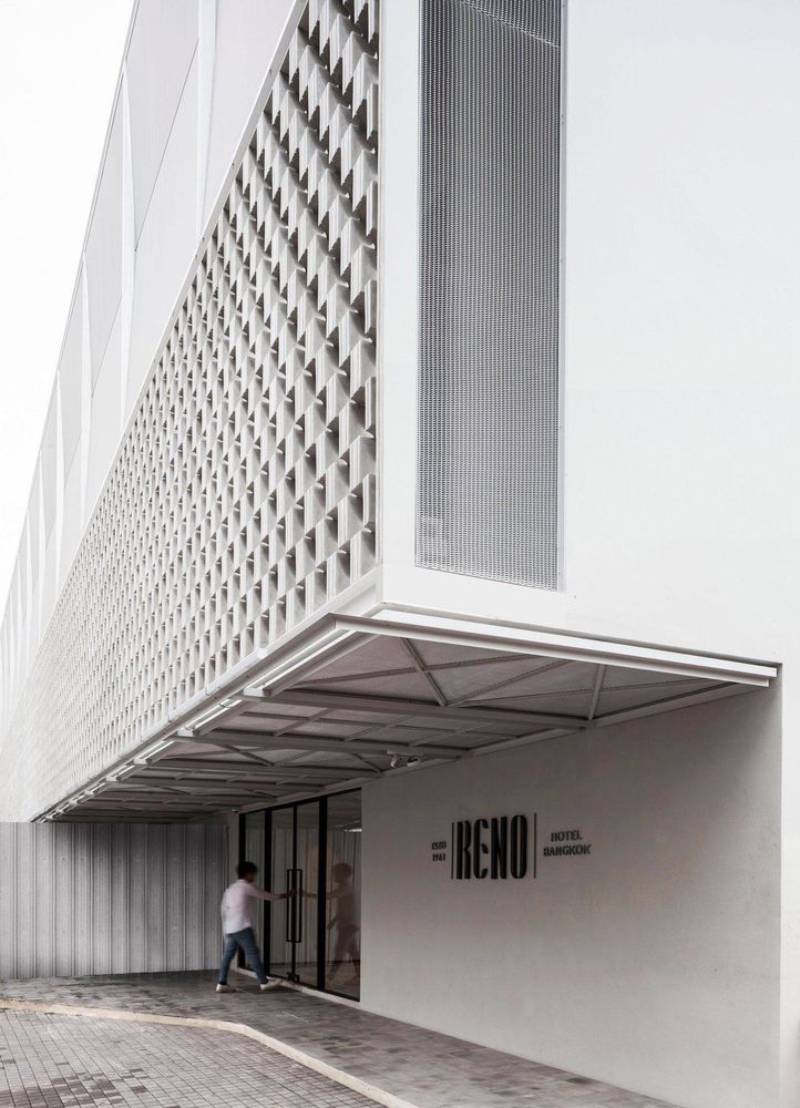
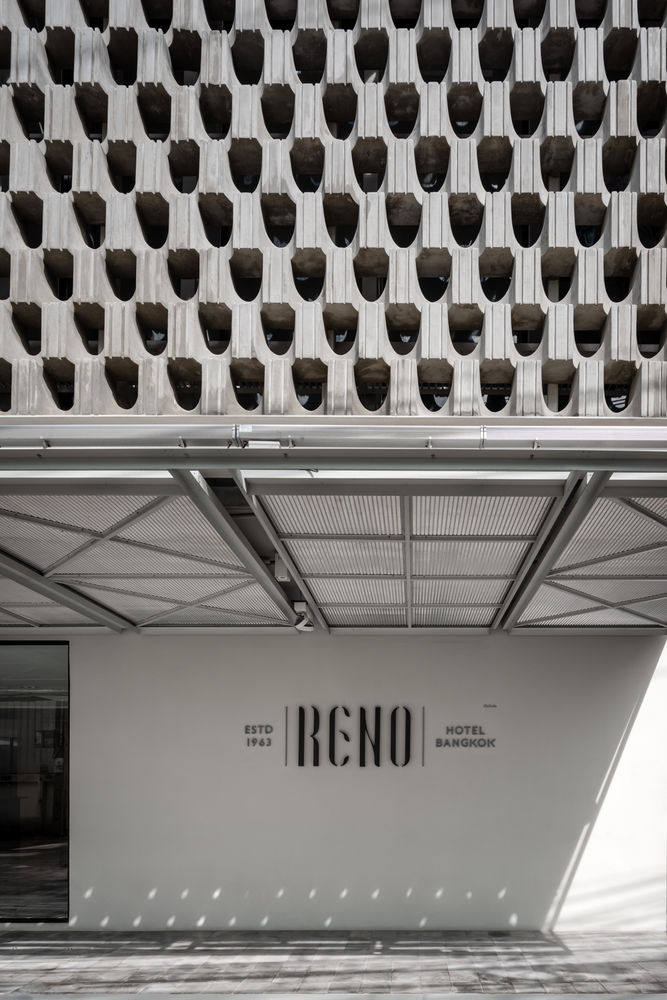
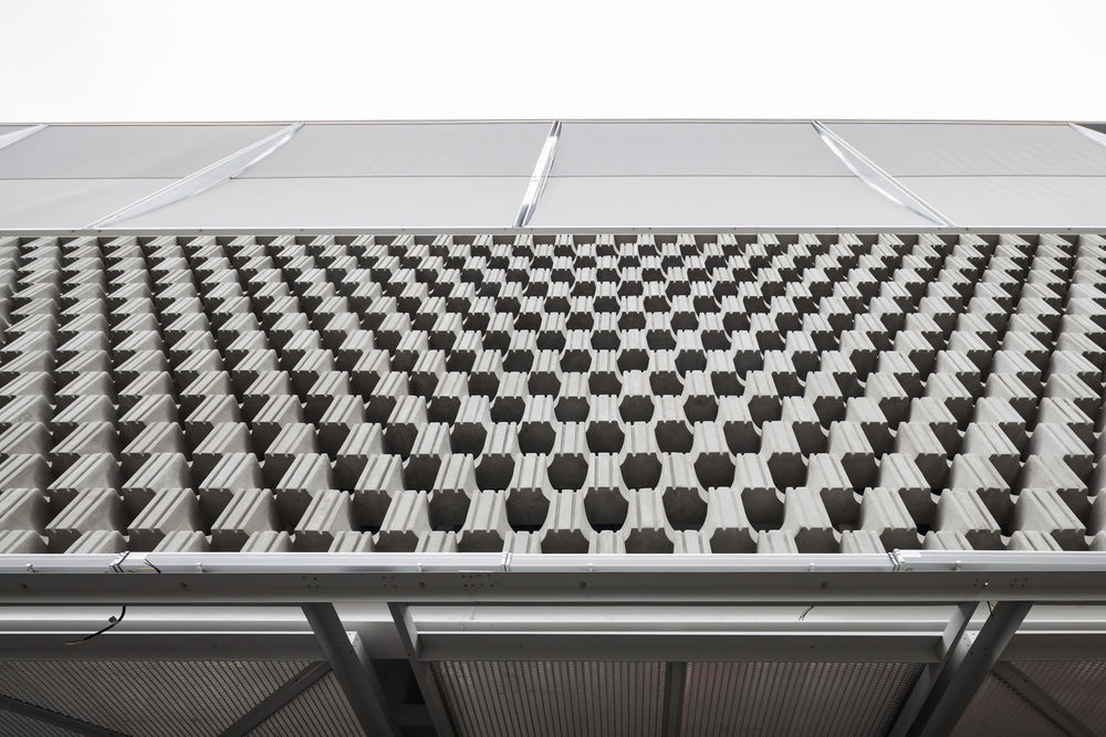
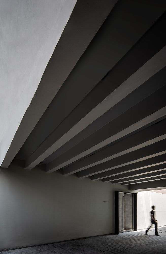
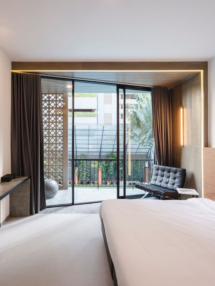
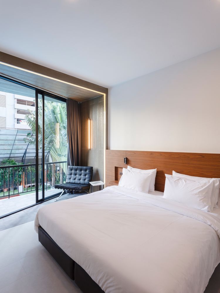
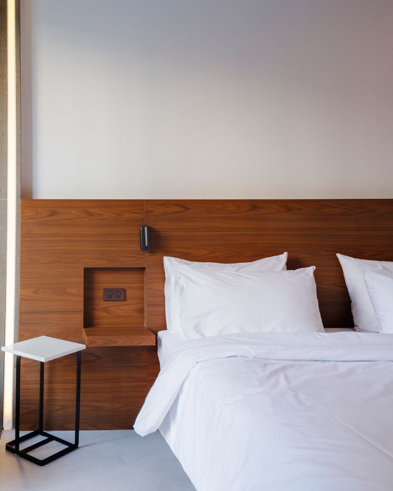
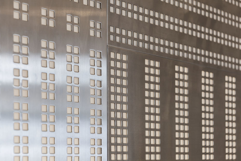
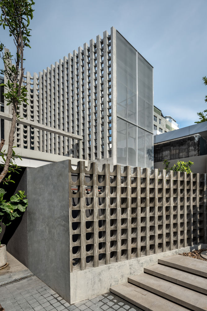
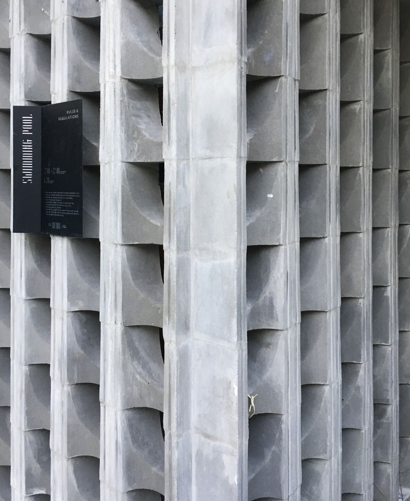
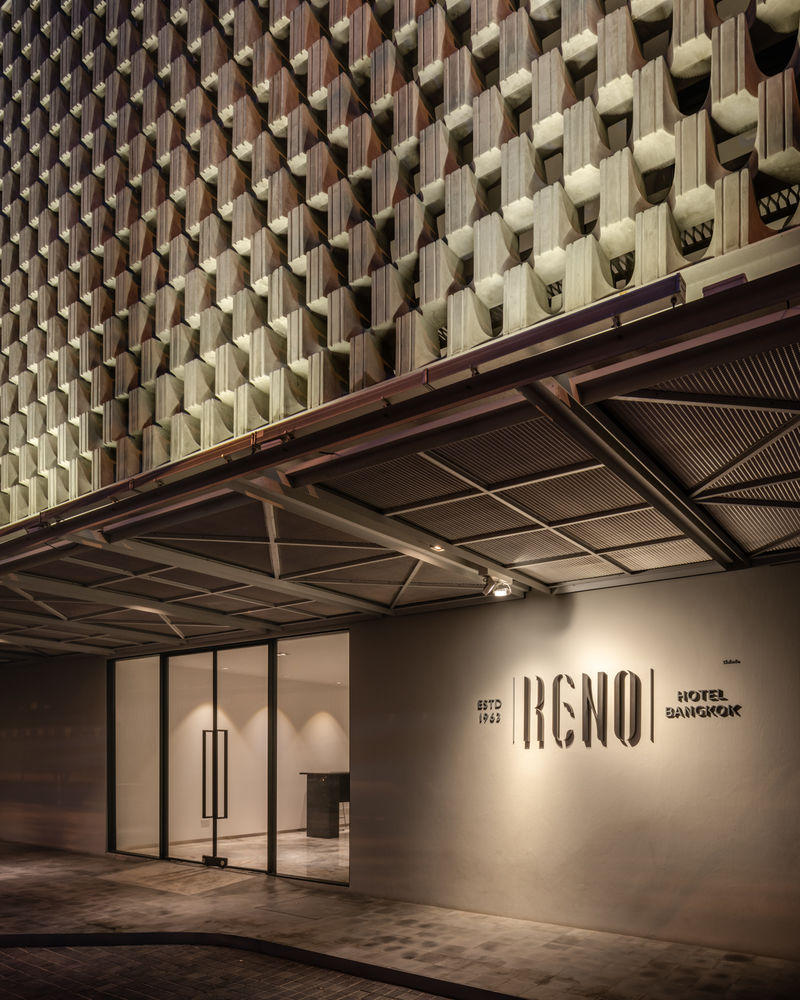

The renovation of the Reno Hotel in Siam, Bangkok by PHTAA Architects explores two concepts. Firstly, a renovation can achieve a balance between the extremes of unrecognizable modernization, and conservation that constricts it to being a museum piece of itself. Secondly, an architectural element can be assembled in different ways, and even taken out of its context to be upcycled later.
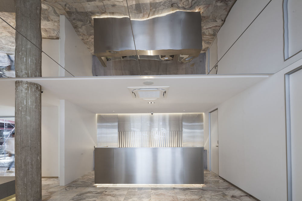
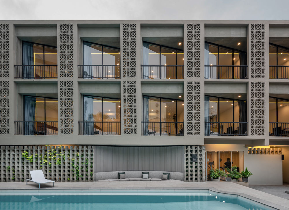
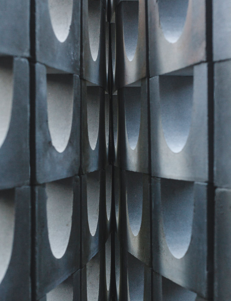
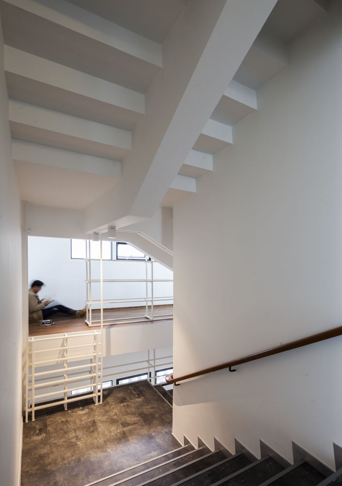
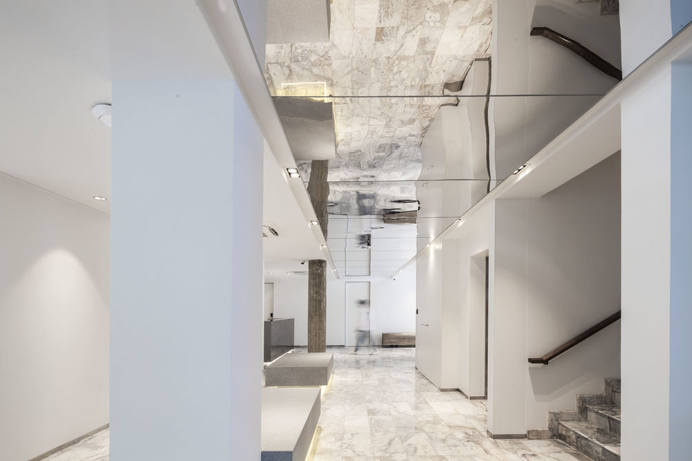
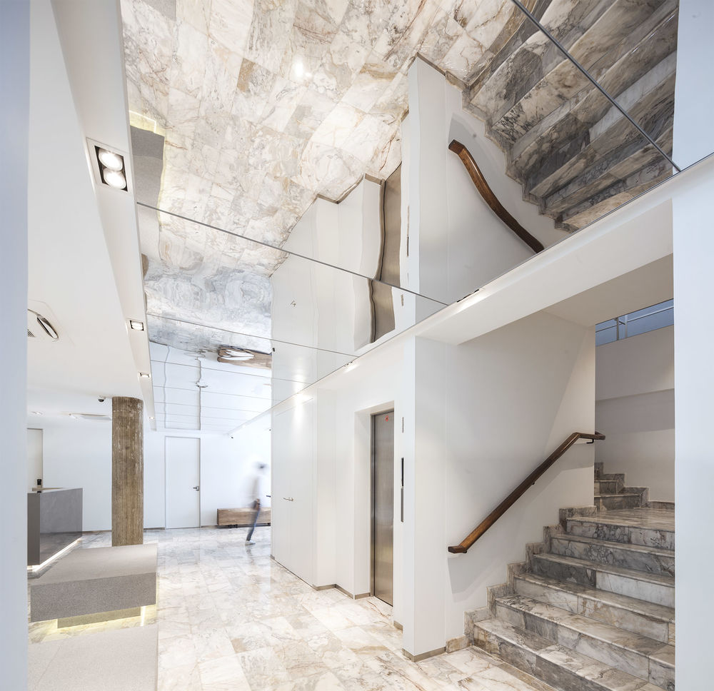
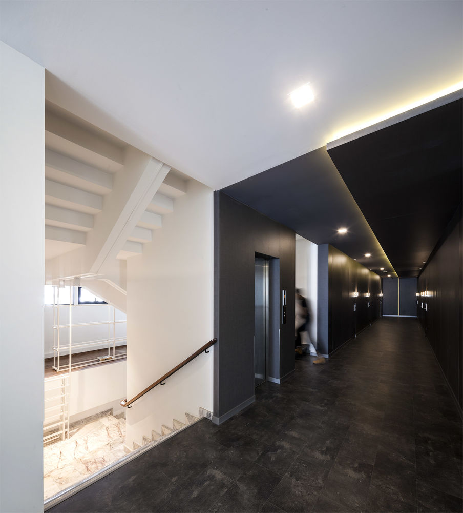
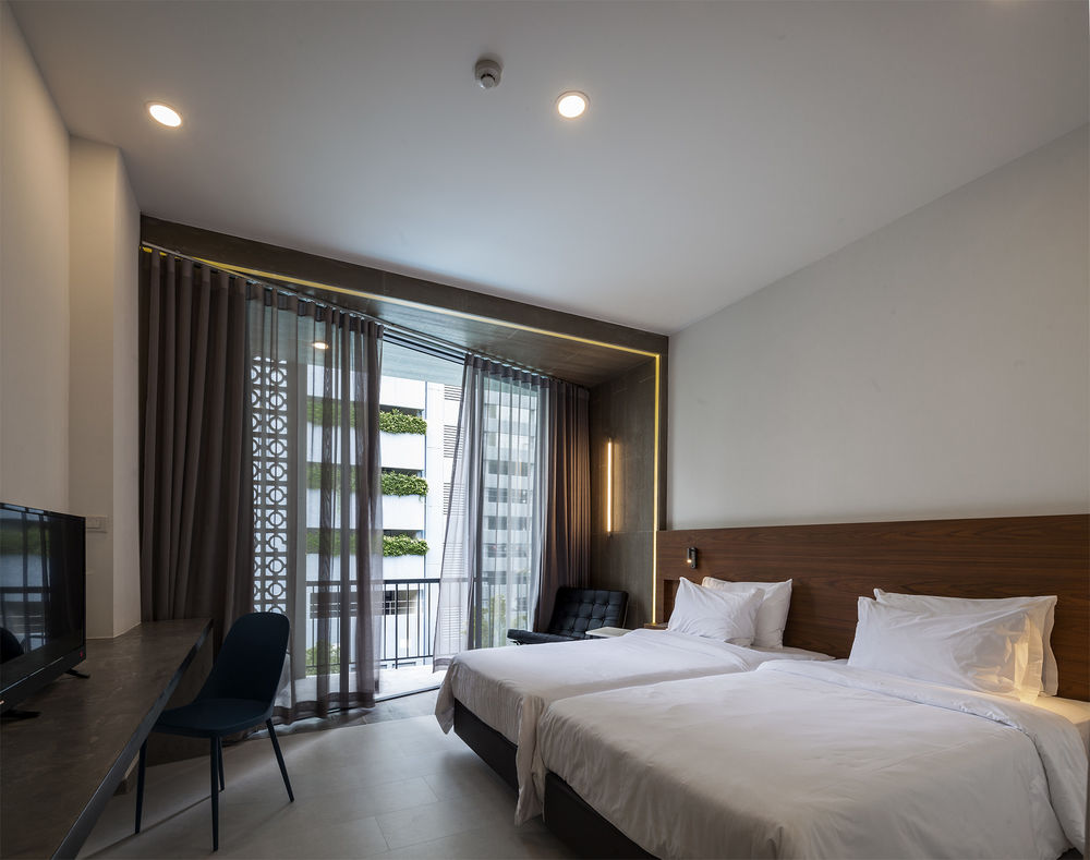
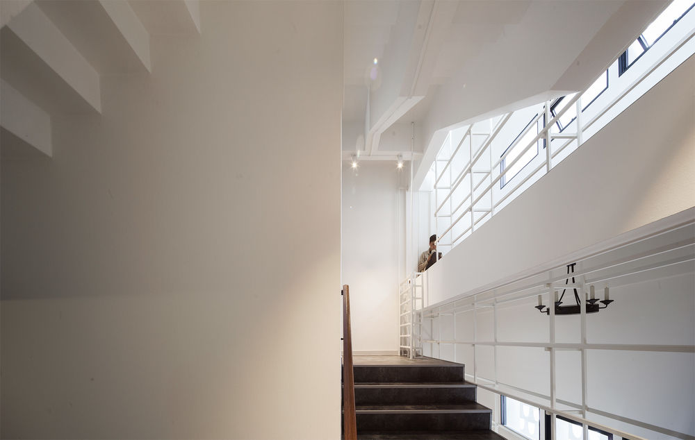
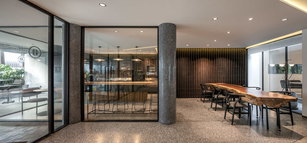
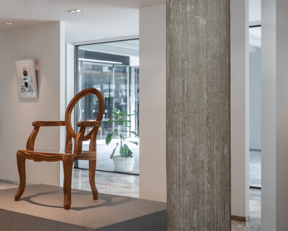
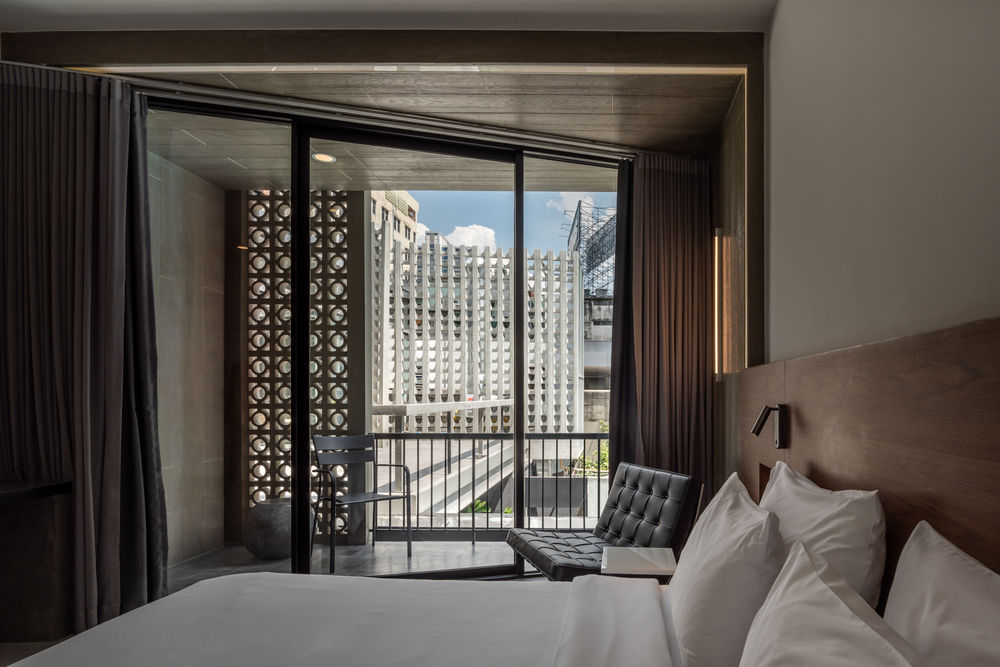
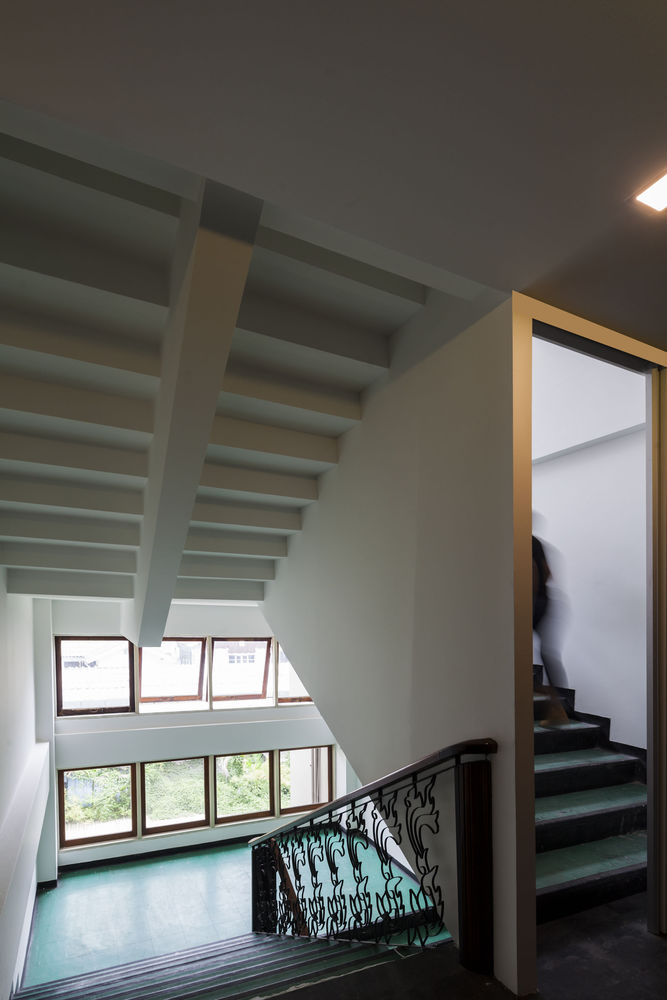
The architects wanted the renovation design to leave a trace of the original feel of the hotel, built in 1963 in a style reminiscent of Miami Modern, and so the idea of “before architecture” was used to retain key design elements, many of which would now be unaffordable to produce. Examples of these are the marble lobby flooring, original breezeblocks on the guest room balconies, a raw unplastered column in the lobby, and original stair details.
The owner also agreed that the renovation should keep elements from the past, not only for guests to be reminded of the hotel’s history, but also to keep a familiar feel of the place for the hotel staff, many of whom have been employed in the hotel since its opening.
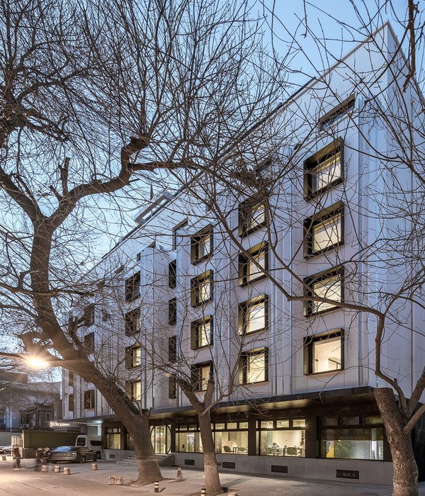
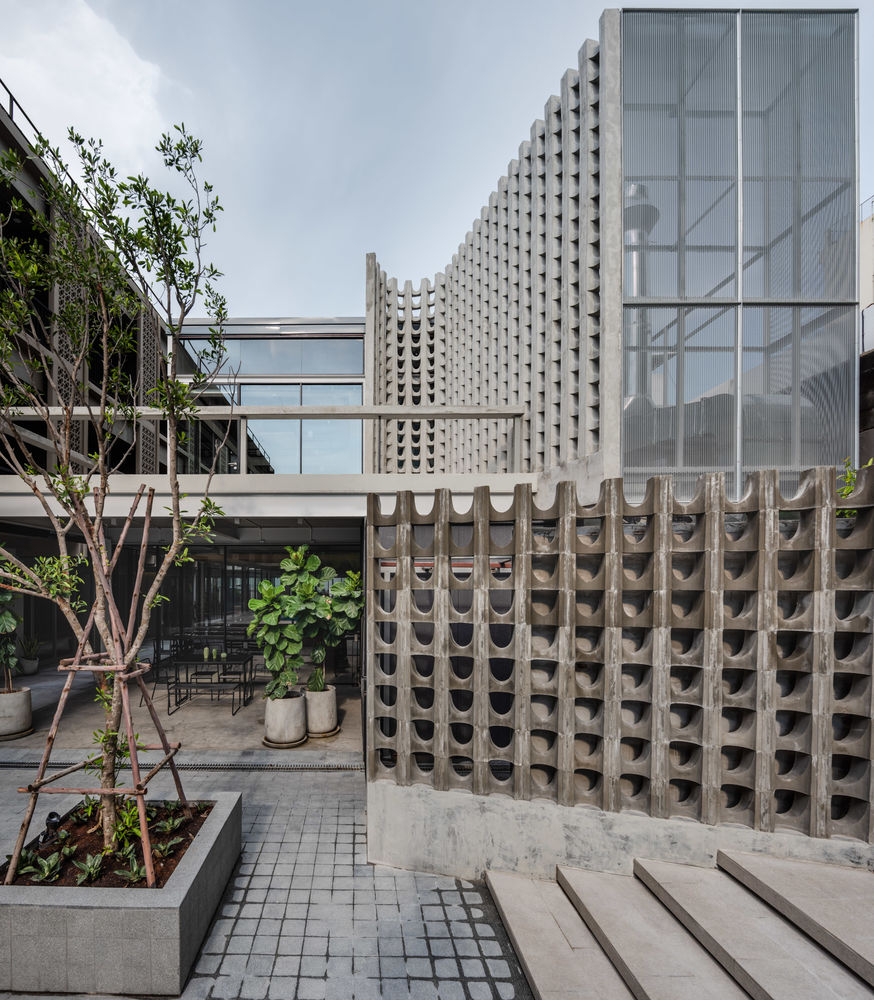
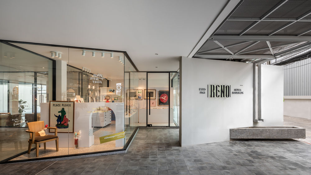
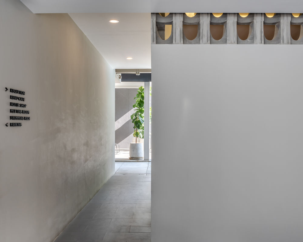
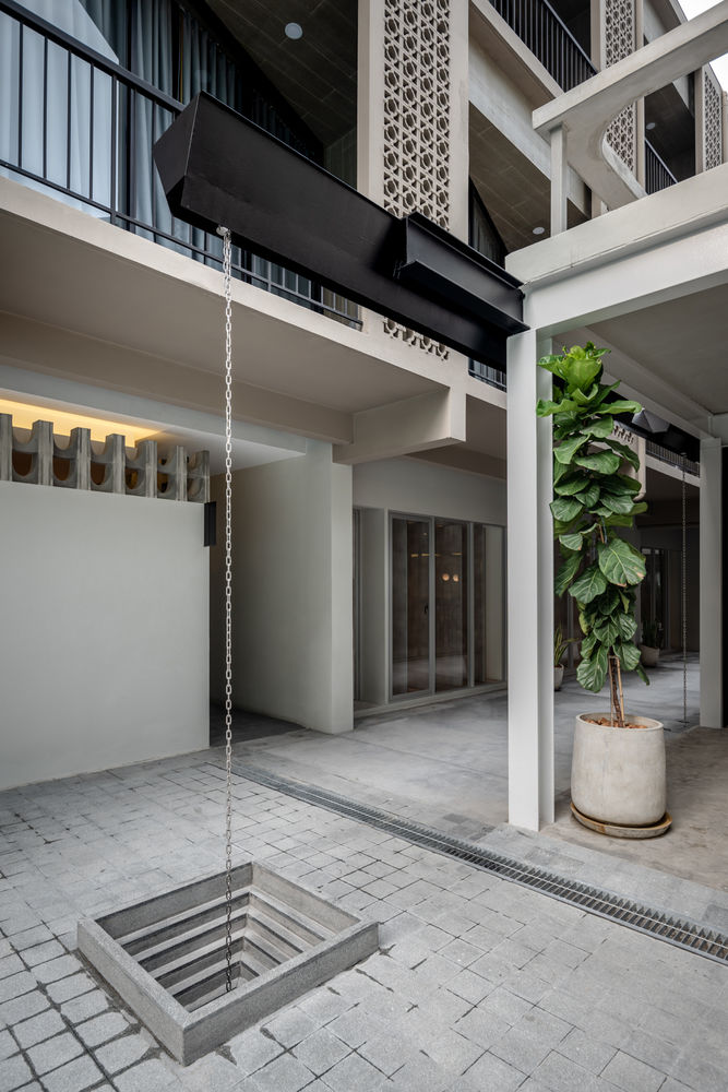
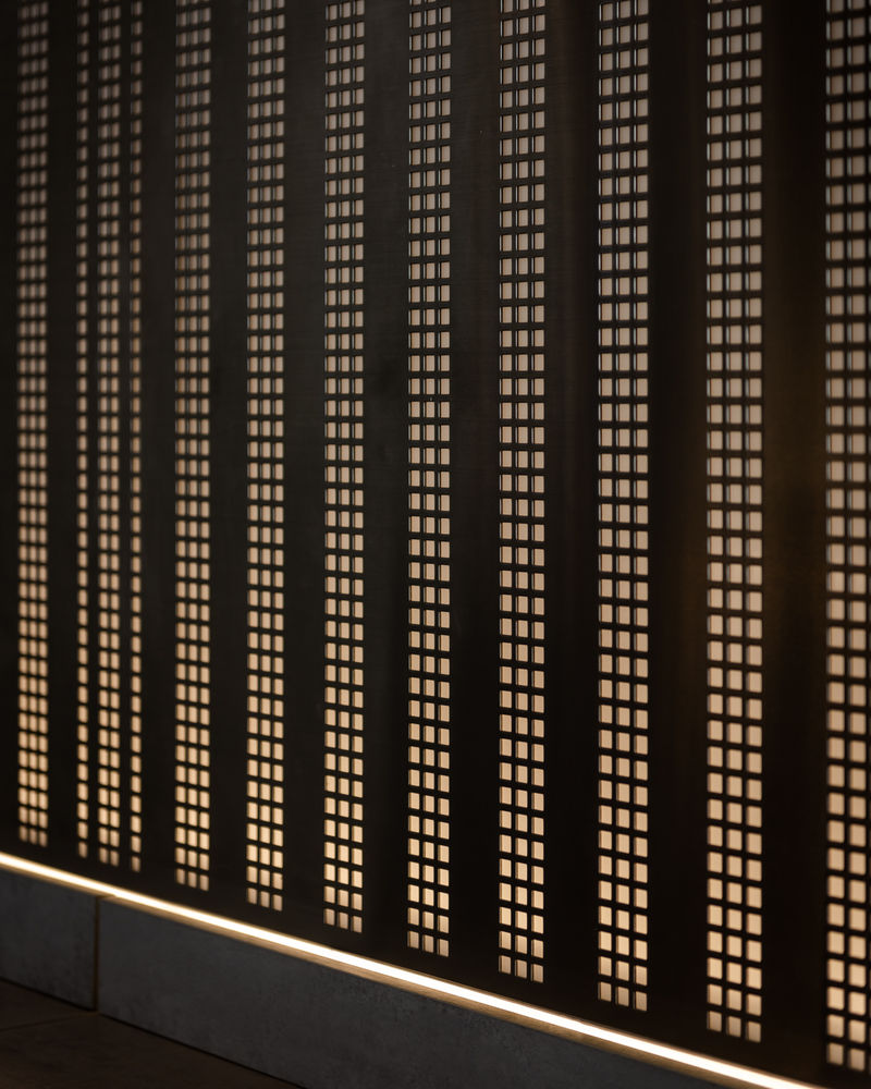
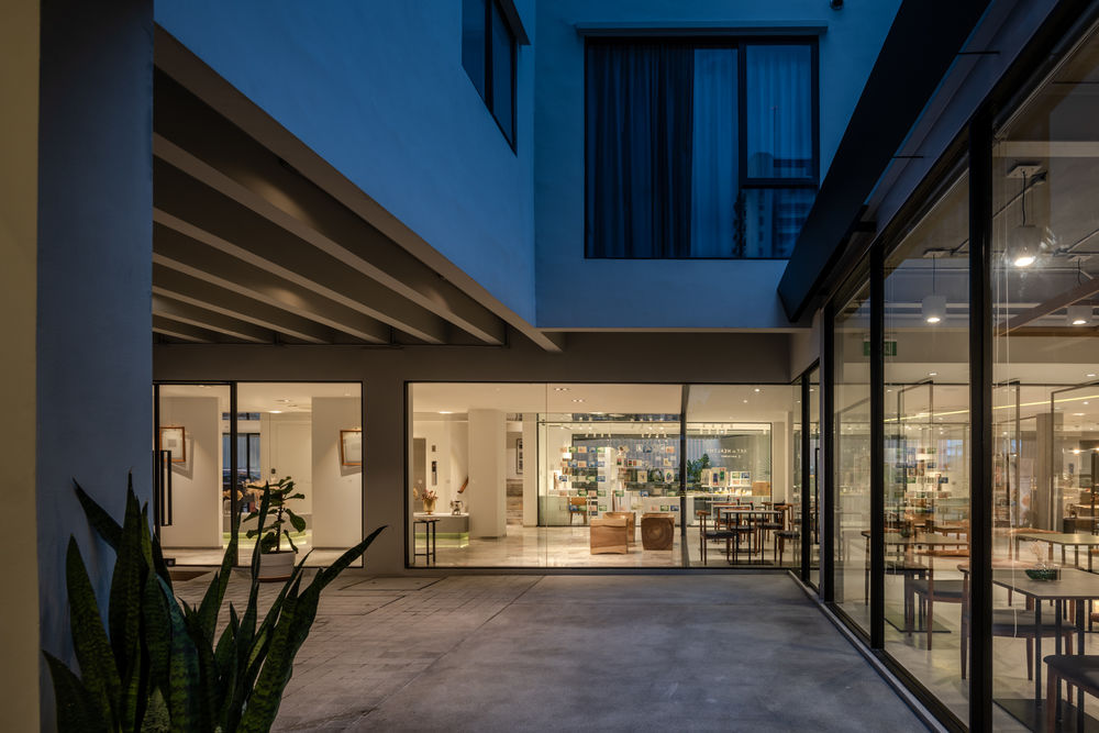
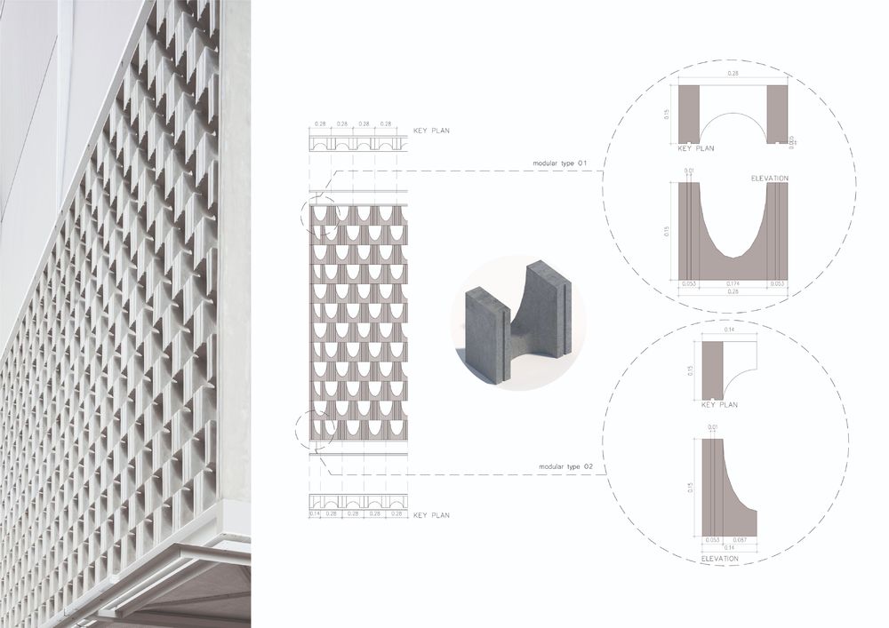
While there were no major structural changes during the renovation, a key concern were issues of privacy versus openness. The existing hotel presented an uninviting blank wall to the street at the ground level, while on upper levels, guest rooms opened directly onto the street. To solve the problem of the hard edge at the ground level, the ground floor spaces were set back to allow for an outdoor space for the cafe, to provide a graduation from exterior to interior, and to give back some space to the public on the street. Instead of presenting a blank wall to the street, extensive use of glass allows transparency from the street all the way to the back courtyard pool area. Guest rooms on the street side are now protected from the street by either a new breezeblock wall or shadecloth, giving privacy, yet allowing light into the rooms with floor to ceiling glass.
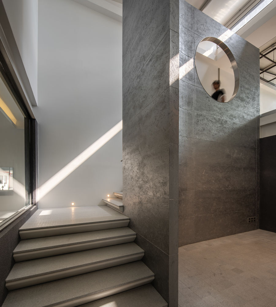
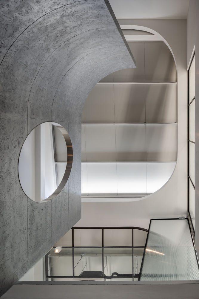
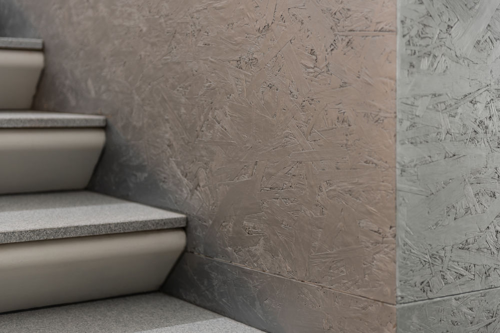
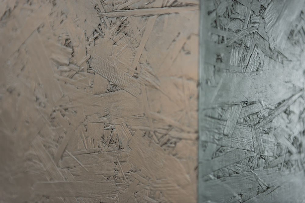
Inside, a new bar was built above the all-day dining room. The staircase to this area wraps around an existing stage area. Again, the owner thought it was important to retain this space as it was often used for karaoke by older clientele, and would be interesting to see if it could attract a new generation of audience. To screen the stage from the staircase, metallic painted OSB boarding was used as a feature element, adding glamour to a typical construction material.
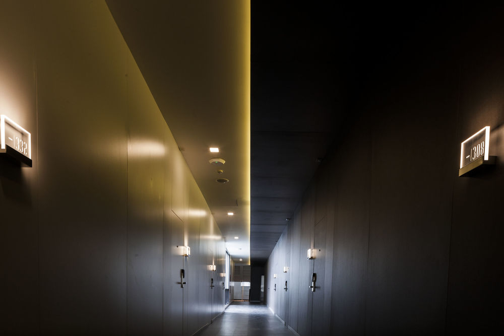
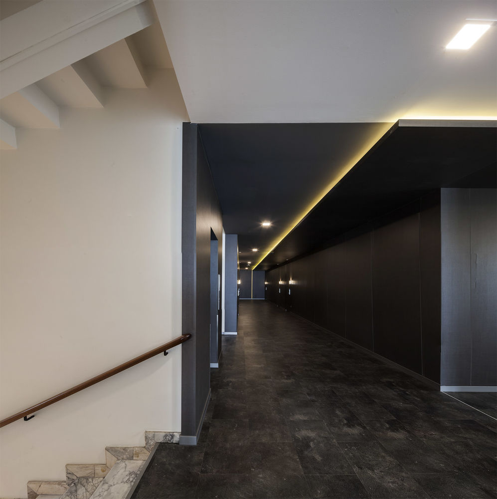
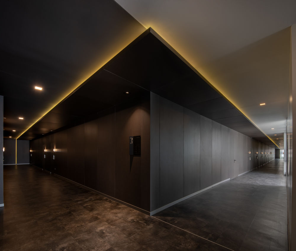
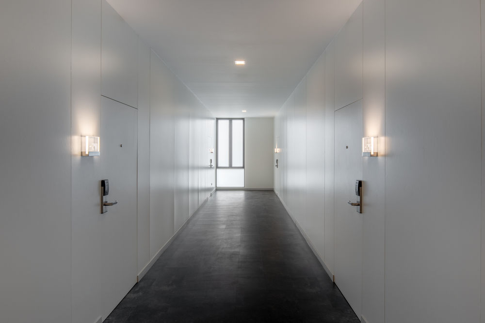
On the second and third floors, the corridors to the guest rooms create a sculptural space. The doors to rooms on either side lie flush with the wall, one side white, the other black. This leads the eye down the space of the corridor to see it as a singular element without being interrupted by alcoves or protrusions.
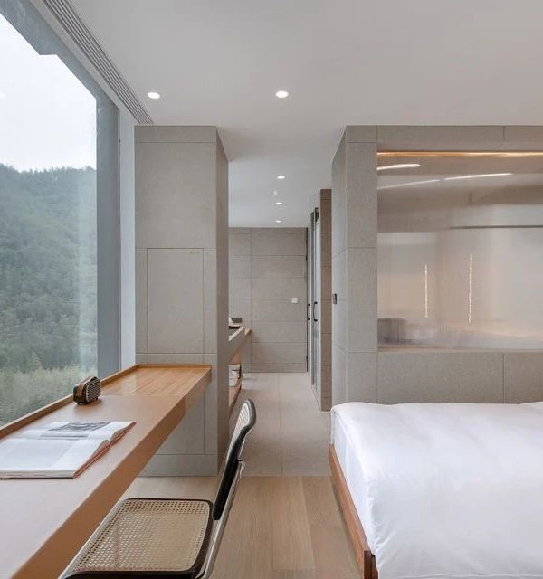
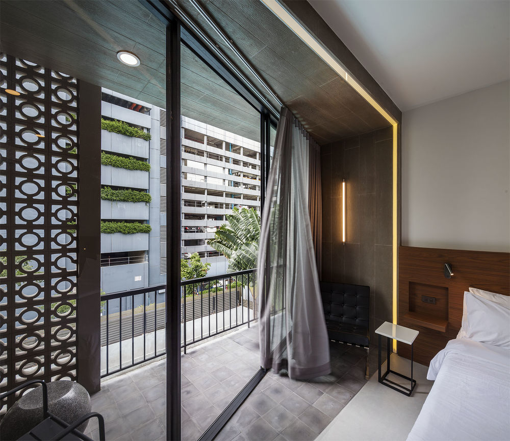
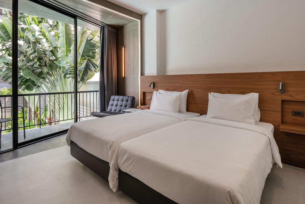
Inside the rooms themselves additional space was created for seating next to the bed, by skewing the glass wall between interior and the balcony so that the room could take over additional balcony space. This allows for some outdoor space behind an existing breezeblock wall while giving the feeling of being on the balcony yet being inside- important during hot Bangkok days. From the outside the horizontally oblique lines of the glass walls create a playful rhythm on the facade.
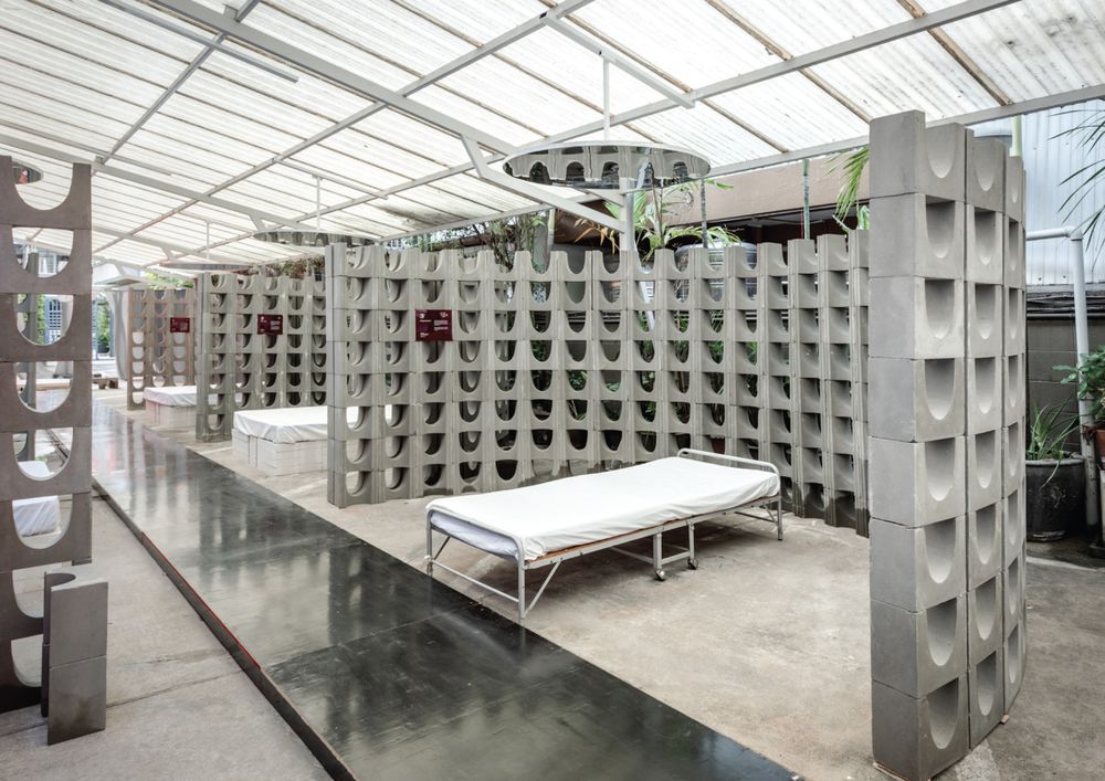
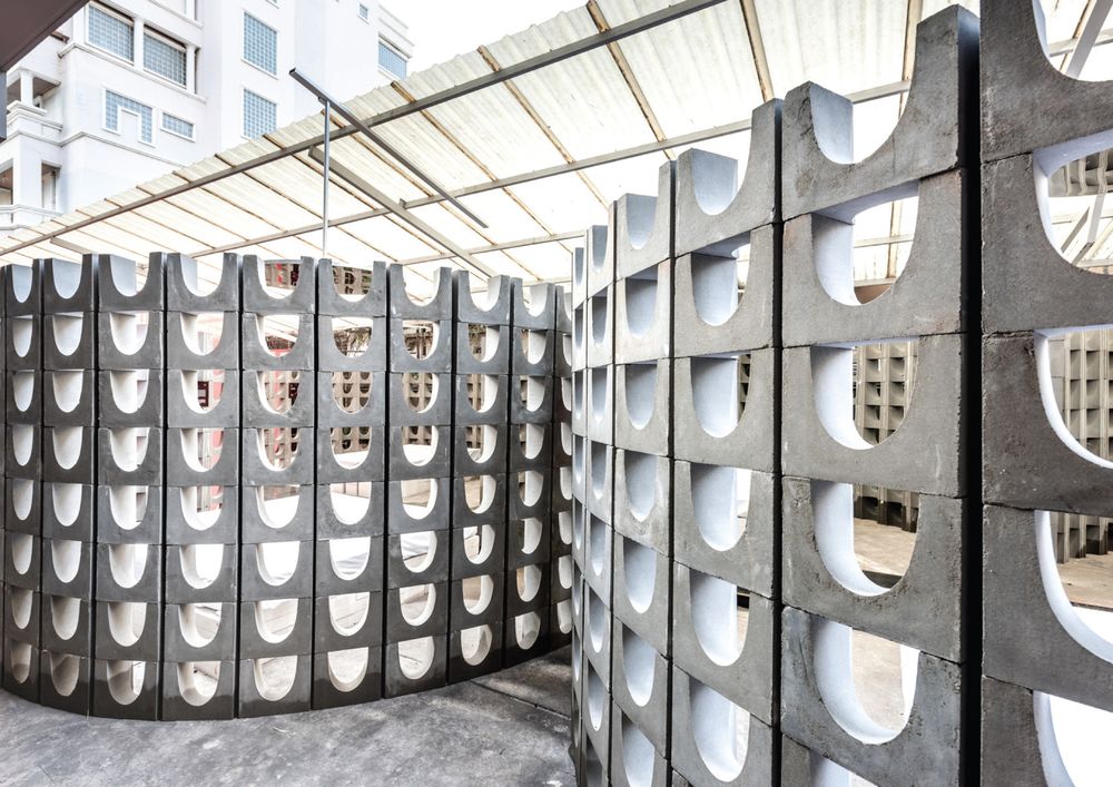
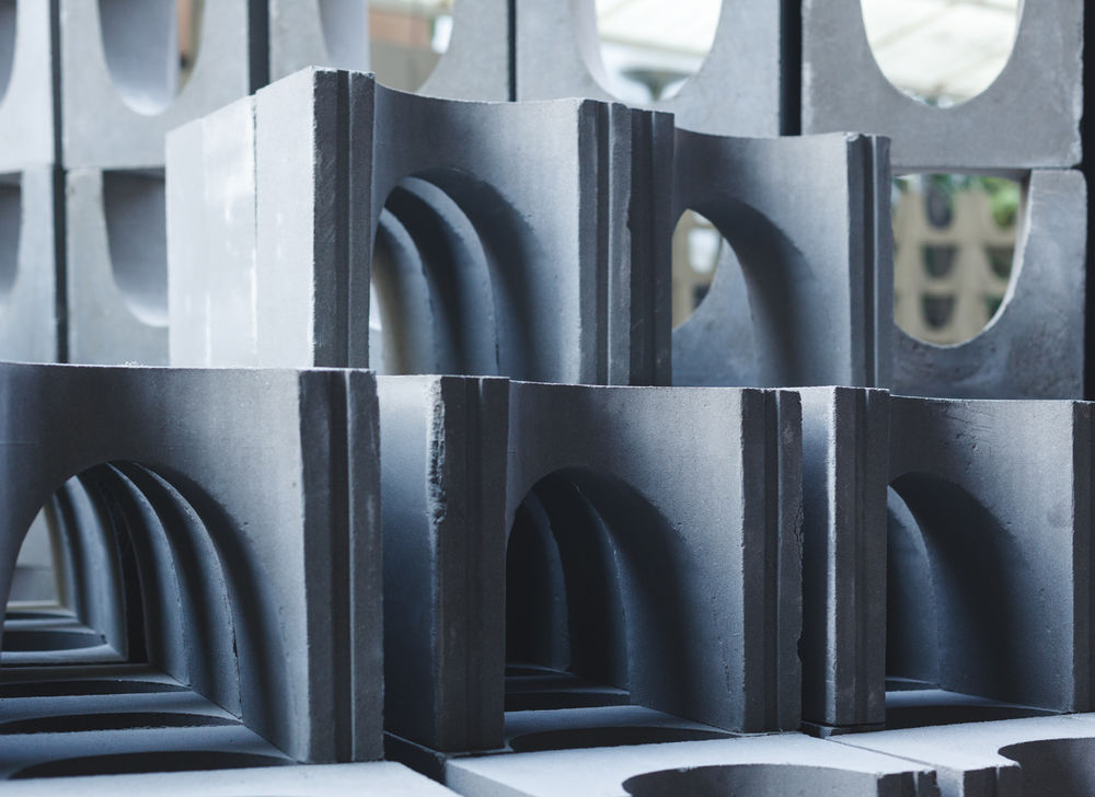
As part of the renovation process, the owner and architect held an exhibition. The breezeblock designed for the hotel would first be used to define spaces in the exhibition which was held in the car park space of the hotel. This installation, called “Modern Love”, was part of Bangkok Design Week 2019, and was a collaborative work of artists and designers. Later the same breezeblocks were upcycled to be used as the facade on the street elevation, for the pool shower, and as entrance to the carpark.


