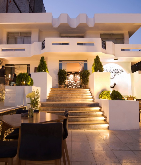
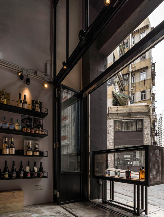
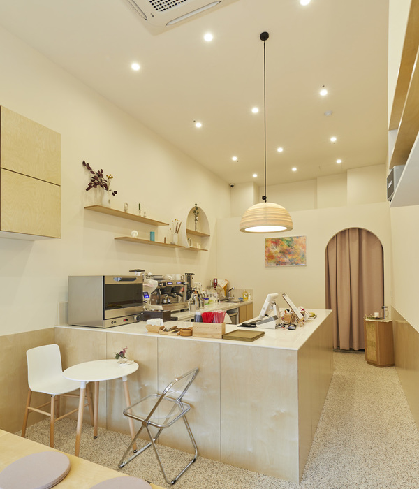
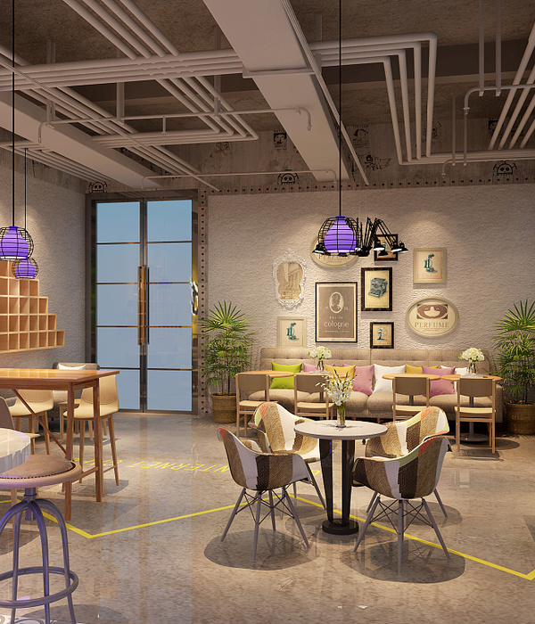
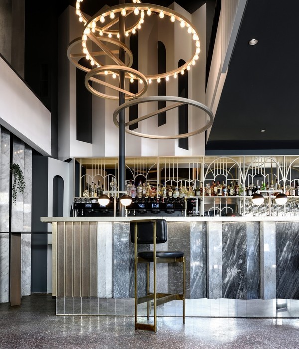
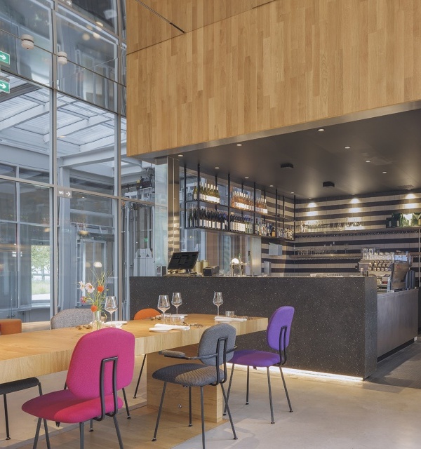
现代性的变革,改变了商业形态的诠释法则,因网络连结而产生的评价标准,影响了店家进入社区巷弄的建构经营,这些营业空间转移了都市里的商业区位,也平衡需求与分布,同时间接改变店家的经营定位,更符合在地居民与区域文化的商业行为,正成为小型商业形态的发展主力。
Modernisation alternates how people explicate today’s business. The internet rating system opens the door to a whole new aspect of the business model. Businesses like a café can now move into a cozy, relatively remote residential area from a business district. Small business is now relocated, our urban area is rezoned, the needs are redistributed, and the marketing strategy is therefore altered. Tailor-made business is designed for the neighbourhood and the local residents. Customisation is now the driving force behind small business success.
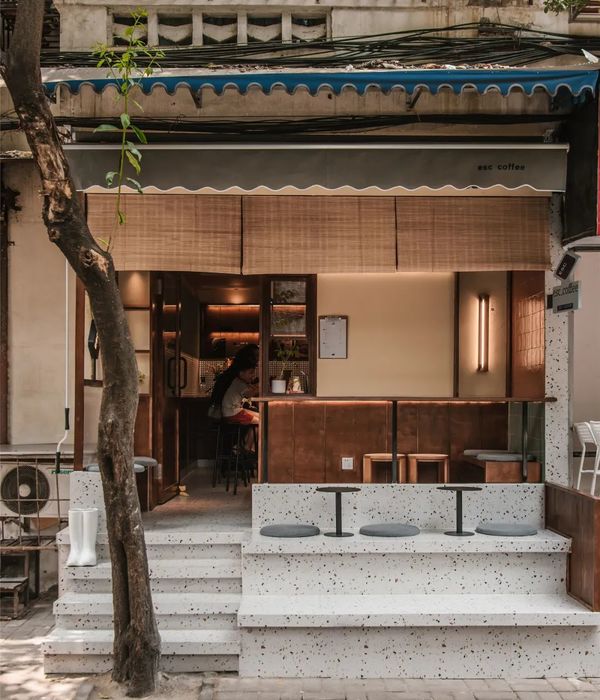
▼项目外观,external view © 李國民空間影像事務所
巷弄常常是展示民间生命力的地方,传统的小吃、民间生活的真实样貌,展现出一种看似毫无章法、却乱中有序的美感,因应生活需要而逐年产生的屋舍修缮或增建,更夹杂着视觉上的、时代上的冲突意涵。基地所在的位置,左边是传统机动车道,右边为一个电脑维修的商家,因此整个基地充满着一种「凌乱」的传统街道视觉感,这与我们传统认知的商空选址有很大的差异性,但让人惊喜的是,这让这类小型的商业空间更能产生独特的经营模式与个性化的美学标准。小南通有别于一般的咖啡馆,将过去台湾文化当中连结社区与人情味的巷弄店面,以摊贩形式来呈现。而台式传统小吃连结西式饮品的经营品项,在设计发想过程中产生更多对空间的想像力,将具有文化表徵与反应时代的材料混和出与当地交流的视觉语汇,借此深刻的设计力道流露出刻意却又不突兀的感受。
Taiwan’s alleys might be disordered at times yet the beauty of it is that they’re exactly where you find genuine street foods and observe real life from real folks. There are always people renovating their households out of necessity. Gradually, the street scenes have changed. Wandering inside of the shining windows are old-fashioned values that will always remain the same. The project café minami is amid a rumpled motorbike shop and a computer repair shop. The location suggests a disarranged feel of the old days. A contrasting location with what we have in mind for this particular project. Thankfully, we manage to turn this contrast into a characteristic combining a unique business model and their distinctive artistic style. Café minami creates a welcoming space akin to those shops back in Taiwan’s agrarian society days, connecting the community with hospitality. There’s plenty of traditional street foods on the menu besides modern-day drinks. The curious coalescence invites imagination. The imagination of the space, characteristics of culture, and the materials reminding people of the good old days. Deliberately designing an indoor food kiosk makes perfect sense.
▼入口立面倾斜三十度,entrance facade with a 30- degree angle © 李國民空間影像事務所
设计的出发点是从「整理」开始的,打除过度潮湿的壁面,改由瓷砖阻断内与外的水气,没有刻意增加的隔间与壁面,让老旧公寓整理到最可用的状态,并因材料的选用而显出风格,利用旧式的木工手法,将原有的窗户包覆成一组木结构的木窗。
This project starts with renovation. We knock off the damp walls and put on new tiles to avoid walls from further dampening. There’s no need to partition the space. A decent renovation would do the job. With the help of traditional carpentry and carefully selected materials, we get our wooden muntin in style.
▼入口区域,entrance area © 李國民空間影像事務所
▼不同材质混合,mixing of different materials © 李國民空間影像事務所
拿掉大门原有的铝窗,在空间内,重塑一个摊贩式的吧台区,让空间中出现屋中屋的视觉感受。吧台区构筑出一个具有情怀与细节的量体,同时产生旧新相融的氛围,由于店面与基地有着一个三十度的斜面,因此顺着斜面的吧台与大门正面产生了视觉错位,而让门面的开放设计显得更有张力。因应基地所赋予的独特条件,原本看似传统的语汇转而成为现代感十足的重叠拼贴视觉,让人们看见一个不寻常的空间状态。
We remove the aluminium frames from the original french window and design a bar that feels like a food kiosk indoors — a kiosk in a shop. A 30- degree angle between the bar and the now-removed french window is very visually intense and creates an optical illusion. Applying open space design to this 30-degree condition gives you an extraordinary space featuring a collage of visions turning long-established glamour into the avant-garde.
▼屋中屋,food kiosk indoors © 李國民空間影像事務所
▼摊贩式的吧台区,vendor-style bar area © 李國民空間影像事務所
▼吧台特写,close-up of the bar © 李國民空間影像事務所
▼用餐区,dining area © 李國民空間影像事務所
铁皮屋是台湾文化的鲜明符号,有着价格低廉却极为耐用的特质,因此早期的屋顶加盖与市场建筑,多以铁皮屋形式呈现,波浪板、黑铁、镀锌管、明锁的螺丝、马赛克式的外墙瓷砖、不太准确的焊接……等,这些可用于铁皮屋的混搭元素,转化运用于空间设计中,建构出独特的台式铁皮屋美学。
Tin houses vividly represent Taiwan. Tinplate is a type of architectural material that is inexpensive, durable, and thus vastly used in rooftop constructions and traditional markets. Other materials such as PVC boards, black iron materials, galvanised pipes, exposed screws, mosaic walls, and inaccurate welding are all very common parts of tin houses. That’s Taiwanese aesthetics.
▼夜景,night view © 李國民空間影像事務所
▼铁皮屋,tinplate house © 李國民空間影像事務所
整理的本身,就是一种借力使力的运用,基地本身的旧雨遮即是波浪板材质,保留原有的铁工架构,重新拼贴材料产生独特的对比关系,在空间中不平整的墙面,运用蒙德里安式垂直水平交错的几何分割,将数种不同的磁砖做拼贴,虽刻意却又随性地去构筑出一个具有时代记忆的视觉符号,对于当代来说,反而是一种前卫的呐喊。重要的是,我们反对用复古的定义来做室内设计,而是利用创新与情怀的交叠,来构筑出一个属于这个时代可能可以被记忆的「现代」。
The renovation itself is an application of continuation. The original rain canopies are PVC boards. While keeping the steel structure, we tile the uneven surfaces creating a graphic image of vertical and horizontal lines like Piet Mondrian’s work. A shout-out to avant-garde originates in a seemingly inattentive collage of carefully selected tiles deliberately generates a cultural symbol of old-time recollection. What’s important is that we’re against the retro approach to interior design. By interlacing innovation with feelings, we construct a ‘modern era’ of our time that might be remembered sometime in the future.
▼平面图,floor plan © 開物設計
{{item.text_origin}}

