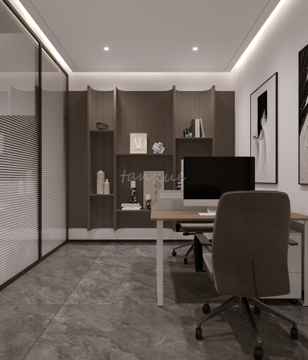
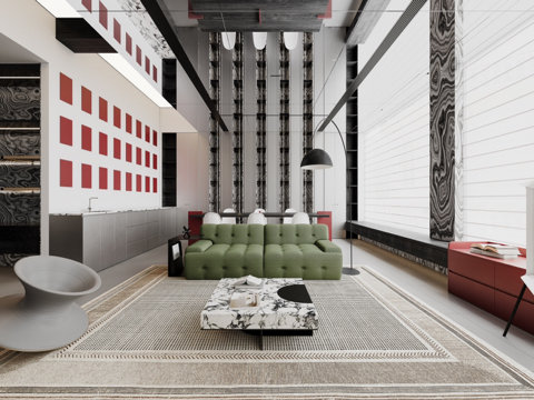
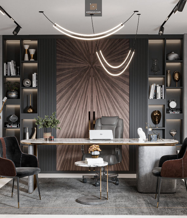
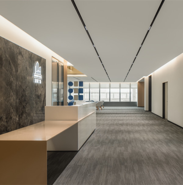
The project is for a small publishing house, specialized in kids´ books with a scientific interest. The project’s functional needs are simple, and the space requirements limited: a reception room, offices, a small reading area, a small kitchen, a meeting room, a depot and an accessible terrace make up the project’s program.
The building is in a mixed-use neighborhood in constant transformation, made up of diverse housing types, light industrial warehouses, mechanical repair shops and some commercial activity.
The building sits on a corner lot, which allowed us to give the project a 3-dimensional quality uncommon in urban lots limited by side party walls that tend to result in 2-dimensional solutions.
The solution creates an urban infill operation that articulates the heights of the neighboring housing units on either side of the corner lot, recovering the lost height the previous building had left unused and giving hierarchy to the corner.
Formally, the building is a solid, lightly punctured, exposed-concrete cube hollowed out inside to accommodate the project´s functional requirements.
The strategy of the interior design is to give openness to the space in order to generate multiple and varied spatial relationships amongst the sectors of the building, and through this, to integrate all the people that work in it, by creating a triple-height open space punctured by the stair case, to which each of the spaces’ access is oriented and by taking advantage of the opportunities afforded by the longer perimeter of the corner lot. It is a project conceived in cubic footage, in 3 dimensions.
The building is introverted and its relationship to the streetscape is limited, recurring to indirect natural light seeping through the top level of the open space and more controlled direct light through the different-sized openings on the facade, which control this relationship and give it a domestic and playful character.
The selection of materials and finishes is basic, intentionally austere: light is used as a material to prioritize the open space with controlled natural and purposefully guided light in each of the spaces.
The interior horizontal planes are exposed concrete whereas the vertical planes alternate between white and glass surfaces that reflect the light, creating multiple internal light reflections as well as transparencies.
The result is a unique building which, through its single-material and objectual quality, stands out in a very mixed urban environment.
{{item.text_origin}}


