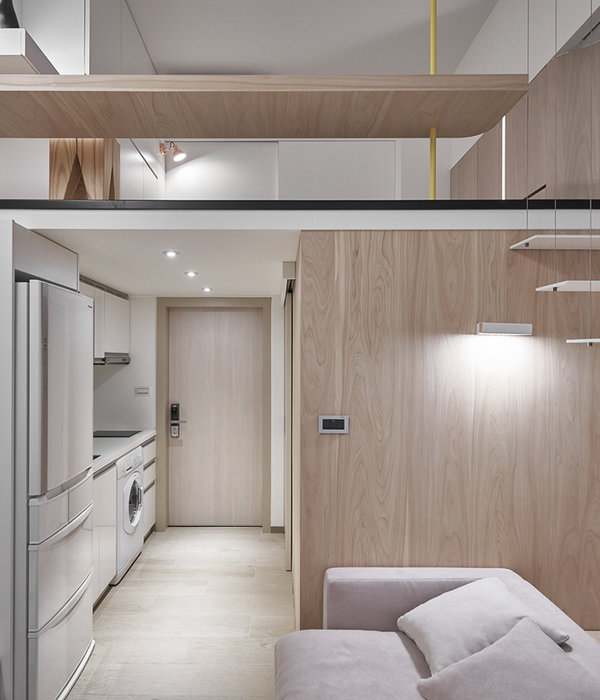
In its former life, before being renovated to become a boutique stay condos, Bare Gallery was a small house inhabited by a multi-generational family. It offers guests and residents the experience of staying in a typical Saigonese‚ tube house, measuring 3.4 metres across by 13 metres deep. When reimagining the front entrance, we decided to change very little, opting only to freshen up the paint outside and planting vines from each balcony. Visible through the floor to ceiling windows on the level below this greenery creates continuity and connection between each storey of the building. Bare Gallery has a small cafe on the ground floor, with four comfortable studio apartments above. The spatial planning embraces the modest floorspace, using innovative furnishings and fittings throughout. Bare Gallery comprises two different designs of apartment, with a floor plan that makes best use of the natural light it receives. In the first of the two studio designs, polished concrete is used for the dominant design elements - a visually commanding bed base and a multi-functional block against the opposite wall. Encompassing both a seating area and clothes storage system, it is enlivened with potted ferns and walnut wood accents. The orientation of the furniture draws your eye to the balcony, which is replete with vines and more local tropical plants. The sliding doors make ample use of the natural light, reducing energy consumption and allowing you to wake up in natural synchronicity with the sun. Many of the furnishings and fittings are multi-functional, subtly morphing from one item into the next - the headboard of the bed extends into a desk, a dark wood dining counter extrudes from the polished cement kitchen unit. A mirror is suspended from an iron frame on the ceiling, creating a subtle distinction between the kitchen area and the wash basin. In all studios, fittings double up as partitions, demarcating spaces without interrupting the natural light. Both the shower room and toilet room are fitted with floor to ceiling white ceramic tiles set into dark grouting, for simplicity, cleanliness and durability. The second studio style is equally resourceful with how the space is choreographed. The bed is placed close and perpendicular to the balcony, granting guests an uninterrupted vantage point of the balcony garden. The metal mesh clothes storage unit is paired with a washbasin to divide partition the kitchen and living area from the shower and toilet. A lounger means you can timetable for the day ahead or focus on some reading, and ensures that the bed doesn't dominate the room. The apartments follow a restrained colour palette. The furnishings and fittings use a breezy palette of pale celadon green, coral orange and midnight blue. The industrial feel of the polished cement and black iron is offset with rich walnut wood and gold coloured copper accents.
{{item.text_origin}}


