南宁 CROYO 办公室-- 绿色城市的创意空间
Shenzhen Super Normal Design and CROYO collaborated to design the offices of CROYO located in Nanning, China.
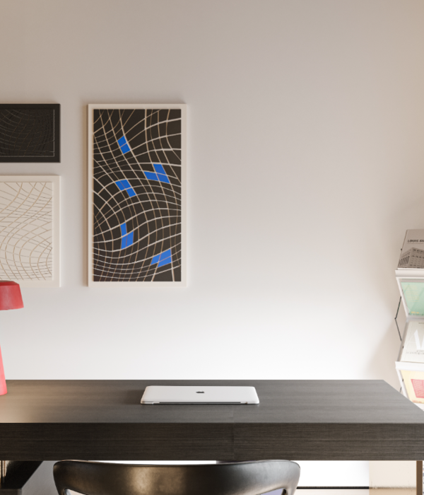
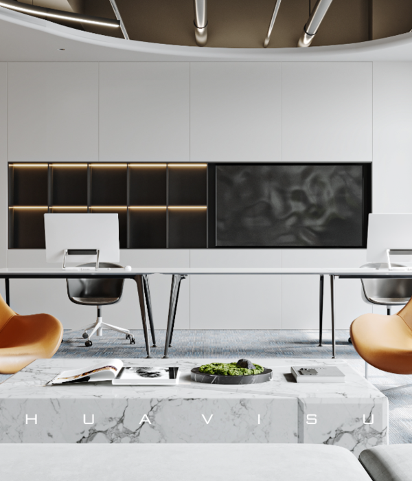
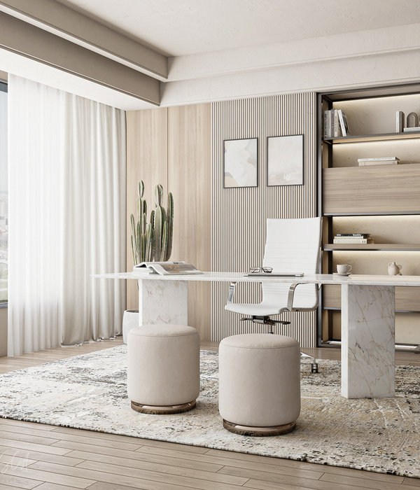
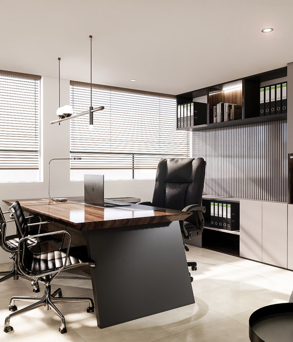
The CROYO headquarter office is situated at the “green city” of China, Nanning, with a total area of 543 square meters. Bearing in mind that the original intention of design is to serve people, the designers created this open-plan office where users can enjoy working and at the same time ensures efficiency of work and communication.
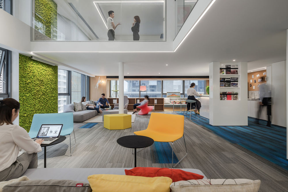
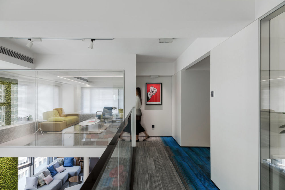
The original space of the project merely occupied a floor area of 280 m2, with a story height of 5.09 meters. Therefore, the designers took setting up a floor slab as the first step, so as to expand the usable area. Considering that the thickness of the floor slab would affect user’s experience, the designers invited friends from Arup Group to be the structure consultants, with a view to creating a thin yet solid floor slab. They tried the best to integrate some structures with the walls, arrange the structure pillars in reasonably and deliberate on the position of each lighting fixture. Eventually, a 150mm-thick floor slab was designed and installed, separating part of the original space into two floors, with each designed in an appropriate height. Through the restructuring of the space via the floor slab, the usable area was expanded to 543 m2.
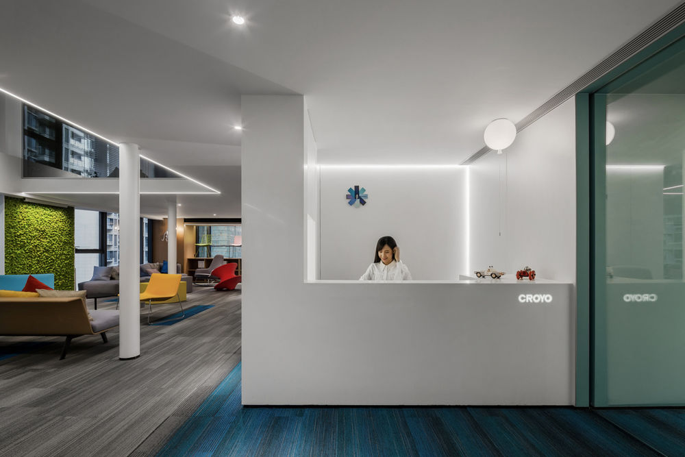
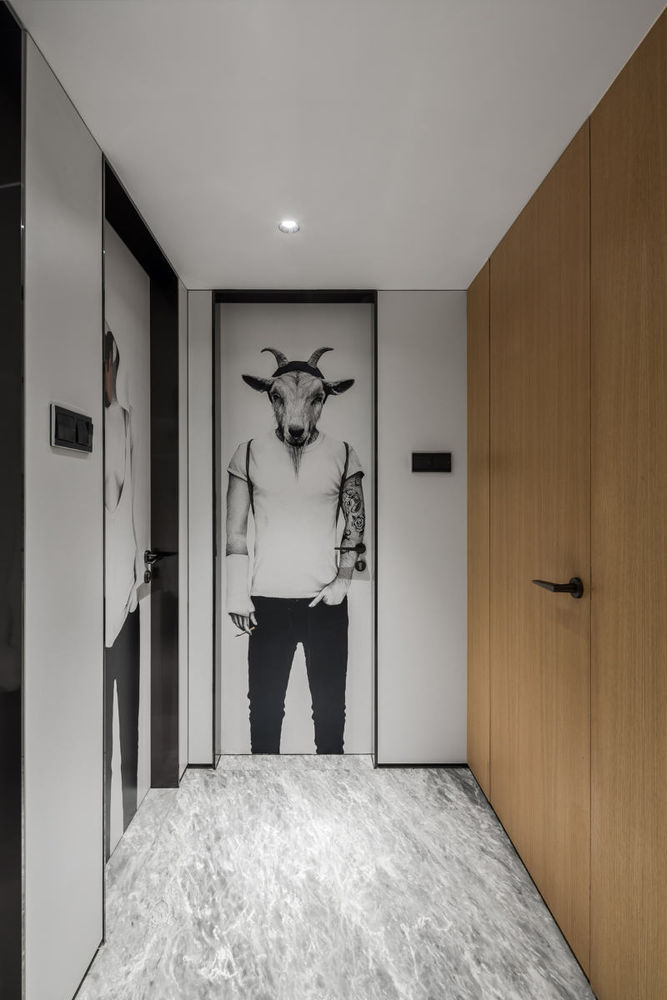
The front counter area is bright and refreshing, embodying the beauty of minimalism. With a view to keeping balance, the designers added some exquisite decorations in the area, thereby creating a lively and relaxing atmosphere. The spatial aesthetics is also demonstrated in the utilization of colors. The blue-gradient carpet keeps people calm, the red office partition makes people passionate, while the green preserved plants add a natural feeling into the space.
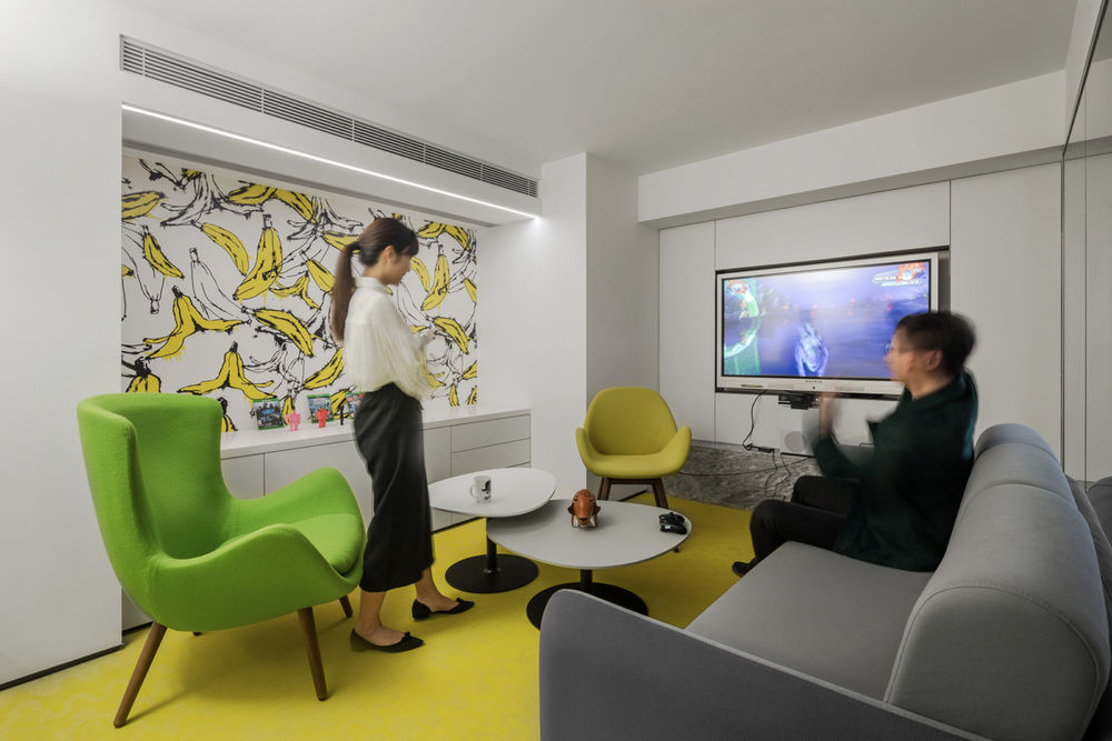
With the theme of “forest”, the design of the brainstorm area is unique and distinctive. In order to bring the forest into the space and recall childlike innocence, designers put a stump-shaped chair, a rug with pattern of tree rings, a sofa resembling sleeping bear and a wall lamp in the shape of monkey in the area. Such bold and ingenuous combination of these elements is conductive to encouraging the staff to “think out of the box” and spark inspiration and creativity during team discussions. As for lighting design, designers chose to utilize floor lamps instead of point light sources, which generate soft and undazzling light, making people feel comfortable and cozy.
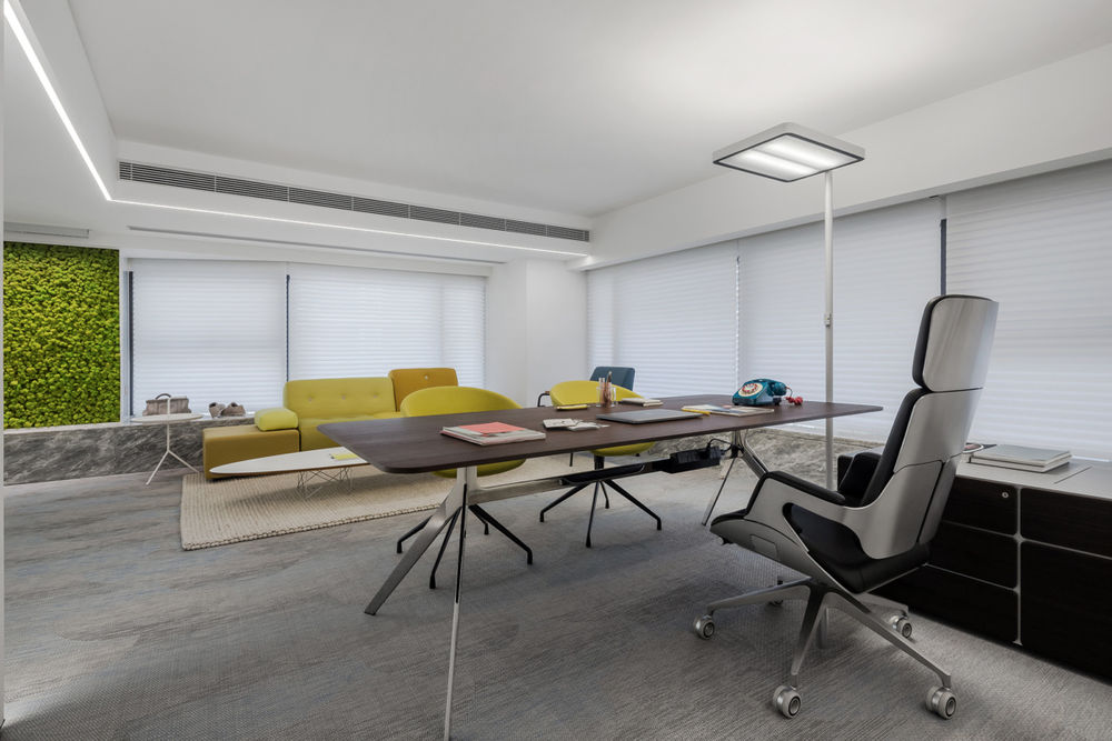
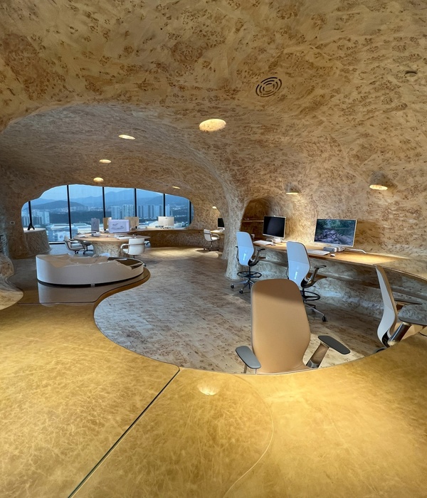
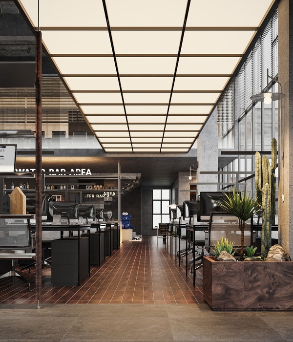
With a view to creating an open-plan office area, the design team set both independent work spaces and shared work spaces, so that the staff can choose the way of working in accordance with their preferences. Such design helps to facilitate face-to-face communication and professional knowledge exchanges among the staff, improve their capability of adapting to changing environment and strengthen their impetus for work, hence enhancing work efficiency. As for seating, the designers chose Steelcase ergonomic office chairs which make the employees feel comfortable and energetic. For lighting design in each independent offices, the interior and lighting designers made a new attempt. As opposed to installing lighting fixtures on the ceiling, they determined to use Waldmann free-standing luminaires. Such solution not only gives the ceiling a simple and clean look but also ensures the light to be soft and pleasant. The average color temperature of light is 4000k, creating a bright and pleasant working environment. However, in the shared working area, which was not partitioned by the floor slab, the designers adopted a different lighting solution. Considering that it was a full-height space, desk lamps were utilized so as to guarantee sufficient light. Besides, on the ceiling of this area, wide-angle track projectors were installed. In order to protect the staff at each seat from dazzling light, the designers made some multilayer cellular reticulations to cover these projectors. Furthermore, TVF wall washers were also used in the shared working area, making the preserved moss with exquisite texture on the wall more striking and refreshing.
In consideration of practical use, the three independent manager offices were designed in minimalist style, with all decorations and structures arranged in a coordinated and integrated manner. The designers skillfully made full use of elements in the space to serve storage functions. The hidden storage boxes keep the desk surface clean. And the little-fox-shaped chair, Candy chair and large leaf-shaped chair in every manager office together present diverse and striking visual experience.
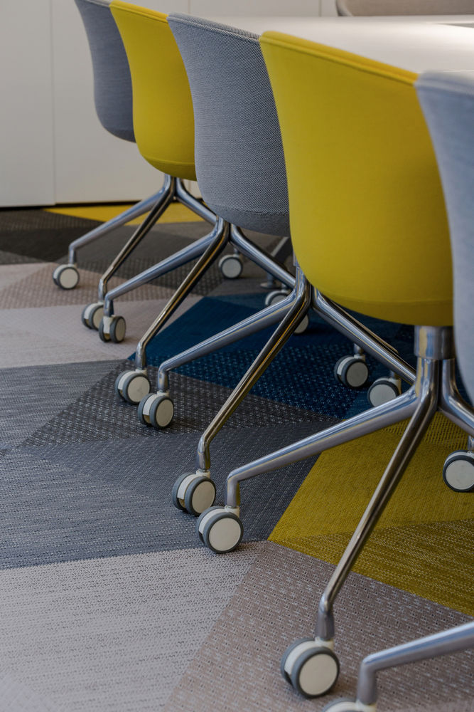
For the conference room, the designers fully utilized neutral tones, with a view to optimizing visual experience. Besides, to improve the efficiency of meetings, a Four Point Eight board-room table was placed in it. There is a rectangular groove in the center of the table so that all power suppliers and data cables can be installed in it, thus avoiding mess in the space. All the lights are focused on the table. Moreover, a smart flat-panel TV was installed on the wall, which offers a new and convenient way for the staff to make presentations and enables them to write on the screen, indicating a future conference mode. The Bolon carpet and HAY furniture with vibrant colors keep tediousness off during meetings. With upward illuminants lightening the ceiling, it makes the space relaxing, though with limited height. The designers are convinced that a good mood improves work efficiency and a space making people feel comfortable is the best people-oriented design.
Designer: Shenzhen Super Normal Design
Design Team: Yang Jianxun, Wu Minwen, Zhang Lei, Li Jianing, Wang Chuangzhe, Song Xiangqian
Decoration Design: Super Normal Design + CROYO
Contractor: CROYO
Photography: Fan Wenyao
20 Images | expand for additional detail
