木作产品是空间结构和饰面以及功能的重要组成部分,如何在有限的尺度内构建丰富的体验场景,以及优化产品展示动线形成多层次的展览视角让空间为产品说话,最终形成自然的转化,这是我们在本案中希望呈现的。
Woodwork productsI is the spatial structure and decoration.And important components of functionality
How to build rich experiential scenarios within a limited scale
And optimize the product display flow to form a multi-level exhibition perspective
Let the space speak for the product
Ultimately forming a natural transformation
This is what we hope to present in this case
Y U J I A N @ D E S I G N
展厅原貌 —Exhibition Hall Original Appearance
该项目位于洛阳市区名优建材城,是一家定制展厅,主要用于展示陈列及销售家居定制系统。业主想要对展厅进行整体的提升改造。原始展厅场地为长方形空间,内部承重柱框架结构,有两面属于和商场过道衔接面。原始展厅空间像被切割成一个又一个的“小盒子”,布局功能分散,实用展墙不多,空间形式单一,利用率不高,且每个 空间之间几乎一览无余,缺乏良好的游走体验。因此,我们在设计时,希望在满足场景化展示和流动空间的状态下,通过丰富的细节节点体验和流畅的空间转换,让空间替产品说话,用设计为产品赋能。
This project is located in the Mingyou Building Materials City of Luoyang City. It is a customized exhibition hall mainly used for displaying and selling home customization systems. The owner wants to carry out overall improvement and renovation of the exhibition hall. The original exhibition hall site was a rectangular space with an internal load-bearing column frame structure, with two sides belonging to the connection surface with the mall aisle. The original exhibition hall space seems to be cut into one "small box" after another, with scattered layout functions, few practical exhibition walls, a single space form, low utilization rate, and almost no clear view between each space, lacking a good travel experience. Therefore, when designing, we hope to empower the product through rich detailed node experiences and smooth spatial transitions, while meeting the requirements of scene based display and flowing space.
外立面 —External facade
外立面设计上结合原建筑形态进行改造,打破原建筑的立面秩序。墙板造型拼接,运用高低错落的关系,将木作定制系统自然的融入其中,给予参观者自然真实的空间美学感受。我们希望构建的不只是单一的展厅,而是定制系统与环境所融合的场景,是人可以游走和驻足的空间。
The seemingly simple lines and structure of the entrance, taking into account aesthetics and functions, are the exquisite hidden inside. Return home to remove all restraints, remove the body tired, embrace the warmth.
透过外立面上的圆形孔洞,展厅内的空间若隐若现,层次感和趣味性跃然而出。金属线条由圆心延伸而出,利落的线条与圆形孔洞,金属吊灯穿插交错,极具秩序之美。
Through the circular holes on the exterior facade, the space inside the exhibition hall is faintly visible, with a sense of hierarchy and fun emerging. The metal lines extend from the center of the circle, with sharp lines and circular holes. The metal chandeliers are interwoven, creating a beautiful sense of order.
入口—Inlet
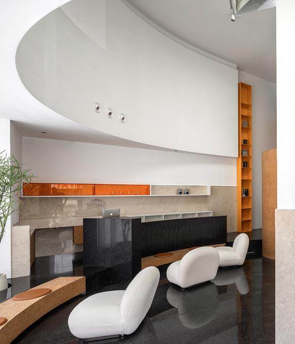
是入口,也是玄关造型和房门系统展示,玄关造型被自然而然的融入其中,不留痕迹。
入口处的弧形墙面柔化了墙角棱角分明的尖锐感,让空间更加流畅自然,人们的游走变得更加顺畅自如。
It is the entrance, as well as the display of the foyer design and door system. The foyer design is naturally integrated into it without leaving any traces. The curved wall at the entrance softens the sharp and sharp corners of the wall, making the space smoother and more natural, and people's movements smoother and more natural.
在入口处置入微景观,取自然之景构空间之境
,以自然的节奏张弛空间气度,以生长的姿态演绎空间力量,生生不惜。光影流动间,木质的温润色泽,自然肌理在绿意的衬托下,更显静谧与自然。弧形吊顶,体块的构成和曲直线相互交错,艺术、结构、细节与质感
完美融合,
彰显
产品质感,营造
空间格调。
Dispose of the micro landscape at the entrance, construct the spatial environment with natural scenery, relax the spatial atmosphere with natural rhythm, and interpret the spatial power with a growth posture, living at all costs. Amidst the flow of light and shadow, the warm color of wood and its natural texture are complemented by greenery, creating a serene and natural atmosphere. Curved ceiling, with the composition of blocks and intersecting curves and lines, perfectly integrates art, structure, details, and texture, showcasing product texture and creating a spatial style.
办公区
—
Office area
办公区和衣帽间收纳系统展示区以黑灰色为基调进行风格叙述,
营造空间的干净利落
。
利落的线条与造型的融入,搭配极简的吊顶与墙面,
与多种材质互相融合,
时尚前卫的空间
节奏感和缓展现,简约与艺术共存。
The display area of the office area and cloakroom storage system is described in a black and gray tone, creating a clean and tidy space. The integration of neat lines and shapes, combined with minimalist ceilings and walls, and the fusion of various materials, creates a fashionable and avant-garde spatial rhythm that is gentle and showcases a balance of simplicity and art.
会客区
—
Reception area
在展厅会客区自然的融入电视柜造型展示区,
从更多元的用户场景体验出发,在有限的空间里多维度的展示产品。通过不同材质,不同造形结构的穿插应用,高标准、高精度的落地效果,展现原材料、生产加工工艺、物料体系等模块,从而更好地展现服务商的专业度和服务落地能力。
In the reception area of the exhibition hall, the TV cabinet design is naturally integrated into the display area, starting from a more diverse user experience and displaying products from multiple dimensions in a limited space. Through the interweaving application of different materials and shapes, high standards and high precision landing effects are achieved, showcasing modules such as raw materials, production and processing technology, and material systems, thereby better demonstrating the professionalism and service landing ability of service providers.
不同
区域之间相互独立,又相互串联
。
洄游动线的引入让空间变得开放而流动,人的活动变得具备更多可能性,
最大化空间的尺度感受。目光流转,光影浮动,步移景异,游走间虚实相生。
Different regions are independent and interconnected. The introduction of migratory routes makes space open and mobile, providing more possibilities for human activities and maximizing the sense of spatial scale. The gaze flows, the light and shadow fluctuate, the scenery changes step by step, and the virtual and real are intertwined while wandering.
橱柜定制系统展示区,从点到线,从线到面,产品既是构成空间的材料本身,也是可以用于展览的艺术品,访客能更直观的感受材料质感,施工工艺,落地服务等,用设计为品牌赋能,用细节代替产品说话
。
The display area of the cabinet customization system is from point to line, from line to surface. The products are not only the materials that make up the space, but also the artworks that can be used for exhibitions. Visitors can more intuitively feel the texture of the materials, construction techniques, and landing services. Design empowers the brand and details speak for the products.
洽谈区
—
Negotiation area
洽谈区可开可合,满足不同场景的转换需求。深色基调营造了一个专注、沉浸的空间氛围,让访客能够更深入的探索、感知与对话。满墙物料展示柜不仅让客户能够更加直观的感受产品,方便选材,同时也是展厅独特的陈设品。
The negotiation area can be opened and closed to meet the conversion needs of different scenarios. The dark tone creates a focused and immersive spatial atmosphere, allowing visitors to explore, perceive, and converse more deeply. The full wall material display cabinet not only allows customers to have a more intuitive experience of the product and facilitate material selection, but also serves as a unique display item in the exhibition hall.
茶室
—
Teahouse
茶室空间隔而不断,视觉上保持空间的尺度延伸感。
极简的线条与造型,
穿插的黑色板材,独特的金属质感,彰显空间高级质感。
The tea room space is constantly separated, visually maintaining a sense of scale extension. The minimalist lines and shapes, interspersed with black panels, and unique metallic texture highlight the high-end texture of the space.
原始结构及平面布局
Primitive type and plane layout
About
Design Company丨设计机构:隅间空间设计工作室
Main case designer丨主案设计:彭华宇
Executive designer丨执行设计/撰稿: 宋威乐 朱梦窈
Location丨项目地址:名优建材城
Project Area丨项目面积:120平方
Project type丨项目类型:定制展厅
end
{{item.text_origin}}

