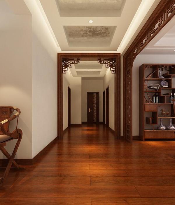
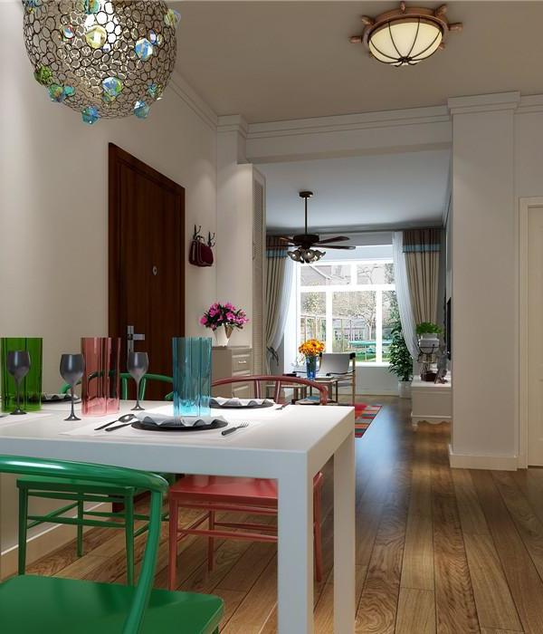
In the centre of London, at the upper floors of a Monumental Victorian Terraced building, a Grade II listed un-modernized maisonette apartment, has been fully re-designed and retrofitted to achieve the highest living standards and provide all the comforts of a contemporary living.
The property is in London ‘Maida Vale’, a mostly residential Conservation Area within the Westminster City Council, and consists of a three-storey top floors apartment, which faces a public road at the front and a beautiful private communal garden, enclosed by similar residential buildings, at the rear.
This area of Maida Vale has an extreme elegance, and buildings, although their monumental nature, appears to be anyway at the human scale. I was impressed since the first time I walked around these streets, and a few dualities gave me essential inspirations for the project: the gentle contrast between the more rigorous elegance of the building fronts on the main roads and the honest chasteness of their rears, which generates the privacy given by the similarity against the greater openness toward the shared green areas; the research of the light through big openings, the view of a more ‘urban’ London through the roofs on one side and a more natural and cosy scenario on the other side.
The project layout is based on a transition that moves from the recovery of the cellular floor plan typical in these kind of dwellings, at the third floor (entrance level) toward a more open and contemporary layout at the upper floor and the mezzanine. A transition, that, both for will and for need, required a full interior refurbishment with complete interior remodelling of the spaces, structural strengthening and installations, full technological upgrade and redecoration.
We developed the design through a contemporary approach with the clean lines of the simple geometrical elements: spaces, volumes, the roof, the staircase, the mezzanine bridge, the bespoke furnitures,.. at the same time, especially at the third floord, integrating and enhancing a few other historical elements: windows, ceiling cornices, doors and architraves..
Materials and colours have been chosen to give light and elegance to the spaces. The ‘white’ that reverbs the natural light appeared to be the appropriate choice then for walls, bespoke furniture and corian tops, furniture volumes are in this way visibly delicate, leaving the perception of the overall house balanced. The European natural oak treated with just a gentle wax appeared to be the best choice to give a natural continuity through the different levels and the stairs, blending original features and contemporary design. For the ensuite bathroom the porcelain cladding similar to the travertine stone resulted a balanced choice to enhance the softness of the natural light, whereas for the for the shared one, a more concrete/grey stone texture has been chosen to enhance the minimalist monolithic perception into this room.
Lighting, especially coming from natural daylight, has been indeed a relevant element of our design. The fourth floor has been designed to enjoy the natural daylight through the different hours of the day. The six opening on the double pitch roof filter the direct sun rays during the whole day, and the bright colours of the room and the glazed elements enhance the light reverb effect. Artificial lighting has been well studied as well, coordinating into a Lutron system a wide variety of light configurations and devices control, for as better comfort and a more efficient energy saving.
{{item.text_origin}}

