融合粗犷与精巧的理发沙龙设计
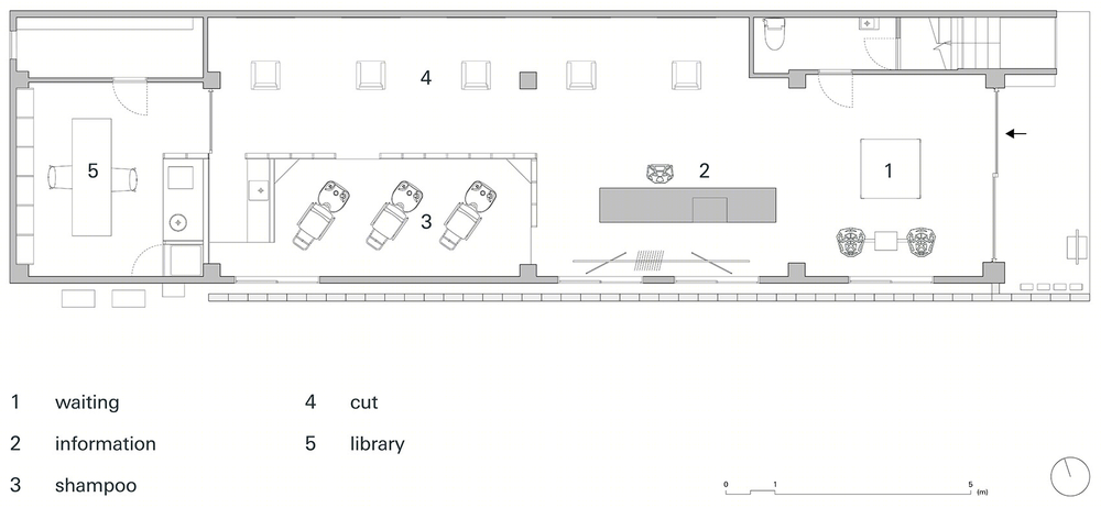
这个美发沙龙改造项目的基地为长条形,沿街面狭窄,于是设计师利用它的进深布置功能空间。建筑一侧与水泥砖墙相邻,但是设计师没有回避它,而是在侧面开窗与其相呼应。这种粗犷的环境正如这里的员工:未经雕琢,拥有无限可能,为沙龙带来了活力。
This is a relocation project for a salon we designed previously.The premises have a narrow façade flanked by utility meters, and windows facing the cement block wall of the adjacent property. Rough surroundings reflect the raw, unpolished charm and undiscovered potential of the staff. We chose to make use of those features rather than hide them for an energetic vibe.
▽建筑外观,external view

▽建筑平面图,不同功能沿进深布置,we can see the location of different functional areas by plan
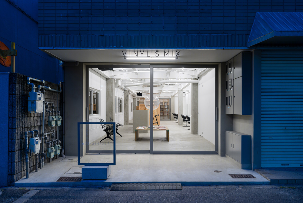
入口处使用巨大的玻璃拉门,行人经过时可以看到建筑深处。室内隔墙可以消除顾客的被监视感,但整个空间依然通透,保持与外界的交流。
To emphasize the depth of the space, the entrance is a glass sliding door with large, unobstructed panes. Dividers inside are high enough that customers do not feel prying eyes from outside, while still sharing the energy of the space with passersby.
▽从入口的玻璃门可以看到房间深处,people could look into the space through the large glass door at the entrance
▽室内概览,overall view of the interior space
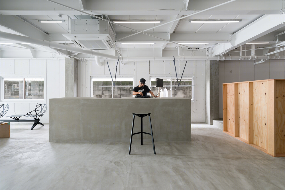


▽面向水泥砖墙的开窗,windows facing the adjacent cement block wall

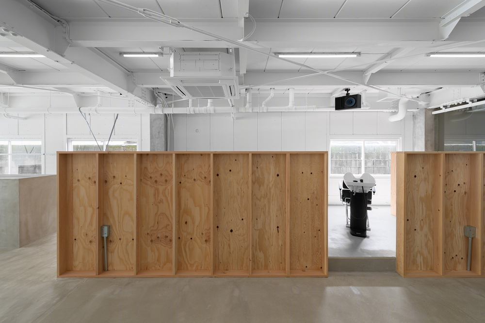
天花板上穿插的钢梁划出了照明网格,而天花下的水管则被用来悬挂衣物杆。与粗野简陋的空间相对,设计师在室内大量运用有纹理的材料,展现出沙龙精巧的本质。
Steel beams crisscrossing the ceiling became a grid for lighting fixtures. Water pipes running just below the ceiling are repurposed as supports for a bar to hang garments on. The redesigned interior has plenty of textured materials to harmonize with the existing rough, unfinished space, expressing the essence of the salon.
▽衣物杆悬挂在水管下,bar hanging under the water pipesYour Content

▽隔墙在提供私密感的同时保持空间的畅通,dividers providing privacy while keeping the transparency of the space

▽剪发区,cut area
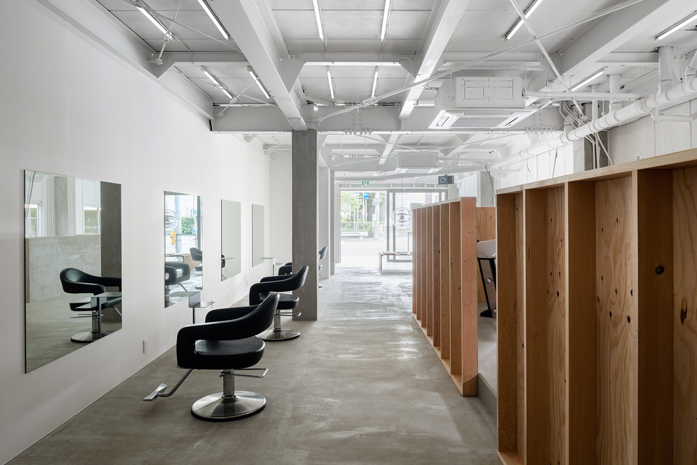
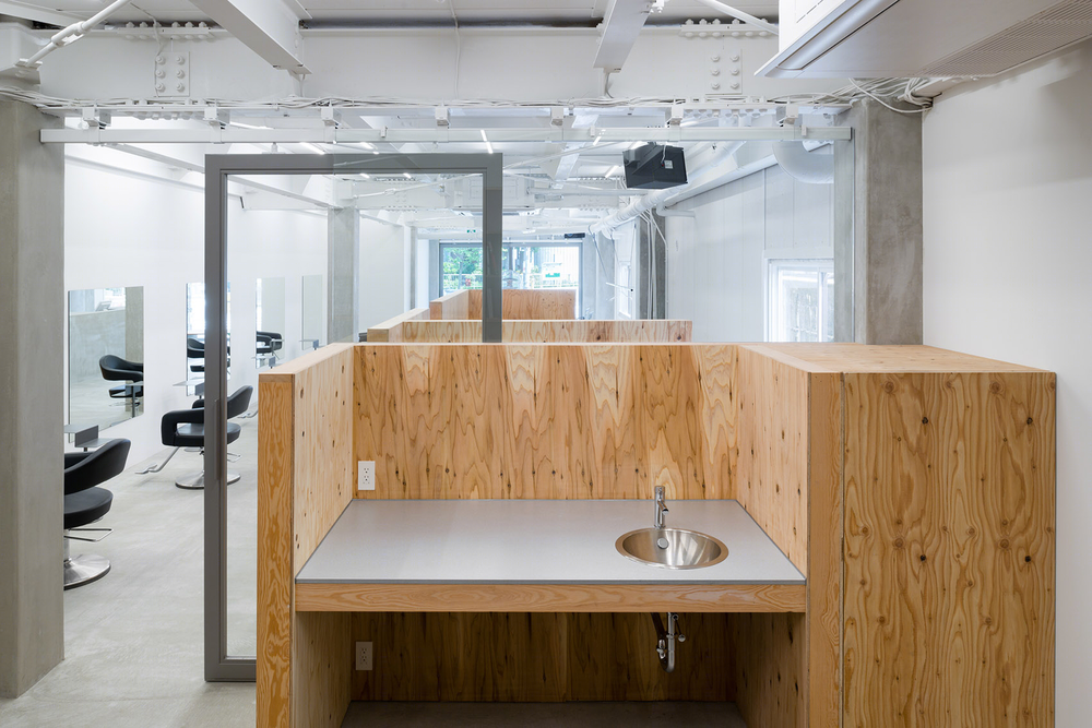
▽隔墙内为洗头区,shampoo area inside the dividers
委托人将美发沙龙起名为vinyl’s mix,希望将音乐,美术及其他不同的文化艺术形式融入其中。图书室的设计正反映了这一理念。这间小图书室是整个沙龙中最富有活力的空间。这里的图书由员工们收集整理,反映了每个人的想法和喜好。
The name “vinyl’s mix” reflects the owner’s idea of integrating music, art and other forms of cultural expression into a hair salon. The library represents this ideal. This is the youngest and most lively of the salon’s locations. The staff has curated a collection of books to showcase their ideas and personalities.
▽图书室入口,entrance of the libraryYour Content
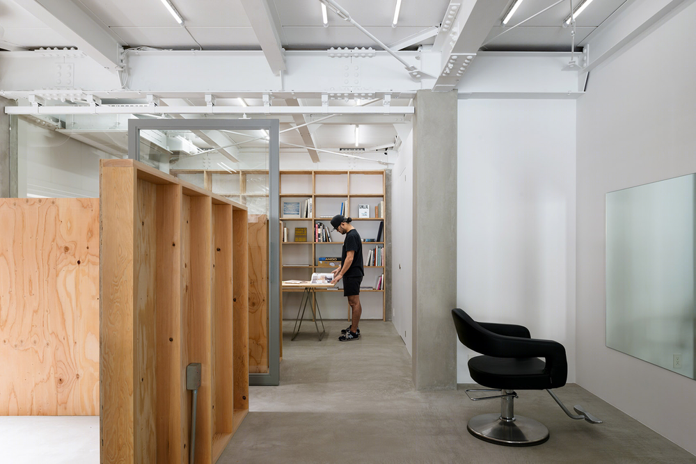

▽图书室,libraryYour Content

▽从图书室向外看,look from the library
▽夜晚从室外看向室内,look from outside during night

Property name: vinyl’s mix
Use: Hair salon
AREA:90.9 ㎡
Designer: Sohei Arao
Photographer: Yoshiro Masuda
Construction company: UEMOTO KOUMUTEN
Address: Imashige Bldg. 1F, 2-3-23 Hagoromo, Takaishi-shi, Osaka
Designed: January 25 – March 31, 2016
Built: April 1 – May 3, 2016
Brand/products
pendant light : VP Globe / vintage model
bench: CHAIR_ONE PUBLIC SEATING SYSTEM / Magis
Hi stool : STOOL ONE / Magis
chair : Tip ton/ vitra
Table : FRAMES / SIDES CORE
Drawing: SIDES CORE
English text: SIDES CORE

