Firm: TRD Design & Construction
Type: Commercial › Office Government + Health › Hospital Medical Facility
STATUS: Built
YEAR: 2021
SIZE: 0 sqft - 1000 sqft
BUDGET: $10K - 50K
Photos: Mohammad Hassan Ettefagh (12)
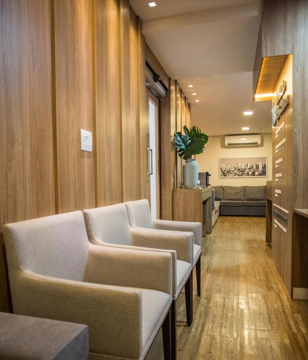
The building initially had a chaotic plan with the atmosphere of residential spaces of the previous decades, which in addition to having a worn-out body, it lacked architectural values (especially therapeutic space standards) from the aesthetic point of view. Therefore, by recognizing the needs of the employer and trying to make the least intervention due to the time limit and the clinic's work schedule, it was tried to provide a favorable environment for the use of health-beauty services.
In order to create privacy and prevent feeling of anxiety due to the display of treatment operations, spaces are considered closed and completely separated from the waiting space.
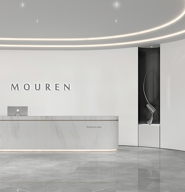
The entrance corridor which, in the original structure, operated as the entry path into space, has become an organized pre-entrance space with hygienic and sterile preparations, alongside a showcase of space introduction and in harmony with the white color and glass material. The movement path from the entrance is defined and extended into the spaces and in its path, in addition to defining the position of the ceiling lighting, with a gentle strain, creates a soft arch like the organic lines of the human body.
The chaotic atmosphere caused by the existing kitchen facilities has been transformed into a hidden pantry space in direct relation to the space behind the reception counter with a hidden door in the same glazed glass wall. In each room, based on the allocated use, by utilizing the created facilities and hygiene infrastructures, the facilities needed for those spaces are considered for the relevant medical operations. All walls and surfaces are considered as minimal and only in the space behind the reception counter, slab stone has been used which, with its reflection and streaked texture, has been an attempt to create a point of gravity in space and focus on the countertops.
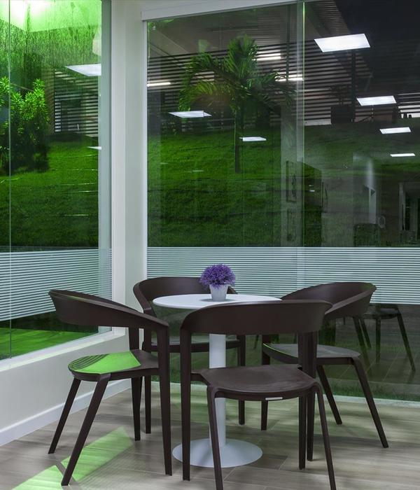
In defining organizational indicators of the complex and for creating a minimal space which fits the therapeutic space, according to the employer's opinion, the medical green color has been used in the background of neutral and pastel colors. In the meantime, efforts have been made to create seamless, smooth and hygienic floors tailored to the color of the walls and to create more integration with the walls, epoxy materials with cement texture and in accordance with the coloring of the space has been selected.
{{item.text_origin}}

