- 项目地址:浙江-嘉兴-约克IVE水生态中央空调展示中心
- 设计风格:现代极简
- 硬装设计:周笙笙建筑装饰设计
- 主要材料:涂料,微水泥,线性灯,超白玻璃,钢架结构,植物造景等
点击上方“
周笙笙全案设计工作室
”可以
订阅哦!
▲[ 1F平面方案 ]
First Floor plan
打破传统专卖店思维设计是甲方的重点需求,也是我们追求的设计思考方向,在格局上我们采用“回”型环绕动线把前台接待、洽谈区、展示区、深度展示区形成一个双向闭环,因为我们相信好的展厅设计就是带着客户考察解说一圈,就可以坐到适合的位置谈合同了.
Break traditional store thinking is the focus of the party a's requirements, design also is our pursuit of design thinking direction, on the pattern we use type "to" use a line round to the front desk reception, negotiation area and displays, depth, exhibits a double closed loop formation, because we believe that a good exhibition hall is designed with the customer to investigate explanation once, can sit to the suitable position about the contract.
▲[ 2F平面方案 ]
Second floor plan
设计上用解构主义来构筑空间关系。通过几何造型形成的叠加来体现建筑形态,同时划分功能区域。各个空间的不同组合,为客户提供一种新型的专卖店空间体验。
The design uses deconstruction to build spatial relationships. Through the superposition of geometric modeling to reflect the architectural form, while dividing the functional areas. The different combination of each space provides customers with a new type of store space experience.
▲[ 入口楼梯间 ]
Entrance stairwell
此案中楼梯的运用不再单纯的作为连接两层之间的跳板,它展现出更为特色独特风格,为整个室内空间锦上添花
The use of the staircase in this case is no longer a simple link between the two floors as a springboard, it shows a more unique style, for the entire interior space icing on the cake
▲
[ 前台接待
]
Front desk
每个区域通过有节奏感的划分,抬高和下沉,让这些区域有自己的附属特性和展示产品的归类,加上不同的通道、门洞衔接流通来模糊界限虚实,前台接待区域的设计更是体现解构主义带来的视觉冲击。
Each area is rhythmically divided, raised and lowered, giving these areas their own attributes and categories of display products, with different channels and openings connecting the circulation to blur the boundaries between the real and the virtual, the reception area is designed to reflect the visual impact of the deconstruction.
▲
[ 洽谈区
]
Discuss the area
洽谈区通过黑灰蓝色系的线面构造围合,使空间几何结构延展,既保证了洽谈的相对私密又能通过透景的方式对展厅有一种窥探的欲望,二楼长条型窗户增强了空间的通透度,也增强了二楼与一楼的关系
。
The discussion area is enclosed by the line and surface of the black-gray-blue system, which makes the space geometry extend, which not only ensures the relative privacy of the discussion, but also has a desire to peep into the exhibition hall through the way of perspective, the long strip windows on the second floor enhance the transparency of the space and the relationship between the second floor and the first floor.
▲
[
玻璃盒子展示区
]
Glass box display area
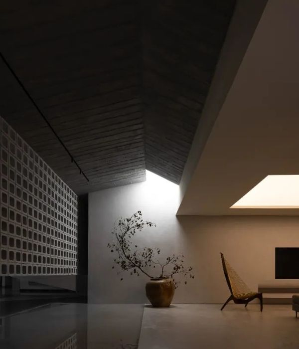
在展厅的中区采用玻璃半围合形式,用灯光模拟出天光投射在干枝景上,形成自然而然的诧寂美学环境,把暖通展厅的单调乏味,通过我们的设计最终呈现出丰富的空间形态。
In the central area of the exhibition hall, the Glass half-enclosed form is used to simulate the skylight projected on the trunk scenery, creating a natural and tranquil aesthetic environment, making the HVAC exhibition hall monotonous and Boring, through our design, we end up with a rich spatial form.
▲
[ 玻璃盒子展示区
]
Glass box display area
‘’玻璃盒子‘’中经过高低错位的墙面结构,使得空间相互渗透,形成新的立体形态的场景。
The wall structure in ' 'glass box' 'with the height dislocation makes the space permeate each other, forming a new three-dimensional form of the scene.
▲
[ 综合展示区
]
Comprehensive exhibition area
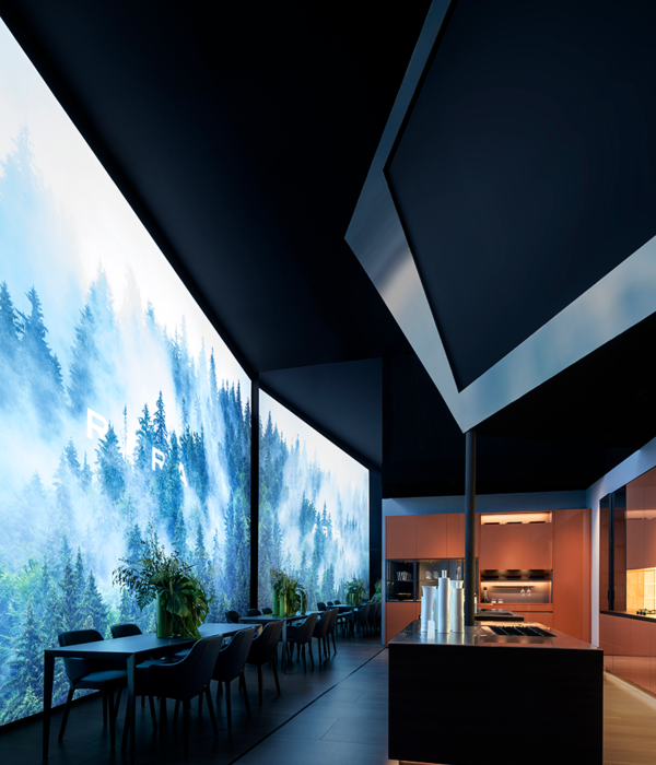
每一个空间的创作都是一种形态,一个个体块结合在一起在这个空间里犹如我们走在一个抽象雕塑的幻象里,每个视角,每个区域,都充满着来自这个空间告诉你的艺术美感。
The creation of each space is a kind of form, and an individual block is combined together in this space as if we are walking in the illusion of an abstract sculpture. Every perspective and every region are full of artistic beauty told to you by this space
项目地址:浙江-嘉兴-约克IVE水生态中央空调展示中心
建筑面积:300
设计风格:现代极简
硬装设计
:
周笙笙建筑装饰设计
主要材料:涂料、微水泥、线性灯、超白玻璃、钢架结构、植物造景等
THANKS
公司地址:长沙东塘潇湘红影文创园3-206
手机 /tel:15388051772
:长沙设计师
周笙笙
周笙笙全案实景 | 400m²冷酷工业风-约克空调展厅
周笙笙 | 卓伯根(ZURBRÜGGEN)中国区总部.公寓公区
{{item.text_origin}}

