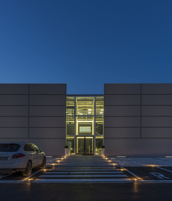
The creation of a public equipments complex within the warehouse Macdonald allows to realize the link between existing architecture and architecture to come, revealing the needs and developments of a changing society. It is also the pretext of the connexion between traditional processes and contemporary needs.Existing warehouse’s architect, Marcel Forest, described it as a base, convenient to the reception of future extensions.This one will be realized by a light metallic structure, a support of a big linear roof sheltering an ensemble of public services.
This big roof put on the existing base, participates in the development of an architectural heritage by adapting it to contemporary functional needs.By its dimensions, its situation and its size, the existing building and its extension is to be looked as and considered on a territorial scale, offering a horizon, proposing an infrastructure. The territory becomes therefore support of the new project; the existing offers the base whereas the roof serves as an unifying element, sheltering a succession of spaces and functions.
Urban and landscaped insertion
The project is located in a strategic position, at the start of the 600m long existing warehouse, between the viaduct of railroad networks and the boulevards Maréchaux, in the center of a zone in full urban restructuration connected to the city and its surrounding by new tramway lines. The insertion of the project answers three imperatives:
- The urban reglementation
- The will to create a strong and contemporary architectural image
- The will to join the context in a just balance, responding to the obligation of preservation of the North facade
The architectural intervention is made of a game of horizontal which strengthens the expression of the existing building. The unity and the homogeneity of the place are looked for to avoid the expression of the programmatic accumulation. The rhythm of the facade, sequenced, is given by a succession of metallic vertical elements. The continuity of the architectural vocabulary of the various equipments confers to give to the building a unity which joins on the scale of the whole masterplan designed by OMA.
The roof
It shelters all the programs and puts in relation the inside and the outside. The overhang generates an interstitial space and defines a profile while marking the continuous statutory line of 65.26 NGP. The ascending edge of the roof from east to west also gives to the silhouette the expression of the start of the general complex.
Thanks to a folded plans vocabulary, public places are connected to the private spaces, as well as the outside square and the inner courtyards. On the outside, its materiality is reinforced by the use of a parisian traditional material (zinc) whereas on the inside, it become lighter and perforated through an alternation of glass elements and zinc panels, allowing the best enlightening for the courtyards.
Filters
The composition and materiality of the façade respond to the general design given by OMA masterplan. Each has to be composed through a superposition of horizontal stratas, materialized with crystal and mineral elements. The structure grid is the starting point for the general composition of the façade. Density of the louvers allows to express the privacy of the functions beyond.
Façade
The relation between inside and outside is handled through the use of filter. It composes, defines and distinguishes facades and is therefore decline through 2 different types: on the outside dark grey metallic louvers that dialogue with the context marked by its industrial past , on the inside a double glass skin, made of an alternation of glass panels and of a metallic membrane which spreads the light. The depth of the filter is investigated in its multiple dimensions. Space and light are therefore amplified.
Exteriors spaces
The succession of the courtyards organized in terrace on different levels allows the needed separation between the junior schoolyard and the high school courtyard. The sequence of the outside spaces is materialized by the implementation of vegetable strips: these are also similar in a way to a filter and bound the space without creating real borders.
{{item.text_origin}}


