《菊豆》Shoppingspace
空间形象效果展示服务
Creative Concept Of Spatial Image
Designed by DA KE DESIGN
2021.04
除了艺术之外,没有更妥善的逃世之方而要与世界联系,也没有一种方法比艺术更好
Besides Art,There is no better way to escapeAnd connect with the world,There is no better way than art
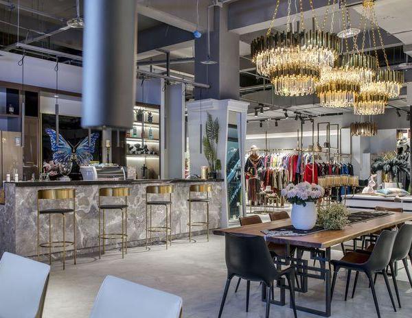
-【揉和】-特殊的店面需求,鞋包与服装得统一与区隔,韩系与小法得元素提取,微水泥与木质得材质平衡...“融合”似乎是贯穿整个空间得主题。
生活的美好源于艺术与自然,在丰富功能的同时尽可能的把空间做通透和纯粹,在视觉上的艺术感受被满足。
Special store needs, shoe bags and clothing must be unified and separated, Korean and small fade element extraction, micro cement and wood material balance... "Fusion" seems to be the theme throughout the whole space.
The beauty of life comes from art and nature. While enriching the functions, we should try our best to make the space transparent and pure, and the visual artistic feeling is satisfied.
Intention of the facade
DAKE DESIGN
在空间中最多停留的就是店主/员工,合理的操作空间舒适得空间氛围也能够感染进店的每个顾客,更好的提高成交机率。
The shopkeeper / employee is the most staying in the space. The reasonable operation space is so comfortable that the space atmosphere can also infect every customer entering the store, so as to better improve the transaction probability.
产品不同得陈列方式以及大量的仓储空间是小空间的重点,有效收纳让空间更加整洁并且有扩大视觉感官的效果。
Different display methods of products and a large amount of storage space are the focus of small space. Effective storage makes the space cleaner and has the effect of expanding visual senses.
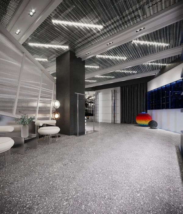
作为空间里不可去除的柱子,通过融入元素反而强调了柱子的存在,使其成为整个空间里的视觉记忆点。
As an indelible column in the space, it emphasizes the existence of the column by integrating elements, making it a visual memory point in the whole space.
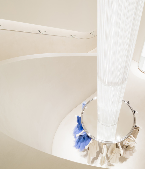
女性顾客得粘性更久,所以更应注重于在这个空间内的任何一个角度,都能感受到美好事物很直接的视觉传达。
Female customers have a longer stickiness, so they should pay more attention to the direct visual communication of beautiful things from any angle in this space.
Project Name
项目名称菊豆
Location|项目地址江苏省徐州市
Area项目面积约60
Chief Designer
首席设计师
大可Master Designer
主案设计师孙冰
Participating designers
参与设计师小波 宋晨
Lighting designer
灯光设计师大可
Material Science
主要材料微水泥 柚木
文字/图片:DAKE
图片调整编辑/排版:DAKE
DESIGNER
大可设计工作室创始人/设计总监:大可
{{item.text_origin}}

