Mardi Mercredi store by Studio Unravel
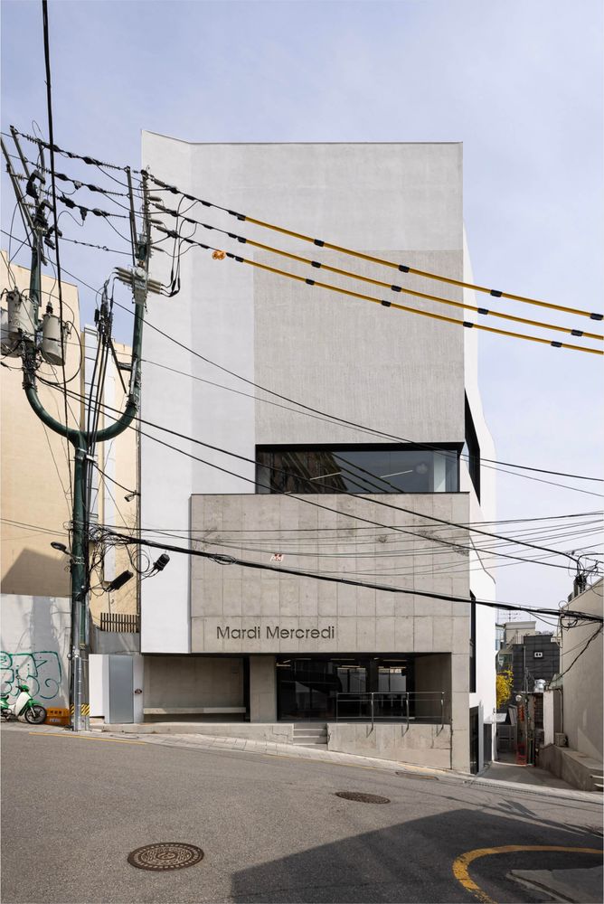
Targeting a savvy Gen Z demographic, South Korean womenswear brand Mardi Mercredi has garnered a large following since its foundation in 2018 by husband-and-wife team Hwa-mok Park and Valerie Lee. Simultaneously with the brand’s rapid growth, the aforementioned duo set their sights on retail early on, collaborating with Seoul-based architecture practice Studio Unravel to create ten design-led retail spaces. Needless to say, its home market is the most significant, and in the South Korean capital alone it manages four standalone shops. The latest to open its doors is a hybrid retail concept in the city’s vibrant Hannam neighbourhood, and yes, it’s once again designed by Studio Unravel. Mardi Mercredi secured an existing four-storey building just off bustling Itaewon-ro which has been fully redeveloped and now also flaunts a brand new façade. The total retail space is no less than 539 sqm. (5,802 sq.ft.), spread across a café and bar, a pop-up space, and shop.
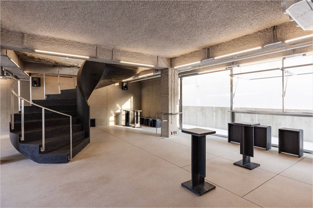
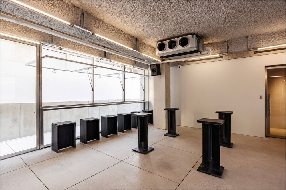
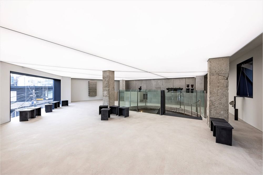
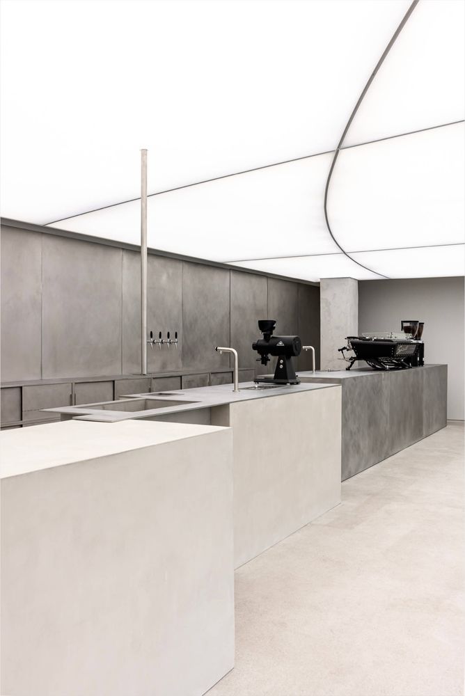
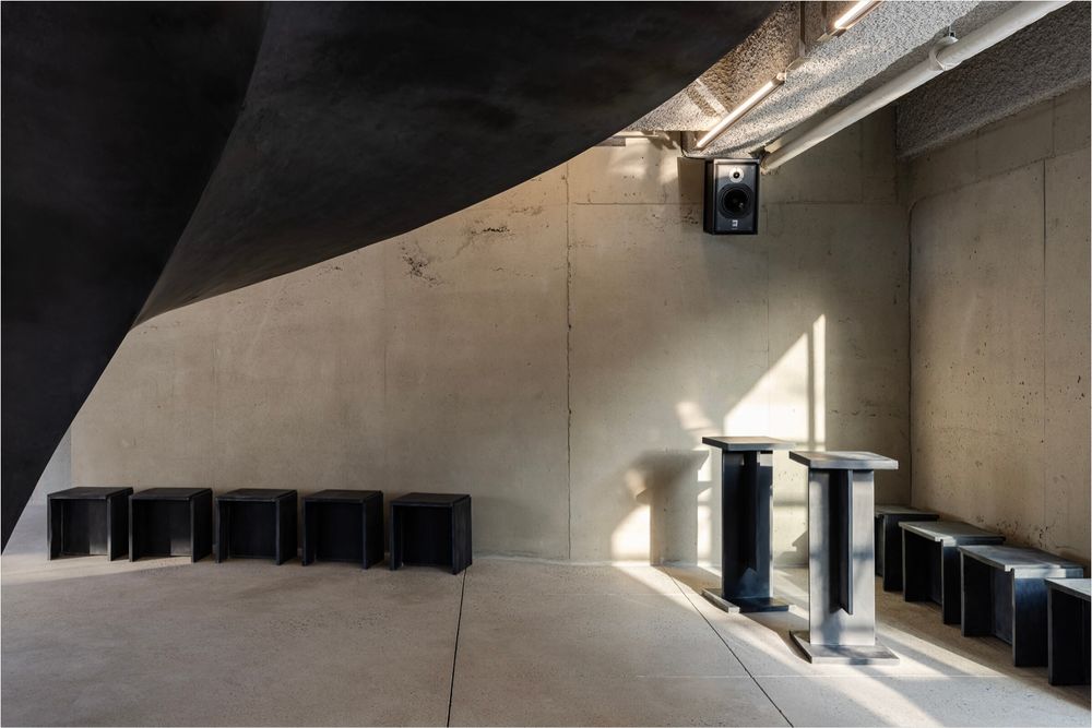
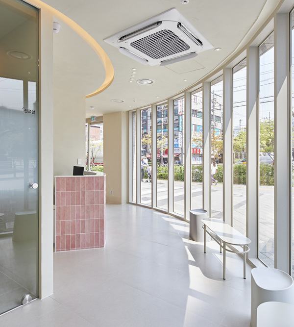
Needless to say, the Mardi Mercredi premises have been designed to boost customer engagement by presenting a full-fledged lifestyle context which seamlessly adapts to the shopping experience, and in fact, elevates it. As such, the biggest space is allocated to the café and bar which occupies the lower two floors. Large floor-to-ceiling glass on two sides allows in floods of daylight which puts the austere design front and centre. Making use of the building’s shell, bare concrete support pillars and wall sections are integrated in the monochrome design which sees terrazzo flooring paired with a sprayed ceiling. A large spiral staircase in black ties in with a series of stools and monolithic tables, the only furnishings to be found here. One floor up, an extension of the space unfolds, featuring a slightly different setting thanks to concrete flooring and an expansive backlit Barrisol ceiling which add a strong visual dynamic. Furnishings are similarly few, comprising merely an elongated bar and black stools.
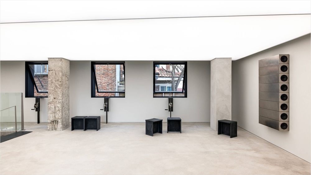
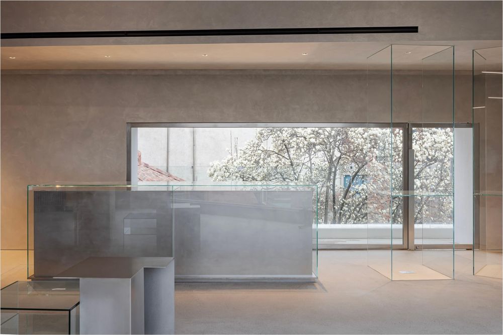
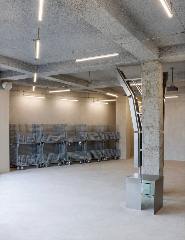
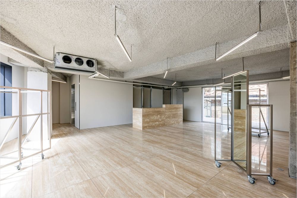
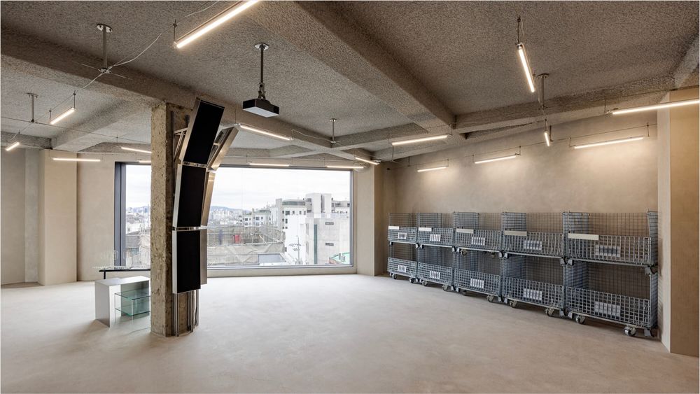
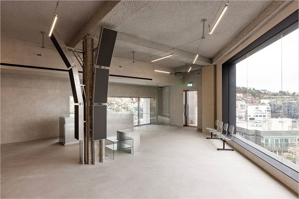
A wall-mounted metallic object adds an artistic touch to the setting. The third floor is reserved for pop-ups of any kind, but mostly collaborations with other brands. Here, in stark contrast, a polished stone floor evokes an entirely different atmosphere. Furnishings comprise a sales counter in matching stone and large moveable metal display racks. Last but not least, the actual Mardi Mercredi store is situated on the top floor. The chosen austerity once again takes different shape—a glass-encased sales counter is paired with two floor-to-ceiling glass display units, metallic and glass display tables, a transparent seating unit, and lining the side wall, are two rows of stacked industrial metal carts. As music is very much part of Mardi Mercredi‘s lifestyle equation, speakers dot the premises in different forms, and here, it’s prominently present, enveloping an entire support pillar. The new Mardi Mercredi store carries the brand’s full range of apparel and accessories. © superfuture
Designed by :
Studio Unravel
Images © Studio Unravel
Photography: Sunghoon Han
