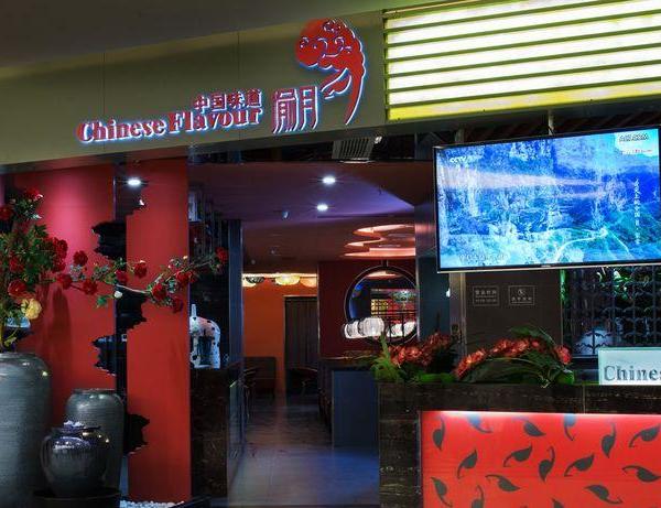
Things are so small and full here
The best time before midsummer
Xiaoyingman is a happy life
It is also the best state of life
位于西班牙惠斯卡市的美食健康餐厅,客户希望提供以上标志性的健康食品,一种超越美食的感官体验,因此设计师建议使用100%的天然材料,将自然融入空间。在城市和健康美食间寻找一个连接点,建立在有益生活方式基础。
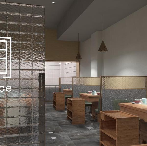
This is a gourmet and healthy restaurant located in wisca, Spain. Customers want to provide the above iconic healthy food, a sensory experience beyond food. Therefore, the designer recommends using 100% natural materials to integrate nature into the space. Find a connection between the city and healthy food, based on a healthy lifestyle.
棕色、白色和绿色泥土色调占据整个空间,让客人联想到大自然,而金色调则让气氛显得有点复杂。空间主要形式是不完美的、有机的,在地板上画一条小路,让人联想到穿过森林的感觉。陶土用于地板、酒吧和墙壁,粗糙灰泥应用于多个区域,作为对自然的另一种参考。
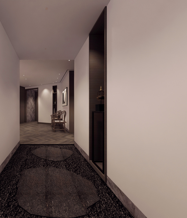
Brown, white and green earthy hues take up the whole space and remind the guests of nature, while gold hues make the atmosphere a little complicated. The main form of space is imperfect and organic. Drawing a path on the floor reminds people of the feeling of walking through the forest. Clay is used for floors, bars and walls, and rough plaster is used in multiple areas as another reference to nature.
意大利汉堡连锁店Bun,该项目创建一个明确关注年轻一代的身份,同时代表高品质汉堡餐厅更先进的方法。
Bun, the Italian hamburger chain, created a more advanced approach that explicitly focuses on the identity of the younger generation while representing high-quality hamburger restaurants.
在过去的几年里,汉堡连锁店有强劲的增长,大多数都选择老式和工业外观的空间。Bun开发的设计则采取相反的方向,并试图创造创新的概念,展示Bun及其粉碎汉堡的真实性。
In the past few years, the hamburger chain has seen strong growth, with most of them choosing old-fashioned and industrial looking spaces. The design developed by bun takes the opposite direction and tries to create innovative concepts to show the authenticity of bun and its smashed hamburger.
通过这种方式,设计师使用金色的触感和水磨石瓷砖,混合一抹色彩,创造一个复杂的,但同时新鲜的设计。项目本身是从对空间现有元素调查开始的,目的是将其融入整体设计美学。
In this way, designers use golden touch and terrazzo tiles, mixing a touch of color to create a complex but fresh design at the same time. The project itself starts from the investigation of the existing elements of the space, and the purpose is to integrate it into the overall design aesthetics.
设计师说:“当我们从空间中看到美丽的砖块和弧线时,很明显我们会将这两种元素作为设计的出发点。”
When we see beautiful bricks and arcs in the space, its obvious that we will take these two elements as the starting point of the design, the designer said.
为了通过空间创造统一的美学,在整个空间中添加绿色和紫色的额外弧线形式,一些是完全独立的,另一些则突出内部建筑中已经存在的弧线。木制桌面和植物代表健康和零塑料身份。
In order to create a unified aesthetics through the space, green and purple additional arc forms are added to the whole space, some of which are completely independent, and others highlight the existing arc in the interior building. Wooden tabletops and plants represent health and zero plastic identity.
{{item.text_origin}}

