Architects:Estúdio BRA
Area :969 ft²
Year :2019
Photographs :Maura Mello
Lead Architects :Rodrigo Maçonilio; André Di Gregorio;
Project Team : Renata Fassio; Anariá Ladeira; Lais Pannia;
City : Brooklin
Country : Brazil
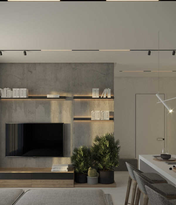
After the first conversation with the future resident, it was decided that the integration of the environments would be achieved through the use of a small material palette and that the furniture would, whenever possible, pass through more than one room. Basically we have wood and some gray [melamine laminate, concrete or high-strength porcelain tiles] on a white background.
In the common areas, wood goes on the walls so that visitors and residents can touch it and observe it during moments of relaxation and meals. In the intimate areas the wood is on the floor reinforcing the comfort of walking barefoot.
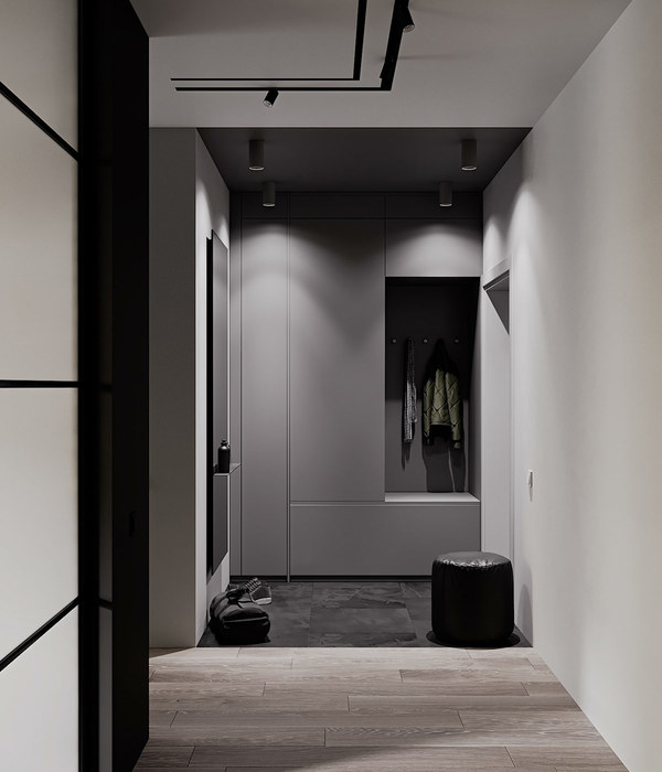
The small palette of materials made it unclear, for example, where the toilet, wardrobe, bedroom doors or the bookcase are, since they were all organized in a panel made with the same wood and with a design that minimizes possible bumps, handles or any item that could break the organic flow of the line that runs through the entire plant.
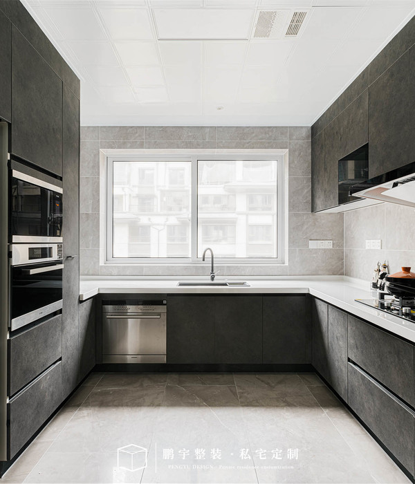
The kitchen, which was dark before the renovation, gained light when we removed the balcony door and part of the intermediate masonry. This new luminosity was enhanced with the palette of white materials of the environment, granite flooring with white and blue pebbles, clear countertop stone and cabinets made with the same wood as the panel but this time with a light coat of white paint bounce light and at the same time preserve the textures and peculiarities of each material.
The concrete beam was peeled and remains there telling which was the first wall demolished and serving as a ruler for the height of all other items in the home. The readjustment of the plant made the six-seat table fit where the balcony door once stood. Now dinners, barbecues and celebrations can enjoy natural lighting and at the same time maintain the relationship with the living room and kitchen.
The island becomes a purposefully heavy and central element as it is rough, dark, rises from the floor while it is surrounded by walls and clear panels that by inverted skirting do not even touch the floor. Those who lean against the island does stand out because of the contrast of colors.
▼项目更多图片
{{item.text_origin}}


