Firm: Dmytro Aranchii Architects
Type: Commercial › Office
STATUS: Built
YEAR: 2019
SIZE: 5000 sqft - 10,000 sqft
BUDGET: Undisclosed
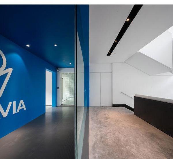
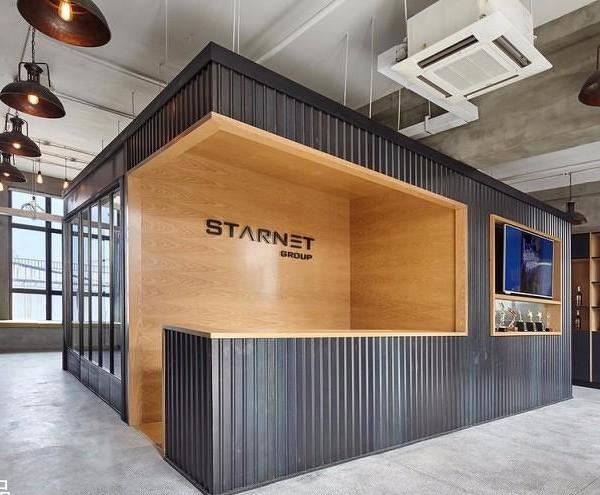
The project of office for 50 employees in the Kyiv city. The main task was to completely rethink the office space for the HR department, which had been in use for many years and needed a major overhaul. The main idea of the project is the transparency of processes.
NAME: Fora HR office
WORK NAME: NVI
LOCATION: Alishera Navoy str., Kyiv, Ukraine
AREA: 600 m2
DATE: 2019
ROGRAMME: HR office for 50 people for one of the biggest Ukrainian retail companies
PHOTO: Alik Usik
STATUS: Implemented
ARCHITECTURE: Dmytro Aranchii Architects
DESIGN: Dmytro Aranchii
TEAM: Anhelina Hladushevska Yevhen Martynenko, Yevhen Kravchenko
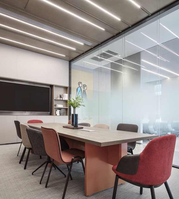
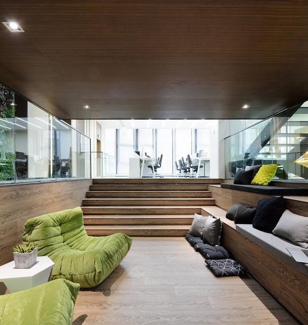
The HR department is the place where a person meets his employer for the first time. The design depicts the complete transparency of the company to any applicant and employee. This is embodied by glass partitions along the main transit and between departments. The job seeker immediately enters a bright and large area for initial questioning and waiting. Also, comfortable spacious areas for seating and meals are provided.
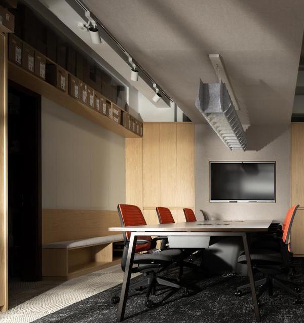
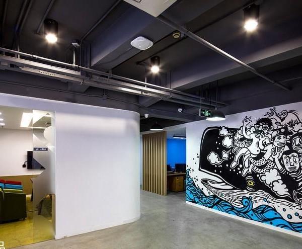
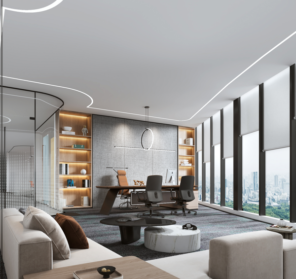
The heart of the ceiling structure is a context-sensitive system. The context for it is created by the seats of employees. The lines that cut through all the rooms underline the overall integrity of the space. This correlates with the idea that the company is a unit and operates as a single organism. There are two hierarchical levels for attractors defining the system: small attractors (for one workplace) and large attractors (in places where many workers sit close). For small attractors, the lines are drowned, and large attractors pull the lines behind. This creates craters that add dynamics to the rigorous lines. Ceiling designs were created using a parametric model, which greatly accelerated work. A few parameter’s switches were needed for any changes, such as adding a new workplace point or changing the point hierarchy. Colour division serves not only to dispel myths about the greyness of typical offices. Bright colours improve navigation, work for easy memorization and orientation in space.
The renovation also touched the facade of the building. Using the computational methods, the pattern of smooth transition between light and dark tile was made. A detailed tile layout was developed for the workers and the drawing was repeated exactly as designed with respect to the placement of each tile.
{{item.text_origin}}

