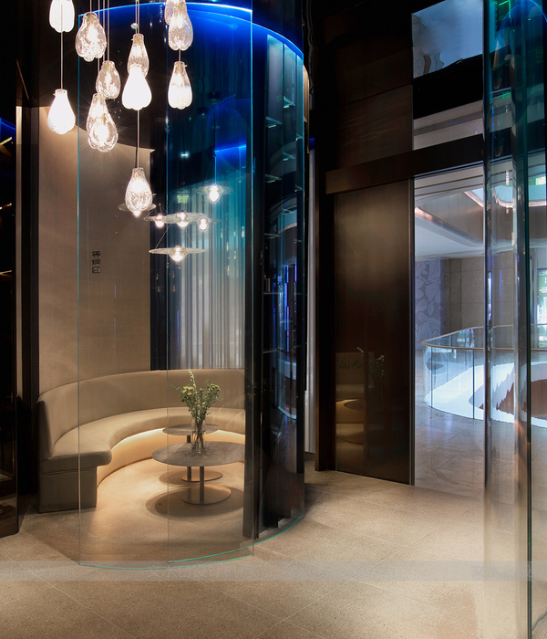
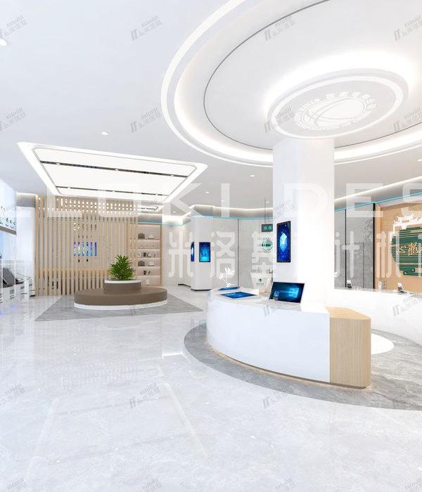
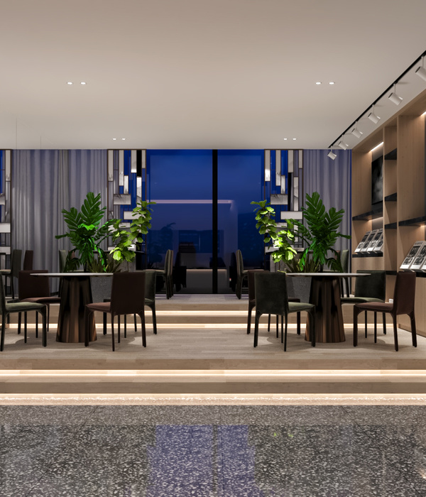
2018年9月22日“一条视频”的新零售线下店在上海三个商业中心同时开业,并在接下来的一个月后成为“上海居家日用热门榜”第一名(来自大众点评榜单)。新零售的概念最早由马云于2016年提出,他认为新零售是“线上线下和物流结合在一起”的产物,因为随着时间的推移,互联网人口红利给电商带来的粉丝自然增长的效益将遇到瓶颈。正是在这样的背景下,一条选择进军线下市场。一条创始人徐沪生在接受媒体采访时指出:“按我个人的估算,线下获客的成本应该是线上成本的十分之一。”▼一条莘庄店(上海仲盛世界商城),Xinzhuang Store ©陈平楠
对新零售而言,线下店最为核心的任务是拉新,并配合线上一起打出组合拳,最终形成高复购率。最终,高频复购背后所对应的“线上线下”总利润,才是新零售的追求。只有理解了新零售与传统商业的差异,才能真正设计出所对应的线下空间(场景)。
线下店主要通过两种方式实现引流任务:一是打通流量的路径;二是制造体验场景(扫码复购的起点)。
As to the new retails, the most important task of offline shops is to acquire new customers and coordinate with the online retails in the pursuit of the highest repeat customer rate. And eventually, the total profit from both online and offline retails based on such high repeat customer rate is what the new retail is distinguished for. Therefore, only when we understand the disparity between the new retail and traditional one, can we successfully design a correspondent offline space or experience.
To achieve the traffic increase, offline shops can rely on two approaches, opening all paths for traffic or creating attractive scenarios for experience (a start point for repurchase through QR code scanning).
▼一条新天地店,(LuOne凯德晶萃广场),Xintiandi Store ©一条
▼一条浦东店(LCM置地旭辉广场),PutongStore©一条
打通流量路径
Increase paths for the traffic
难点Challenges
莘庄店位于一家销品茂的三楼,前身是一家餐厅。餐厅入口十分狭小,大约只有1米多。面向销品茂中庭的立面是沾满油灰的金属幕帘,暗淡无光。这样的位置、入口和形象对于零售业态十分不利。另一个难题是,这个跃层的店铺,上层虽然在销品茂的四楼,却没有直接对外营业入口,从下层进入的顾客必须由内部楼梯引导至上层。更有难度的是,上层总共300多平米,却被分割为三大两小五个空间,不同空间之间的通道只够一人通行。这样的空间条件严重制约着新零售对“流量”的追求。
The Xinzhuang Store is situated at the 3rd floor of a shopping mall, where used to be a restaurant. The entrance is very narrow, only about 1 meter wide. And the facade facing the center of the shopping mall is a dim metal curtain full of oil stain and dust. Such location and entrance is none other than an adversity to a retail business. Another problem is that the store is of a loft structure, but the upper floor has no direct access to the 4th floor. As a result, customers have to reach the upper floor through an inner staircase. Even worse, the upper floor of 300m2 in total is divided into three large and five small rooms connected by narrow passages for only one person. All the difficulties strictly limit the traffic increase which the new retail most concerns.
▼场地原状问题分析,analysis of the original site
2. 对策 Strategies
针对以上难题,我们提出的总体策略是加入6个装置,打通各个阻碍“流量”的环节,顺势引流。
第一个大装置是“一大条”,它首先解决的是整体形象问题。我们将金属幕帘去除后,把较大的内部空间暴露出来;并且在内部空间塑造一个集合楼梯和货架于一身的“建筑装置”。这个可以“带货”装置,在精心设计的灯光的照射下格外显眼。在商城中庭内的人流的眼球被牢牢吸引,继而将人流通过装置内的楼梯引导至跃层的上层空间。装置采用了简朴且轻型的扁钢结构,经过10多轮的讨论设计而成。这一轻钢结构包含了设计的各个环节,从建筑结构至细小的道具均尊从简朴原则,从而形成明显的辨识度。
To solve these problems, our strategy is to add 6 devices, increasing traffic through opening all joints.
The first device is “Yidatiao” (a distinctive structure), which helps to create a whole image. We expose the inner space by removing the metal curtain and build an architectural installation combing stair and shelves. This structure, also functioned as a display shelf, is quite eye-catching under the delicate light. Customers in the atrium will be attracted firmly and continue their ventures to the upper space through the stair-like structure. This structure made of simple and light-weight flat steel is an outcome of over 10 rounds of discussions. Such a light steel structure is fully designed from its structure to small decorations, not only presenting a style of simplicity but also resulting in notable identity.
▼“一大条”装置,“Yidatiao” installation ©吴清山
第二个大装置是入口的改造。在业主和商场部门的支持下,我们将原先1米多宽的大门改为将近6米的入口通道,并在通道上方安装了一个视频。它与第一个装置一起,为入口区的引流做出相当的贡献。
The second device is the reform of the entrance. Supported by the client and the business department of the shopping mall, we enlarged the entrance from a one-meter-wide door to a six-meter-wide access with a video installed right above. Together with the first device, the access has contributed significantly to the traffic increase.
入口改造,entrance after reformation©吴清山
第三、四个装置是两个通道装置,被网友昵称为“兔子洞”。它们将上层被割断的空间进行串联,而通道本身也是一个小建筑的化身。粉红色的拱廊状通道是在避开现场管井、墙体和反梁时自然形成,其中多道拱圈是为了包裹内壁宽大的管井。另一个宽窄不一的白色坡顶廊道,原先是厨房,现在被设计为悬浮的小房子。这两个“兔子洞”小空间后来成为“网红打卡地”。
The third and fourth devices are two passages recognized by netizens as “Rabbit Holes”. These passages connected the isolated rooms on the upper floor in small architectural shapes. The pink archway was shaped resulting from avoiding those tube wells, walls and beams, applying multiple arches to cover the wide tube wells in the inner side. The white veranda in various widths, originally a kitchen, was designed into a hut in air. The “Rabbit Holes” has emerged as a pilgrimage site for netizens.
▼粉色兔子洞,thepink “Rabbit Hole”©吴清山
▼白色兔子洞,the white “Rabbit Hole”©吴清山
第五、六个装置都是咖啡吧棚架。外摆区同样是引流的装置,通过造型与空间设计,它将通向自动扶梯一侧的人流与店铺内部的咖啡吧取得呼应,同时,外摆区与隔壁的传统咖啡店形成并置连接。这就直接形成了新零售和传统零售之间的竞争索引关系。
The fifth and sixth devices are both canopies of the coffee bar. To attract traffic, the outside seating area was designed into the style guiding the people from the escalator to the coffee bar inside. Meanwhile, the connection of this extension area and the adjacent coffee shop leads to competition as well as mutual support between the new and traditional retails.
▼外摆咖啡区,the outside seating area©陈平楠
▼室内咖啡吧台棚架,the canopy of the coffee bar©吴清山
创造体验场景
Creating experience scenario
体验场景的创造,必须紧贴新零售业态的具体特征。在策划时,我们将“一条”的特性总结为四个关键词:“视频、大咖、优选、快更”。我们据此制定了设计场景的策略:视频的呈现、大咖的互动、场景和货物的优选与快更,共同营造出“线上视频中的生活美学,在这里也能体验得到”的场景。
The experience scenario must be created with new retail characters.We have summarized the characteristics of ‘Yitiao.tv’ into four keywords, ‘video, master, selection and fast renewal’, based on which, we have designed four scenarios, presentation of videos, interaction with masters, selection and fast renewal of scenarios and goods. All these images aim at the impression that ‘You can fully experience the aesthetics of life just as described in the video’.
1. 视频的呈现
Presentation of the video
视频大致分为大、中、小三种尺度呈现。最大的视频被设计在入口处。在设计莘庄店的时候,把入口扩大结合视频一起设计,最终得到了一个40平方米的大屏幕,成为商场里最大的广告面。其余两家店,则根据不同的空间制约,采用了转角屏和透明屏。除了入口大屏,另一个大屏幕是莘庄店的咖啡大棚上的融合屏的投影,一是结合咖啡吧成为一个新奇的场景,同时也为排队等候的顾客提供了一种观赏可能。中等尺度的视频结合收银台区设计——十个50寸电视机不停循环播放着一条生活美学的视频,供排队结账时观看。最小尺度的屏幕采用iPad Mini,结合主力商品的场景,播放15秒的视频,使人快速了解商品详情。
Videos are presented on screens of three different sizes. The largest screen is arranged at the entrance. Taking the Xinzhuang Store as an example, by combining the video with the expanded entrance, we built a screen of 40m2, which becomes the largest advertisement screen in the mall. The other two stores apply corner screen and TOLED respectively due to the space limitation. In addition to the entrance screen, there is also a large one made of SLEDs on the canopy of the coffee bar of the Xinzhuang Store. It forms a novel scene with the coffee bar, meanwhile providing a visual focus for the queuers. The medium-sized screen integrated with the cashier area. Ten 50-inch screens play the same content about the aesthetics of life repeatedly for the customers in the checkout queue. The smallest one is iPad Mini which is used for a quick introduction of the commodities in the correspondent scenario of main commodities through playing a 15-second video.
视频结合收银台区设计,the medium-sized screen integrated with the cashier area©吴清山
2.大咖的互动
Interaction with masters
互动区根据不同店的空间特征进行排布。莘庄店利用整个空间序列的末端(上层顾客能到达的最里一间)作为展示互动厅,例如摆设“职人”们为生活而作的器皿。这样有利于将顾客引流至最终的一个空间。
在标准店中,入口场地比较开阔,我们将引流的咖啡区域和书店区域结合在一起,并加入了投影设备。这样的叠合,产生了另外一种场景——除了买书的人可以随时坐下翻看书籍外,还可以作为大咖分享会使用。原先只有在视频中才能看到的大咖,现在在线下和粉丝们可以互动,从而形成叠合场景。与此同时,店铺内外的购物人群也会被吸引至此,形成拉新效应。
The interaction area is designed according to the spatial characteristics of different stores. The Xinzhuang Store uses the ends of entire space (the last room accessible by customers on the upper floor) as a display and interaction hall where the vessels made by “professionals” are displayed. Such design is helpful to attract customers to the last room.
For conventional stores with wide entrance, we combine the attractive coffee area with book-selling area, equipped with projectors. Such combination creates another compound scenario, where customers can buy and read books, as well as interacting with masters, those idols from videos can now interact with their fans in reality. Meanwhile, those who wander outside can also be attracted as new customers.
大咖线下分享会,interacting with masters©一条
▼顾客线下分享,offline activity ©一条
3.场景和货物的优选与快更
Selection and fast renewal of scenarios and goods
由于一条的货物在线上是日更频率,线下也随之影响。这个跟传统店铺常年不变的设计类集合店有着本质区别。传统店铺由于商品比较固定,因此习惯于设计出符合商品特性的道具(指用于商品展示的柜子、桌子以及一些辅助的支架等)。这样做即使有一定成本,也可以由时间摊薄。而在“快更”的情况下,商家制作大量的特殊道,无论时间,还是费用成本都是很难承受的。因此,我们的策略是,大道具“以不变应万变”,设计最为简单而通用的道具去适应不同商品。而小场景需要的小道具则采用多种灵活方式,根据情况不停迭代。
As the goods on the online platform of ‘Yitiao.tv’ is refreshed daily, so is the goods sold offline, which is essentially different from the traditional stores with unchanged designs. Because of the relatively fixed commodities, the traditional stores are accustomed to designing the tools (referring to the cabinets, tables and racks used for display of the commodities) suitable for the commodities. In this way, the cost could be amortized over the time. But in case of ‘fast renewal of goods’, retailer needs to make a large number of props, which is difficult to bear either time or cost. So, our strategy is to apply large props for many scenarios, design simple and general props of various commodities while using small ones in a more flexible way to facilitate the changes.
▼室内挑高空间,the full-height interior space©吴清山
4.灯光和VI的体验
Experience of light and VI
新零售的战场是体验的战场。因此目光所及的范围都是必须要思考的点。灯光和VI(视觉设计)及其与设计的匹配度都变得更为重要。
在设计之初,考虑使用局部光,实施过程中认识到局部光与全局光的比例需要一定的调和。因为强调局部光会使顾客感觉到一种精品状态的呈现;而“流量”的要求是偏向于一种放松购物的状态。因此要通过专业的灯光敏感度去平衡商业中个性化的需求,才能体现出被照射商品的品质感和环境的放松感。
The battlefield of new retail is a battlefield of experience. All visable details should take into consideration. The light and VI (visual design), their coherence with the design are all of great importance.
At the beginning, we considered illumination only for part of the area. With the project going forward, we decided to combine illumination both for the whole area and parts. Because the emphasis of the illumination for parts brings in sense of boutique store, to achieve traffic increase, customers prefer to do shopping with relaxed mood. By balancing the business-style through professional illumination design, both the quality of the illuminated commodities and the relaxed shopping environment can be achieved.
室内人工灯光营造出的氛围,the unique atmosphere created by artificial lighting©吴清山
同样需要细心设计的还有VI。因为体验是一个连续的过程,无论硬装和道具如何到位,如果在导视系统、产品包装、宣传海报等平面设计环节有所欠缺的话,也是不完整的。我们在和业主讨论过程中,去除了LOGO外部边界线(有圆形和方形两种),直接将其LOGO中核心的文字作为设计元素进行延伸。在保留LOGO的辨识度的同时,兼容了各种应用环境。例如应用于导视、包装、海报、详情介绍页面等细节设计中,甚至渗透到电子价签。这个小小的电子价签由6个团队合作打造,最终呈现出一个多场景适应的标准构件。
The VI design also weights. As a continuous process, the experience degrades with any missing in design of advertisement video system, product packaging or graphic design like promotion posters, even with perfect hardware and props. After discussing with the client, we decided to remove the outline of the LOGO (round and square shapes), using directly the logo character as the design element. It could not only maintain its distinction but also make it more applicable to various scenarios. For example, we applied it into the video, package, poster and pamphlets and even the small electronic price tag, which was jointly designed by six teams, the whole standard structure is applicable to multiple scenarios.
▼入口处的导视系统,guiding system at the entrance©吴清山
综上所述,与传统商业不同,新零售线下店以线上高复购率作为主要目标,流量及其转换是设计最重要的切入点。新零售空间策略的逻辑是:一切空间设计都围绕着场景,一切场景都围绕着体验,一切体验都围绕着流量,一切流量都围绕着转化率。同时,要赋予消费者更好的体验,设计师不仅仅控制好传统的空间品质,更是打通空间、装饰、灯光、VI等多个环节,为体验的整体性、连续性做到全面而细致的考虑。
In conclusion, different from traditional retail business, an offline store of new retail mode aims at high repeat customer rate, therefore, traffic increase and transformation are key for design. The logic for the new retail space strategy is that all the space design is carried out for the scenario. All the scenarios come from the traffic-based experiences, and all the traffic are related with the conversion rate. Meanwhile, in order to provide better experiences for the customers, the designer should not only build good spatial quality, but also combining the design of space connection, decoration, illumination and VI to achieve continuous and integrated experience.
一层休息区,seating area on the ground floor©吴清山
另外,不得不提及一个令人感受深刻的记忆点——速度。由于新零售脱胎于电商,互联网产业对于速度的要求也随之贯穿到线下店的设计和建造中。4个月,三个近千平方米门店和一个模块化的快闪店,从设计概念到最终开业,几乎是不可能完成的任务。高度整合的设计、建造团队在与业主默契的配合中,最终将新零售空间较为完美地呈现出来,相当不易。
Finally, there is another impressive thing worth mentioning, the speed. As the new retail originates from E-commerce, the emphasis of speed required by the internet industry is also implemented in the design and construction of offline stores. Within 4 months, three stores covering nearly 1000m2 and a modular pop-up shop are designed and opened, which seems to be almost impossible. Thanks to the highly close cooperation of the design and construction teams and the owner, yet it is absolutely not an easy job to present the new retail space in such a perfect way eventually.
▼通向上层的楼梯,stair leading to the upper floor©吴清山
▼莘庄店一层平面图,ground floor plan (Xinzhuang Store)
▼莘庄店二层平面图,first floor plan(Xinzhuang Store)
特别感谢华霞虹教授对本文的建议Special thanks to professor HUA Xiahong for her Suggestions for this article.
策划组织:那行文化
设计总监:阿科米星建筑设计事务所 / 唐煜、庄慎、游诗雨、王迪
室内设计:蘑菇云设计工作室 / 徐迅君、崔强松、杨育青、陈刚、王东、陈昕
VI 设计:七月合作社 / 韩文斌、秦川杰、王瞻远
灯光设计:倘思照明设计有限公司 /钟鸣、赵梦周、吴蓉、唐轸
结构设计:源规建筑结构设计事务所(普通合伙) / 张业巍、李秋云
施工单位:璟筑建筑工程有限公司 / 杨元磊(莘庄店、新天地店)章冉装饰设计工程有限公司 / 陈松(浦东店)摄影:吴清山、陈平楠
Programing: Nextmixing
Principal Design: Atelier Archmixing/ TANG Yu, ZHUANG Shen, YOU Shiyu, WANG Di
Interior Design: Supercloud/ XU Xunjun, CUI Qiangsong, YANG Yuqing, CHEN Gang, WANG Dong, CHEN Xin
VI Design: July Cooperation Company/ HAN Wenbin, QIN Chuanjie, WANG Zhanyuan
Lighting: Tungsten Studio/ ZHONG Ming, ZHAO Mengzhou, WU Rong, TANG Zhen
Structure Engineering: Shanghai Wildness Structural Des. Firm Inc. (General Partnership) / ZHANG Yewei, LI Qiuyun
Contractor: Jingzhu Construction Engineering Co., LTD/ YANG Yuanlei (Xintiandi & Xinzhuang store)Zhangran Decoration Design Engineering Co. LTD/ CHEN Song (Pudong store)Photographer: WU Qingshan, CHEN Pingnan
{{item.text_origin}}


