After refurbishing the first studio in Paris 20e, our office miogui was asked for a second one in the same building. It’s almost the same space, with some little differences, that create a different plan, with the same concept.
The existing situation is banal, a bathroom too big for the space, one window in the bathroom, one other in the main space, a little kitchen, a big wardrobe, a bed. The main question we want to answer is: How can the space look bigger?
Feeling of a bigger space. Our first action was to destroy the bathroom wall to give back the second window for the living space. It is important for us to give the maximum space and light to the living room by compacting as much as we could technical spaces.
To break the feeling of a small living room, we covered an entire wall of mirrors. One big mirror without joints gives the impression of an extra room. Funny fact, during the visits, people asked, «what is in the next room ?». It is interesting how such a huge element, even difficult to bring in, can finally disappear to create more space. The orientation of the parquet follows the biggest diagonal of the space. It makes it feel bigger. Its reflection in the mirror creates the illusion of another room.
Geometry / abstraction / material. It is important to note that in small spaces we have to keep a certain degree of abstraction that blurs the understanding of the space and dimensions, a notion that we learned during our work in Japan a few years ago.
The use of geometry: drawings are guided by strong geometrical shapes, looking for the beauty of the plan. Details follow the same idea. A circular hole is created in the bathroom roof to bring natural light. The mosaic triangle in the space hides some pipes and serves as a little platform for sculptures or plants. It’s important that every choice in the project is motivated by at least two reasons, that one object is used for different functions. In the bathroom, the round mirror and spherical lamp are geometrical forms to blur their technical role.
The game with perception: the door of the bathroom has a hidden frame and is painted with the same color of the wall to disappear. The proportion of the door, 50cm wide, makes it higher. The mirror in the living room creates reflections that enlarge the space and brings more natural light. The use of a little square mosaic in the bathroom aims to multiply the joints to increase the feeling of space.
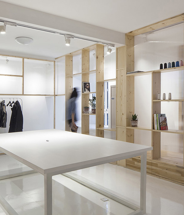
The use of raw materials: pillars and beams in the facade are raw concrete. The roof of the bathroom is a thin sheet of metal. All the kitchen is made of the same material, pine plywood to unify the functions. A blue curtain hides the kitchen and creates an abstract blue wall. The pipes of the radiator are left visible and integrated into the shelf.
Reveal the structure. For every project, we try to reveal the truth about the structure. We scrubbed the coating to reveal the concrete structure underneath. In contrast with the white and clean aspect of the apartment, this rough surface creates a good balance. It links the flat to the entire building.
Working in such small spaces is really challenging. The aim is to find the best balance between functionality and abstraction, with real attention to details and proportions.
As the spaces are existent and old, we always have to deal with irregularity, unexpected discoveries. The construction site is like a second conception phase, where details have to be adapted, decisions made quickly. The understanding and dialogue with the craftsmen are essential for a good project.
To work on the second project in almost the same space is very interesting as it shows that the possibilities are endless. The same concepts of minimalism, compactness, natural light, geometry, the beauty of the plan, reflections, attention to details and materials, are applied to the space for a different result.
▼项目更多图片
{{item.text_origin}}


